Ok I was very excited to post this box. I wanted my first box of 2010 to be amazing and have more to come later on this year. Well I wanted to keep the color tones almost like Dissidia Final Fantasy and I think it came out great.
Hate the ugly white borders of the renders or the blended logo. That's the image of cloud from the ending on the front right? i was gonna use that as my new avatar, but later decided i couldn't get the angle i wanted so i didn't.
Despite anything people have to say about VII being better or worse than VI, this box is really great with the great typography and beautiful artwork. I can't say enough how much I like it. Flawless in my opinion (Well, except the Heavenly Sword copyright info, lol, but that's just grasping at little nitpicky stuff).
I really wish this would happen one day. I wouldn't mind an HD reimagining of Final Fantasy VI either, but the popularity and following of Final Fantasy VII deserves that this be made someday.
#11, I meant for it to be like that. The white wouldnt go away in the first place after I rendered it. I wanted it to have a bit of white on it so it wouldnt blend in with the back so much.
Aside from the horrible text makeup on the back (copy text, again) and the headline on the back being toooooo far on the edges (again as well) it is very well done.
The way i look at it. It sort of says something to me. Like the front shows Cloud walking away from his bad past(red) and walking into his better future(green). The back shows Sephiroth walking into cloud's future trying to make his life dark like it once was.
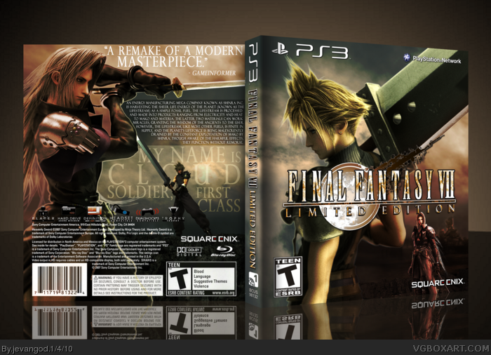
 Final Fantasy VII Limited Edition Box Cover Comments
Epic!
[ Reply ]
Ok I was very excited to post this box. I wanted my first box of 2010 to be amazing and have more to come later on this year. Well I wanted to keep the color tones almost like Dissidia Final Fantasy and I think it came out great.
[ Reply ]
Great job... Only if it were really.
[ Reply ]
VII is overrated. VI is far more deserving of a PS3 remake.
Good box, though.
[ Reply ]
#4, Sorry. VII just had a better storyline and more memorable characters.
[ Reply ]
#4, I beg to to differ. Fantastic job on this, and hopefully it will get a remake.
[ Reply ]
i like to cover
but the back... not so much
[ Reply ]
Very cool man, I like it
[ Reply ]
Hate the ugly white borders of the renders or the blended logo. That's the image of cloud from the ending on the front right? i was gonna use that as my new avatar, but later decided i couldn't get the angle i wanted so i didn't.
Looks very good though.
[ Reply ]
#9, Wasnt a render from the ending. Was just one of those promotional renders. The white on the edges of the renders is cause of the blurry parts.
[ Reply ]
I just noticed the logo on the front is really bad toward the sword. It wasn't rendered very good. The box is still fav. worthy though.
[ Reply ]
Despite anything people have to say about VII being better or worse than VI, this box is really great with the great typography and beautiful artwork. I can't say enough how much I like it. Flawless in my opinion (Well, except the Heavenly Sword copyright info, lol, but that's just grasping at little nitpicky stuff).
I really wish this would happen one day. I wouldn't mind an HD reimagining of Final Fantasy VI either, but the popularity and following of Final Fantasy VII deserves that this be made someday.
Edited at 1 decade ago
[ Reply ]
#11, I meant for it to be like that. The white wouldnt go away in the first place after I rendered it. I wanted it to have a bit of white on it so it wouldnt blend in with the back so much.
#12, Thanks.
[ Reply ]
#6, agreed, VII is a superb game. Much like this boxart, brilliant!
[ Reply ]
#5, VII was just a watered down version of VI with a lesser plot and skin deep stereotypical characters designed to appeal to angsty tweens.
[ Reply ]
#15, hmmmmmmm. Nahh.
[ Reply ]
My first 2010 HOF box. Thanks guys.
[ Reply ]
One of the best fan-made boxarts of one of the best games ever created. this BA is pure epic
[ Reply ]
#18, Thanks.
Printable added.
[ Reply ]
This is probably my favorite box on VGBoxArt. Way to go, Jevangod!
[ Reply ]
Freaking nice bro.
[ Reply ]
Wow easily your best box yet and one of my favorites on the site! Where did you get those renders!
[ Reply ]
#22, You can find them on the final fantasy wiki. But you'll have to render the two biggest ones on this box.
[ Reply ]
Aside from the horrible text makeup on the back (copy text, again) and the headline on the back being toooooo far on the edges (again as well) it is very well done.
[ Reply ]
#24, Thank you very much.
[ Reply ]
Fucking badass.
[ Reply ]
Double post, lol.
Edited at 1 decade ago
[ Reply ]
The way i look at it. It sort of says something to me. Like the front shows Cloud walking away from his bad past(red) and walking into his better future(green). The back shows Sephiroth walking into cloud's future trying to make his life dark like it once was.
[ Reply ]
Amazing. Love your work jevangod.
[ Reply ]
classic
[ Reply ]