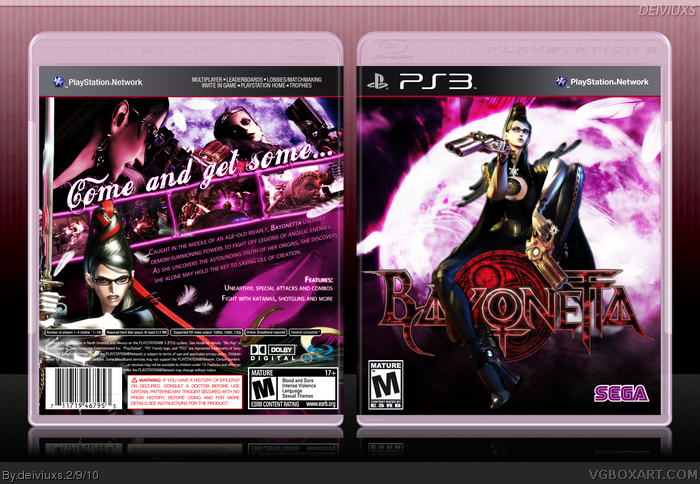
The lady is crazy, thus she deserves a box. =)
Fun project to make. Front cover is edited version of a pic made by AnIvorySoul from DeviantArt (link. Back was lots of experimenting but the end result is pretty eye pleasing to me.
Comment & favs appreciated.
Credits:
Sens - PS3 plastic template (3D)
Cerium - SEGA logo (edited)
AnIvorySoul - front image (edited)
That doesn't look like her on the front, Bayonetta is insulted. It looks alright though, neither of those fonts on the back really fit Bayonetta, a more elegant one would probably fit in better.
I like the composition on the front but I don't like that fanart of her at all. Also, it may be too much black on there. I like the back a little better but as shady said, the fonts doesn't match at all and the way you placed them makes it look a bit too cluttered. The box also need a lot more "sexy".
Front is supposed to be sexy in a very calm and simple way, whereas back is more action packed (or cluttered) to show off her more dangerous and "crazy" side.
the front looks a bit too empty,and a tad too simple,wheres the back feels tóo cluttered.
The typographic style you used for the back tagline doesn't work with this font[or font-style,for that matter],and the rest of the composition feels a bit amateurish.
A few things bother me. The stroke on the tagline text is too heavy to me. But the tagline seems to read "come get and some." Also, I don't like that you have a drawn artwork of Bayonetta on the front, and a 3D artwork on the back.
I do like the simplicity of the front and font choices work for me, actually. Just try to find another 3D Bayonetta for the front.
#10, Well then why bother making a comment then if you have nothing good/bad to say...
#11, Did you just came to bash my work, just because of few comments on Crotale's box?
Anyways, people don't seem to favor creativity on this site. If a particular font doesn't go well with the vibe of the game, then everything is out of control and simply sucks.
I'll wait for 150 days to pass and delete this box. Keep it for in my own computer with few other boxes that probably will never be uploaded to this site.
#12, My suggestion to you is to stop getting mad every time someones box gets more attention than yours, which in this case is Crotale's. You shouldn't delete it just because of the number of favorites it gets, but that's just my opinion. There is an update feature for a reason, and you have been given many critiques but have yet to show any strive in improving the box from the help of others. If you want the "attention" you think this box deserves, my advice would be to take Ayrons suggestions and do an update, or you could just give up and delete it.
#12, I didn't come to bash your box at all. My comments had nothing to do with Crotale's box. In fact, my comments were meant to show that I didn't have any hard feelings and wanted to provide some feedback. I defended your font choice if you were to read my comment a little more carefully. There's a lot I like about this box, and you are a talented artist, but I think it's important to listen to others' input to improve when you can.
Try to put your ego aside when people give you critiques. I know it can be hard to do, but it will help immensely to improve your designs.
#12, Way to take critique. You don't have to do shit if you don't want to, it's all just suggestions and thoughts on what improvements we would like to see. If you want nothing but praise then why bother posting at all?
#13, Mad? Oh no, I am not mad at all. I think it's great that the guy who bashes everyone (and this site as a whole) in the forums should get all the attention he deserves. Hell, let's give his second box into Masterworks, why the hell not?!
#14, Oh, I love getting critiques. All the critiques I used to get in the WIP forum where so helpful and definitely worth it.
#15, To be honest I do not know why I bothered posting on this site anyways. I do not have any talent at all, this is just a stupid hobby that I should keep it private. I'd rather leave room for more talented people on this site.
Oh, and one more thing that proves that this site is a big popularity contest. After being "mean" I lost one fav (not sure which box and not sure who unfaved), but it just again that members (at least some) look more closely at who made the box and not how the box looks like.
If you're nice - you get your attention, comments, and favs, but if you're an ass (like me I guess) you get no attention. I guess you do get some attention, but that's usually in the form of "pretty" comments.
#16, I hear you about the critiques, or lack of critiques rather. Unfortunately I'm guilty of not commenting on WIP's as much as I could either, so yeah. Anyway, that's why I gave you one here since I'm now interested in the design. This site IS a big popularity contest. It's not CG Society, that's for sure.
#16, Yes this site is a lot about popularity, but part of that comes with listening to critiques to improve. Just because your box didn't get any posts in the WIP forums doesn't mean that you can't implement the critiques given on he boxes page after it's been posted.I understand what you are saying but I think you should be happy with the comments and critiques your getting. You're a great artist, and have really improved since you've came here. I think you could improve a lot more by listening to as many critiques as you can.
Not bad, but the artwork on the front doesn't fit the games style that much and mixing it with the rendering of Bayonetta in the back makes it not good either. Sure, it is your right to do so, but I think you should stick with either just artworks of Bayonetta and some screenshots or just renderings.
I have to agree about the tagline on the back as well. Again: You are free do play with fonts, but legibility should not suffer.
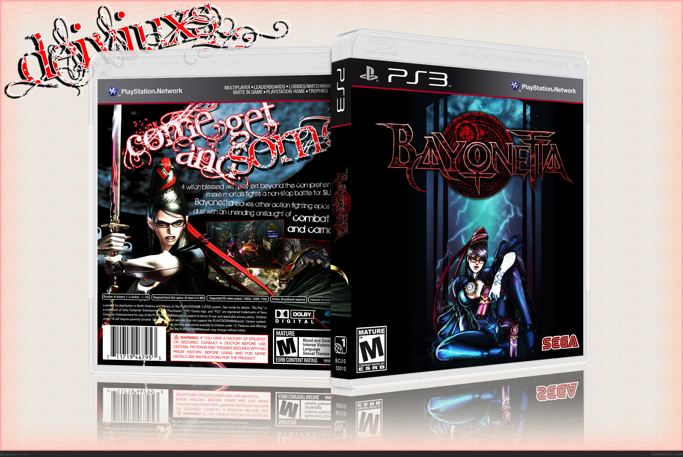
Finally, I am done with this box. I really wanted to show you guys that I do appreciate every single comment (bad or good) that I receive on my boxes, I decided to do an update for this box.
I tried to take all the critiques I received and "fix" them and make the box better.
In order to do that, I decided to start fresh, which means that the box you see right now has been made from scratch. I tried to make the box more "sexy" looking and did not use any custom artwork. I really had lots of trouble with the back design. I probably went through 5-6 different backs until I ended up with the one you see right now and even this back does not satisfy me 100% but I believe it looks good and fits the cover well.
I would also like to apologize for being rude to some of you. I had some personal issues and I know I shouldn't have offended you guys for giving me critiques.
Again, thanks for your support and help. I really appreciate it and I hope you like this update more.
#22, How does the sword look odd to you? I could move the render to the right a bit so the sword is not visible anymore, but me personally, don't really find it that odd.
#26, I knew some people might have a problem with the logo being covered by her legs, but I did that on purpose. First, I really wanted to draw attention to her body, especially her legs, because I think that adds more sexiness to Bayonetta. Second, I really don't think that the leg covers so much of the logo that it is hard to read and understand what kind of game it was. I also think it looks much better for her leg to be in front of the logo than behind it.
#28, I don't have that much of a problem with it, but if this would be the real package and a thumbnail of it was printed in catalogues or flyers, it would be impossible to read/see the logo. After all almost everything from the "y" is covered now.
 Bayonetta Box Cover Comments
The lady is crazy, thus she deserves a box. =)
Fun project to make. Front cover is edited version of a pic made by AnIvorySoul from DeviantArt (link. Back was lots of experimenting but the end result is pretty eye pleasing to me.
Comment & favs appreciated.
Credits:
Sens - PS3 plastic template (3D)
Cerium - SEGA logo (edited)
AnIvorySoul - front image (edited)
[ Reply ]
Goddam thats awesome, top work mate, loving the whole direction here.
[ Reply ]
Really great work man, top notch!
[ Reply ]
That doesn't look like her on the front, Bayonetta is insulted. It looks alright though, neither of those fonts on the back really fit Bayonetta, a more elegant one would probably fit in better.
[ Reply ]
I got the game demo for the 360. This game will be so cool! GUNS ON FEET ATTACK!!!!
[ Reply ]
I like the composition on the front but I don't like that fanart of her at all. Also, it may be too much black on there. I like the back a little better but as shady said, the fonts doesn't match at all and the way you placed them makes it look a bit too cluttered. The box also need a lot more "sexy".
[ Reply ]
The front feels very empty for me, would like some more of the blue you got there.
But the back...wow.
[ Reply ]
Front is supposed to be sexy in a very calm and simple way, whereas back is more action packed (or cluttered) to show off her more dangerous and "crazy" side.
[ Reply ]
I'm sorry,but i do not like this.
the front looks a bit too empty,and a tad too simple,wheres the back feels tóo cluttered.
The typographic style you used for the back tagline doesn't work with this font[or font-style,for that matter],and the rest of the composition feels a bit amateurish.
You can do alot better.
[ Reply ]
^ Sums it up basically for me.
[ Reply ]
A few things bother me. The stroke on the tagline text is too heavy to me. But the tagline seems to read "come get and some." Also, I don't like that you have a drawn artwork of Bayonetta on the front, and a 3D artwork on the back.
I do like the simplicity of the front and font choices work for me, actually. Just try to find another 3D Bayonetta for the front.
[ Reply ]
#10, Well then why bother making a comment then if you have nothing good/bad to say...
#11, Did you just came to bash my work, just because of few comments on Crotale's box?
Anyways, people don't seem to favor creativity on this site. If a particular font doesn't go well with the vibe of the game, then everything is out of control and simply sucks.
I'll wait for 150 days to pass and delete this box. Keep it for in my own computer with few other boxes that probably will never be uploaded to this site.
Edited at 1 decade ago
[ Reply ]
#12, My suggestion to you is to stop getting mad every time someones box gets more attention than yours, which in this case is Crotale's. You shouldn't delete it just because of the number of favorites it gets, but that's just my opinion. There is an update feature for a reason, and you have been given many critiques but have yet to show any strive in improving the box from the help of others. If you want the "attention" you think this box deserves, my advice would be to take Ayrons suggestions and do an update, or you could just give up and delete it.
[ Reply ]
#12, I didn't come to bash your box at all. My comments had nothing to do with Crotale's box. In fact, my comments were meant to show that I didn't have any hard feelings and wanted to provide some feedback. I defended your font choice if you were to read my comment a little more carefully. There's a lot I like about this box, and you are a talented artist, but I think it's important to listen to others' input to improve when you can.
Try to put your ego aside when people give you critiques. I know it can be hard to do, but it will help immensely to improve your designs.
[ Reply ]
#12, Way to take critique. You don't have to do shit if you don't want to, it's all just suggestions and thoughts on what improvements we would like to see. If you want nothing but praise then why bother posting at all?
[ Reply ]
#13, Mad? Oh no, I am not mad at all. I think it's great that the guy who bashes everyone (and this site as a whole) in the forums should get all the attention he deserves. Hell, let's give his second box into Masterworks, why the hell not?!
#14, Oh, I love getting critiques. All the critiques I used to get in the WIP forum where so helpful and definitely worth it.
#15, To be honest I do not know why I bothered posting on this site anyways. I do not have any talent at all, this is just a stupid hobby that I should keep it private. I'd rather leave room for more talented people on this site.
Oh, and one more thing that proves that this site is a big popularity contest. After being "mean" I lost one fav (not sure which box and not sure who unfaved), but it just again that members (at least some) look more closely at who made the box and not how the box looks like.
If you're nice - you get your attention, comments, and favs, but if you're an ass (like me I guess) you get no attention. I guess you do get some attention, but that's usually in the form of "pretty" comments.
[ Reply ]
#16, I hear you about the critiques, or lack of critiques rather. Unfortunately I'm guilty of not commenting on WIP's as much as I could either, so yeah. Anyway, that's why I gave you one here since I'm now interested in the design. This site IS a big popularity contest. It's not CG Society, that's for sure.
[ Reply ]
#16, Yes this site is a lot about popularity, but part of that comes with listening to critiques to improve. Just because your box didn't get any posts in the WIP forums doesn't mean that you can't implement the critiques given on he boxes page after it's been posted.I understand what you are saying but I think you should be happy with the comments and critiques your getting. You're a great artist, and have really improved since you've came here. I think you could improve a lot more by listening to as many critiques as you can.
[ Reply ]
Not bad, but the artwork on the front doesn't fit the games style that much and mixing it with the rendering of Bayonetta in the back makes it not good either. Sure, it is your right to do so, but I think you should stick with either just artworks of Bayonetta and some screenshots or just renderings.
I have to agree about the tagline on the back as well. Again: You are free do play with fonts, but legibility should not suffer.
[ Reply ]
Finally, I am done with this box. I really wanted to show you guys that I do appreciate every single comment (bad or good) that I receive on my boxes, I decided to do an update for this box.
I tried to take all the critiques I received and "fix" them and make the box better.
In order to do that, I decided to start fresh, which means that the box you see right now has been made from scratch. I tried to make the box more "sexy" looking and did not use any custom artwork. I really had lots of trouble with the back design. I probably went through 5-6 different backs until I ended up with the one you see right now and even this back does not satisfy me 100% but I believe it looks good and fits the cover well.
I would also like to apologize for being rude to some of you. I had some personal issues and I know I shouldn't have offended you guys for giving me critiques.
Again, thanks for your support and help. I really appreciate it and I hope you like this update more.
[ Reply ]
I love this update, everything looks much better. Amazing job!
[ Reply ]
Looks way better than before, very nice update.
Her sword on the back render does look kind of odd though.
[ Reply ]
This is an awesome game and an awesome box!! Favorite..great work.
[ Reply ]
Dude. Vast, VAST improvement. I'm so happy to see this.
[ Reply ]
Yes.
Thanks for not begging for attention,but just asking me politely in a pm. I appreciate that.
[ Reply ]
Way better, however it is always a bit risky to but something in front of a logo. In this case it make sthe title a bit hard to read.
[ Reply ]
Sexy legs.
[ Reply ]
#22, How does the sword look odd to you? I could move the render to the right a bit so the sword is not visible anymore, but me personally, don't really find it that odd.
#26, I knew some people might have a problem with the logo being covered by her legs, but I did that on purpose. First, I really wanted to draw attention to her body, especially her legs, because I think that adds more sexiness to Bayonetta. Second, I really don't think that the leg covers so much of the logo that it is hard to read and understand what kind of game it was. I also think it looks much better for her leg to be in front of the logo than behind it.
[ Reply ]
#28, I don't have that much of a problem with it, but if this would be the real package and a thumbnail of it was printed in catalogues or flyers, it would be impossible to read/see the logo. After all almost everything from the "y" is covered now.
[ Reply ]
Well, I wish I could fav it again.
Very good update, the colours are very nice on this one.
[ Reply ]
#29, I get what you're saying but since this will never be printed, I keep it like that.
[ Reply ]
extremely great work!!! aaghhhh!! i would apprecaite a copy sir! :D email---> teo123inamoski@yahoo.com THANKS in advance! :D
[ Reply ]