I'm sorry... but I really don't like it... The render looks stretched, the logo looks stretched, the background does not go good with the game, and the worst thing about it... ITS ON DS??? bad move there dude... i give this a 1/5... sorry... could of been WAY better...
 Kingdom Hearts Collection Box Cover Comments
my first in awhile! im glad to be back!
credit:
logo: punisherab
render: stevencho
temp: ray blade
square enix logo: qwerty334
[ Reply ]
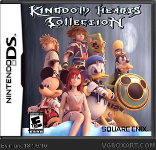
Basically, this is the instruction manual art for Kingdom Hearts 2.
The whole concept of putting the "collection" on a handheld doesn't exactly appeal to me or many others i doubt.
However, the background is not a bad selection for the given renders.
You'll improve over time. :)
To be quite frank, i can't do much better.
[ Reply ]
nice!
its wonderful!
MAKE A BACK!
nao!
FAVE
[ Reply ]
I'm sorry... but I really don't like it... The render looks stretched, the logo looks stretched, the background does not go good with the game, and the worst thing about it... ITS ON DS??? bad move there dude... i give this a 1/5... sorry... could of been WAY better...
Edited at 1 decade ago
[ Reply ]