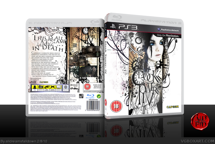
pretty a rtistic, but that girl does not fit since its style seems very very diffrent to the rest of the package. Maybe try to make it a bit more sketchy? And the whole title would not work in print medias, like a catalogue. Very hard to see anything. Asides from this it is very well done
Hey, why'd you re-upload your old Bioshock cove- Ohhhhh.
Just because smudges, splatters, flowing lines, and overly crowded silhouette montages are cool on Wal-Mart t-shirts doesn't mean they're always a good idea. Especially when doing a design for any particular thing. Especially, especially, for a video game. I can't think of a single video game that warrants this type of design style. Even if it were fitting for some game, it sure as hell isn't Clocktower IV.
It looks like you tried to fit every possible graphic design cliche' possible into this cover. Swirlies? Got 'em. Splatters? Smudges? Photoshop brush repeating stamps? Check. "Rising sun?" Of course. Some emo bitch (Who isn't even in the game. What the fuck?!) saturated to the point of being composed only of black and white but her eyes still show color? Damn, it's lookin' pretty 13-year-old-with-a-camera-and-a-DeviantART-account in here.
I actually just now checked to make sure you didn't upload this as a humor box.
I know, that's a lot of mean shit to say about something, especially something that probably took a lot of work and time from you. I'm really sorry, but damn.
You're a great designer. You're better than this.
My heart is broken, and I'm sorely disappointed in you.
I lost the count of times I suggested this in the MW thread, and I'm glad to see this box finally gettins the recognition it deserves. Congratulations.
 Clock Tower IV Box Cover Comments
Epic.
[ Reply ]
Awesome
[ Reply ]
That back is just plain fantastic.
[ Reply ]
Very nice indeed.
[ Reply ]
Excellent design my friend.
[ Reply ]
I'm reminded of your Saw box. And that's not a bad thing.
Faved.
Edited at 1 decade ago
[ Reply ]
Awesome job, everything looks great.
[ Reply ]
Another Clock Tower fan, eh? Really nice work but to nitpick I think it would have looked better with screens from Haunting Ground.
[ Reply ]
This... is just damn right sexy...
[ Reply ]
Huh, Clock Tower, haven't heard of that game for ages. Goddam i love your creations ADFD, they always exceed my expectations.
[ Reply ]
Speechless sir, just speechless.
[ Reply ]
#11, I'm getting to close to your style. I need to stop that.
[ Reply ]
pretty a rtistic, but that girl does not fit since its style seems very very diffrent to the rest of the package. Maybe try to make it a bit more sketchy? And the whole title would not work in print medias, like a catalogue. Very hard to see anything. Asides from this it is very well done
Edited at 1 decade ago
[ Reply ]
Hey, why'd you re-upload your old Bioshock cove- Ohhhhh.
Just because smudges, splatters, flowing lines, and overly crowded silhouette montages are cool on Wal-Mart t-shirts doesn't mean they're always a good idea. Especially when doing a design for any particular thing. Especially, especially, for a video game. I can't think of a single video game that warrants this type of design style. Even if it were fitting for some game, it sure as hell isn't Clocktower IV.
It looks like you tried to fit every possible graphic design cliche' possible into this cover. Swirlies? Got 'em. Splatters? Smudges? Photoshop brush repeating stamps? Check. "Rising sun?" Of course. Some emo bitch (Who isn't even in the game. What the fuck?!) saturated to the point of being composed only of black and white but her eyes still show color? Damn, it's lookin' pretty 13-year-old-with-a-camera-and-a-DeviantART-account in here.
I actually just now checked to make sure you didn't upload this as a humor box.
I know, that's a lot of mean shit to say about something, especially something that probably took a lot of work and time from you. I'm really sorry, but damn.
You're a great designer. You're better than this.
My heart is broken, and I'm sorely disappointed in you.
[ Reply ]
I'm not feeling this one
Edited at 1 decade ago
[ Reply ]
Awesome.
[ Reply ]
doesn't look remotely video game related at all, but that doesn't keep it from looking great
[ Reply ]
Masterworks worthy!
[ Reply ]
It's about time.
[ Reply ]
I lost the count of times I suggested this in the MW thread, and I'm glad to see this box finally gettins the recognition it deserves. Congratulations.
[ Reply ]
CONGRATS!
[ Reply ]
The real Clock Tower 3 sucked...hopefully the 4th will redeem the series.
[ Reply ]
ADFD, you make me wet.
[ Reply ]