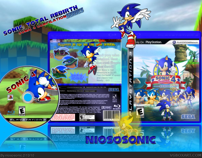
"OnlyOnPlaystation" sign is maybe a "WTF" but the version you don't download is only on the ps3 (not on real)
I edited the old style sonics so they looked more "modern"
ENJOY! Fav's and comments welcome, Author favs are VERY WELCOME
#2, thanks
Thanks guys for the favs :D
#4, really? Im honoured :DDDDDDDD xD
#8, OMG!!! MY FIRST AUTHOR FAV! OMG! IM GONNA BE RANK 2! THANK YOU SO MUCH :D
#11, thanks, i noticed that the rank up system is lazy, i had 84% before he author faved me, and still im %84 ..owhell...
I really like this.
I think in time, you're gonna be a great member here. You remind me of me when I first started out on this website. Making crappy Sonic boxes (no offence) which eventually turn into okay Sonic boxes, then good Sonic boxes, then great Sonic boxes...etc
I will +fav it, if only to push you up to rank 2 ;)
#7, A better font, NOT the Sonic one! Work on your grammar, and don't use colors that clash with the background unless you're gonna use an outline, that "old" bit in red looks a little tacky. Try to use an actual font that looks like scruffy handwriting. But don't use BradleyHand, it'll look a bit naff.
Great box and the front looks really good to me :o
But if you were considering making it less cluttered you could cut it down to just four sonics (considering Sonic 4 is just continuing the main series anyway) and have a sonic from 1, 2, and 3 behind the Sonic 4 character image
 Sonic The Hedgehog 4: Episode 1 Box Cover Comments
Template: afifan000
disc: Nerdysimmer
logo: KoopaDasher
NiosoSonic logo: LaserSonic
"OnlyOnPlaystation" sign is maybe a "WTF" but the version you don't download is only on the ps3 (not on real)
I edited the old style sonics so they looked more "modern"
ENJOY! Fav's and comments welcome, Author favs are VERY WELCOME
#2, thanks
Thanks guys for the favs :D
#4, really? Im honoured :DDDDDDDD xD
Edited at 1 decade ago
[ Reply ]
Oh shit, you did it again.
Really, I like what you did here.
[ Reply ]
Ya me logo
[ Reply ]
You're definitely one of the better newer members.
[ Reply ]
English can use some work lol
[ Reply ]
I quite like the front... but the back and the disc need WAY more work on them.
[ Reply ]
#5, Yeah, I know xD
#6, what do you suggest?
Edited at 1 decade ago
[ Reply ]
Very nice.
+fav
+author fav
Keep up the good work.
[ Reply ]
#8, OMG!!! MY FIRST AUTHOR FAV! OMG! IM GONNA BE RANK 2! THANK YOU SO MUCH :D
#11, thanks, i noticed that the rank up system is lazy, i had 84% before he author faved me, and still im %84 ..owhell...
Edited at 1 decade ago
[ Reply ]
I think the back's just as good.
The disc needs work though.
[ Reply ]
I really like this.
I think in time, you're gonna be a great member here. You remind me of me when I first started out on this website. Making crappy Sonic boxes (no offence) which eventually turn into okay Sonic boxes, then good Sonic boxes, then great Sonic boxes...etc
I will +fav it, if only to push you up to rank 2 ;)
[ Reply ]
Nice box.
[ Reply ]
#7, A better font, NOT the Sonic one! Work on your grammar, and don't use colors that clash with the background unless you're gonna use an outline, that "old" bit in red looks a little tacky. Try to use an actual font that looks like scruffy handwriting. But don't use BradleyHand, it'll look a bit naff.
[ Reply ]
#13, I'll try to update it, if i have time
#12, thanks
[ Reply ]
nice
[ Reply ]
#15, Thanks
[ Reply ]
Too many Sonics on the front.
[ Reply ]
#17, It shows the evolution of sonic, my friend :P
[ Reply ]
I love your front, the the back is WAY to plain my friend. ^^ Good job though.
[ Reply ]
#18, It doesn't show it that well. It just looks cluttered.
[ Reply ]
Great box and the front looks really good to me :o
But if you were considering making it less cluttered you could cut it down to just four sonics (considering Sonic 4 is just continuing the main series anyway) and have a sonic from 1, 2, and 3 behind the Sonic 4 character image
[ Reply ]
#21, then I think I'll go with sonic 1, sonic adventure and STH
I'll maybe update, I'm working on art to my later box
[ Reply ]
I like he front a lot.
[ Reply ]
Nice.
[ Reply ]