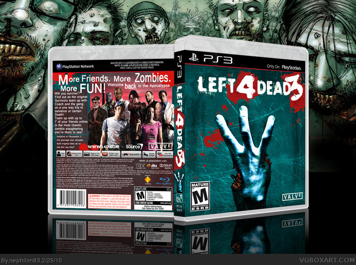
#1, Lol. Yeah, man, I couldn't get that freakin' three to look good on there no matter how hard I tried. I'm still trying to find a decent solution. That particulour three is the "2" from "Left 4 Dead 2" that I chopped up and flipped around. The blood's too much, but it looks just as bad without it in my opinion.
Anyway, thanks for the comment! Hopefully, I'll be adding an update soon!
I was thinking about making a L4D3 box, would have done it a bit differently. Not bad though, it's just I'm not sure the blue suits the game that much.
#7, green would have been my first choice, but thats been done already. Yellow, too. Pretty much everything else wouldn't compliment the red of the blood as well as this cool blue does. I like that blue just makes the blood pop right off the cover. Anyway, I hope you still intend to make yours. I'd like to see someone else's version.
I like the logo. The three isn't that bad, is it? I mean, I think it looks good.
Would have been fun to just have the hand showing three fingers though, but maybe that'd be hard to get trough. People might think it was the first game.
 Left 4 Dead 3 Box Cover Comments
Logo ruined it for me. Otherwise very good.
[ Reply ]
#1, Lol. Yeah, man, I couldn't get that freakin' three to look good on there no matter how hard I tried. I'm still trying to find a decent solution. That particulour three is the "2" from "Left 4 Dead 2" that I chopped up and flipped around. The blood's too much, but it looks just as bad without it in my opinion.
Anyway, thanks for the comment! Hopefully, I'll be adding an update soon!
[ Reply ]
The front is good but the back is meh. 8.5/10 +fav
[ Reply ]
#3, The back took the most work. :( Thanks for the comment!
[ Reply ]
Unlike rpgfreak, I like the back more because of the effort it took =)
+fav
[ Reply ]
I like the way you got rid of the other finger and thumb very clever front and back very good 9/10
[ Reply ]
I was thinking about making a L4D3 box, would have done it a bit differently. Not bad though, it's just I'm not sure the blue suits the game that much.
Edited at 1 decade ago
[ Reply ]
#7, green would have been my first choice, but thats been done already. Yellow, too. Pretty much everything else wouldn't compliment the red of the blood as well as this cool blue does. I like that blue just makes the blood pop right off the cover. Anyway, I hope you still intend to make yours. I'd like to see someone else's version.
Everyone, thanks for the wonderful compliments!
[ Reply ]
I like the logo. The three isn't that bad, is it? I mean, I think it looks good.
Would have been fun to just have the hand showing three fingers though, but maybe that'd be hard to get trough. People might think it was the first game.
Edited at 1 decade ago
[ Reply ]
It's funny cause that's what the box will probably look like.
[ Reply ]