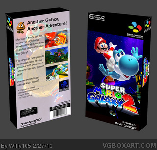
The front is AMAZING. Like, Hall-worthy. But the back is pretty gross. The front has a dark coloursheme while the back has a light one, which I dont like. I think the text on the back should be japanese too.
I will fave for the front, But i would REALLY like to see that back updated :D
I don't think the Super Famicom could handle the screenshots seen on the back. Just in general I don't really like the back, but the front is nearly perfect.
 Super Mario Galaxy 2 Box Cover Comments
Template by Reza
[ Reply ]
Sweet
[ Reply ]
pretty good. 9/10
But why a japanese template when the back is in english?
Edited at 1 decade ago
[ Reply ]
Nice but why did you change Yoshi?
[ Reply ]
The front is AMAZING. Like, Hall-worthy. But the back is pretty gross. The front has a dark coloursheme while the back has a light one, which I dont like. I think the text on the back should be japanese too.
I will fave for the front, But i would REALLY like to see that back updated :D
Edited at 1 decade ago
[ Reply ]
I don't think the Super Famicom could handle the screenshots seen on the back. Just in general I don't really like the back, but the front is nearly perfect.
[ Reply ]
I dont know why but i just dont see much good in this.
[ Reply ]
why would a 3d game be on a 16-bit system?
[ Reply ]