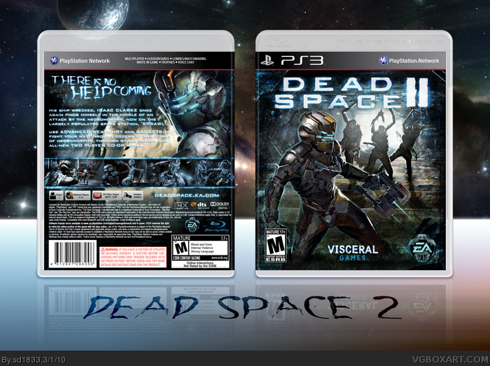
Been working on this for a few days now, really enjoyed this making this one. The back's not perfect, mainly due to the small amount of artwork, but I pulled it off anyway. Hope you all like it!
Credit to Scorpion Soldier and Sens, I combined their templates.
Where did you get the stuff for the front? I've never seen that before. It looks like you have better pics of the Unitology script too. Only thing I don't like is the font for "There is no help coming" on the back. The logo with II is better than with the 2 as well.
Well, you are correct about the back. It's nothing special and I really dislike the fact that you used the same tagline used 100 times before for a Dead Space box, I wish you came up with something new and fresh.
However, that front is fantastic and is enough for me to give you a fav. =)
I think It would look a little better if the scanlines didn't overlap the MC but otherwise... damn, that front freaking is amazing. The back could have a little more innovative design but still looks pretty sweet.
Everything's very good except that the scanlines are way heavy and the screenshots on the back aren't blended that well. However, it's still very well made. Good job indeed.
Thanks everyone for the comments, critiques and favs. =D
I plan on updating tomorrow with a better tagline/font, reduced scanlines, and I might even mess around with the back design to see if I can come up with anything better with the limited materials.
 Dead Space 2 Box Cover Comments
Been working on this for a few days now, really enjoyed this making this one. The back's not perfect, mainly due to the small amount of artwork, but I pulled it off anyway. Hope you all like it!
Credit to Scorpion Soldier and Sens, I combined their templates.
[ Reply ]
o_____________o
[ Reply ]
Where did you get the stuff for the front? I've never seen that before. It looks like you have better pics of the Unitology script too. Only thing I don't like is the font for "There is no help coming" on the back. The logo with II is better than with the 2 as well.
Fav'd.
[ Reply ]
<3
[ Reply ]
Well, you are correct about the back. It's nothing special and I really dislike the fact that you used the same tagline used 100 times before for a Dead Space box, I wish you came up with something new and fresh.
However, that front is fantastic and is enough for me to give you a fav. =)
[ Reply ]
Holy Hell, dude. This is just too beautiful for words. I'll trade ya this +fav for a printable. :)
[ Reply ]
I absolutely pretty much love this. fav + author fave
[ Reply ]
Who's ass did you pull this from?
Because this is the shit.
BD
[ Reply ]
Someone's getting an A!
[ Reply ]
I think It would look a little better if the scanlines didn't overlap the MC but otherwise... damn, that front freaking is amazing. The back could have a little more innovative design but still looks pretty sweet.
[ Reply ]
Better than the official box will be. I think it's about time I author faved you.
Edited at 1 decade ago
[ Reply ]
Only thing I dont like is the 2.
[ Reply ]
Excellent job. Love the composition.
[ Reply ]
Everything's very good except that the scanlines are way heavy and the screenshots on the back aren't blended that well. However, it's still very well made. Good job indeed.
[ Reply ]
It looked awesome until I saw the full view. My suggestion would be to reduce the scan line effect a bit.
[ Reply ]
that is a sweet case man good job your getting better,ya u do need to reduce the scan line effect
[ Reply ]
Thanks everyone for the comments, critiques and favs. =D
I plan on updating tomorrow with a better tagline/font, reduced scanlines, and I might even mess around with the back design to see if I can come up with anything better with the limited materials.
[ Reply ]
a job well done.
[ Reply ]
#17, Nooo! The scanlines are awesome! And coming from someone who didn't really enjoy the first game: This box has me excited to check it out!
[ Reply ]
awesome i love the logo
[ Reply ]
This is excellent work... but didn't I see that image of Clarke on Deviant Art a few days ago?
[ Reply ]
But still, this cover looks brilliant
[ Reply ]
#21, Oh man you serious? Do you have a link, because I'd never take fanart without crediting the artist.
[ Reply ]
#23, Its not exactly the same, but similar -- link
[ Reply ]
#24, Wow the piece really looks like official concept art! Well, besides adding the three necropmorphs it's pretty much the same.
Huh, credit goes to Jessada-Nuy from DA for that amazing artwork on the front then...
Edited at 1 decade ago
[ Reply ]
WOW!!!!!
[ Reply ]
Damn, a third? You guys are crazy! :P
It's really appreciated guys, glad to see you all like my work.
[ Reply ]
Awwwww yeee.
[ Reply ]
This is so damn pro I can't believe it. I love LOVE L-O-V-E this.
[ Reply ]
Best dead space 2 box ive seen so far...
Edited at 1 decade ago
[ Reply ]
je! very good
[ Reply ]
Printable
[ Reply ]
No Printable version :(
[ Reply ]