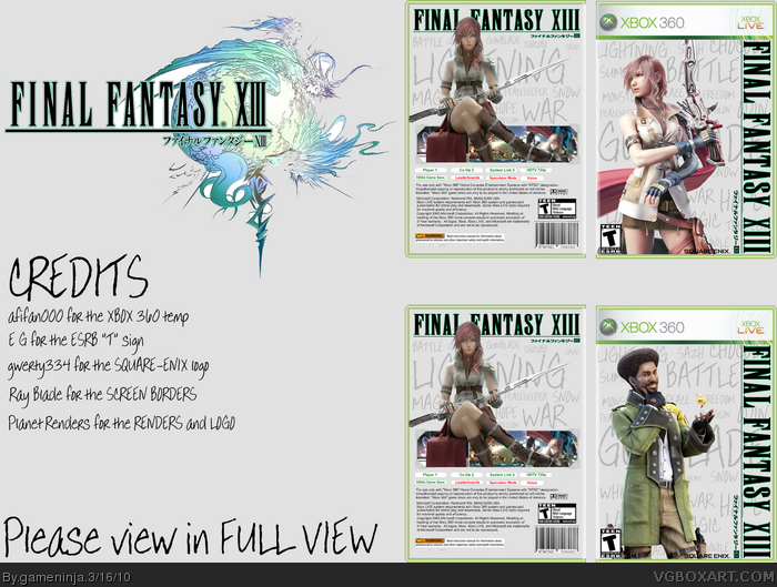
This one was a quickie, but I actually really like it. I tried to keep it simplistic, and I tried to make it look like someone had handwritten the different words all over the box.
Did I succeed? Or is this box a horrible, crushing, mind-numbing failure?
I don't feel this suits the game at all. The handwriting font is kind of cool, but the game is all about sleek, streamlined sophistication. Also, I think the words could vary more in size and direction (put in some that run vertically).
Also, the render of Lightning on the back is bad, especially at her hair. Also, the logo looks horizontally squished, and I don't think it's needed on the back.
I admire that you tried something unique, but I don't feel what's going on here.
 Final Fantasy XIII: Limited Edition Box Cover Comments
Well, what do you guys think?
This one was a quickie, but I actually really like it. I tried to keep it simplistic, and I tried to make it look like someone had handwritten the different words all over the box.
Did I succeed? Or is this box a horrible, crushing, mind-numbing failure?
Tips wanted! Scores needed!
[ Reply ]
to plan it needs something
[ Reply ]
#2, Apparently you didn't read that I wanted it to be simplistic.
[ Reply ]
I don't feel this suits the game at all. The handwriting font is kind of cool, but the game is all about sleek, streamlined sophistication. Also, I think the words could vary more in size and direction (put in some that run vertically).
Also, the render of Lightning on the back is bad, especially at her hair. Also, the logo looks horizontally squished, and I don't think it's needed on the back.
I admire that you tried something unique, but I don't feel what's going on here.
[ Reply ]
I respect that, and I feel like I didn't do everything I possibly could. It was a quickie after all. Maybe I'll do a V2 someday.
[ Reply ]