Thanks Both of you
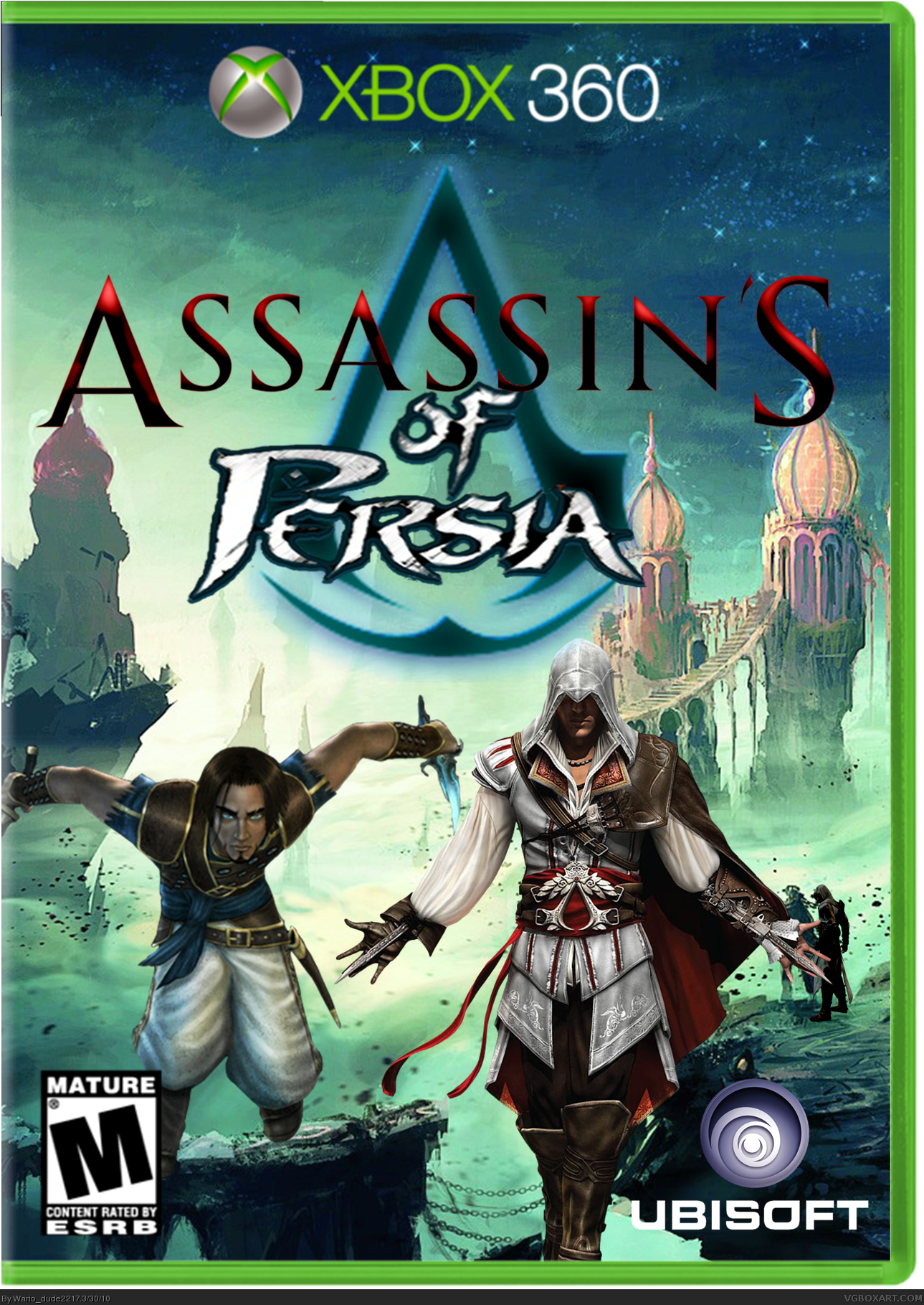
#4, Ezio is floating because he can...
#5,Where you are wrong it is Assassin's of Persia its pural meaning the assassins are from Persia!!!
#6, Dear God I hope English isn't your fist language.... Assassins is plural. Assassin's is possessive. Your title basically says that a single assassin owns something called "of persia." Now, back to grammar school with you! :P
The front is a million times better, but the back is hideous. Terrible font, bland background, oddly placed render, and bad description spoil the front for me.
Okay, I promised you a fav so I gave you one. Oh, how dissappointed I am in myself for that.... You can do better than this!!! Man, whether you've never done a box or have done it a million times you should be able to look around on this site and see what's expected of you. If you can't pull off certain things you should ask for help. I for one gladly help people on a daily basis. I spend more time helping others tweak their work than I do producing my own. If ever you get the urge to post stuff like this, please drop me a private message and we'll at least get you going in the right direction. For god's sake don't make Gameninja burn his freakin' eyes out!!!
Anyway, to be a bit more constructive:
Altair sticks out like an afro at a white supremecy rally. You need to play with the contrast and brightness to set him into the rest of the image better.
The synopsis sucks. I would rather sell a game with no synopsis on the back, because I feel completely confident in the fact that it would sell more than if it had that crap written on it.
One screen shot is hardly enough. Its understandable when you don't have a lot of resources, but if you actually did some research you could have scored some great images of the prince of persia games with a cell-shaded altair in the scene. It would have been perfect for this. Give me a minute and I'll send you a few.
Your font is blah. Fonts should always be very clean, crisp, and clear. People have to read it! We don't want to warp our eyeballs over your drooling fuzzy text! Sometimes compromising legibility for style will get rabbid monkeys sent to you via fedex and they LOVE to go for the nuts!
The background is..... What is it exactly?
Either brighten it up to where we can at least kind of see what it is or how it relates or just destort it to the point of a Jackson Pollock painting. In this case it looks like the rabbid monkeys have already arrived and took a shit all over your boxart.
Ok.... That's all. That's just about the back, now, but don't go thinking the front is all that great either. I really appreciate the effort you've made so far to make it better, but you need to realize you have a long way to go. I urge you to try harder and keep practicing. Its only a mouse and a little copyright infringement. Nothing you can't master. Now, lets do some work, son!!!
#15, thanks loads for the help ill try and improve my work for this box in a bit!!!
#16, im sorry i have realised how much tis box is a discrase to the site me know
#16, Well at least now you wont have to see your own crummy work! Lol. I keed! I keed!
#17, I have faith in you, man! If you ever need help with anything just let me know. Oh, and did you get those screenshots I sent? If so I'll be expecting an update soon! I need you to justify that +fav I gave you! You can do it! ;)
 Assassin's Of Persia Box Cover Comments
I created this box because i would love this to happen!!!
Its not the best box ever but not too bad!!!
Credit:
Template By - Leegion
Logo By - Me
Renders By - Planet Renders/me
Background By - Google
[ Reply ]
I Will Never Be Able To Do A Box Like This I Love It Fav
[ Reply ]
#2, Thanks loads Destiny, some ok boxes you have made.
I don't understand how i'm a rank 1 and you're rank 2 when my boxes are this standard???
Thanks Again
[ Reply ]
#3, Standard? The Assassin is floating in the air.
[ Reply ]
"Assassin's of Persia" means one of two things:
1) The Assassin owns "of Persia", or 2) Assassin is of Persia.
Plus, why is Ezio floating?
However, it's a rather nice picture in it's entity.
[ Reply ]
Thanks Both of you
#4, Ezio is floating because he can...
#5,Where you are wrong it is Assassin's of Persia its pural meaning the assassins are from Persia!!!
Thanks Again
[ Reply ]
#6, Dear God I hope English isn't your fist language.... Assassins is plural. Assassin's is possessive. Your title basically says that a single assassin owns something called "of persia." Now, back to grammar school with you! :P
Anyway, it still looks pretty cool.
[ Reply ]
#6, See crap like that is why people arent going to take you serious.
[ Reply ]
#7, I see it Now!!! I just said the Title in my head and it just sounded right...
#8, Now i feel like an idot, i so have to do a version 2 now!!!
Edited at 1 decade ago
[ Reply ]
#9, Thank you for seeing the light. Now, if you can be so kind as to include a back in that V2 update I will gladly give you fav...
[ Reply ]
#3, that made me lol
[ Reply ]
#10, yes i have started on the back!!! thanks loads for your help!!!
[ Reply ]
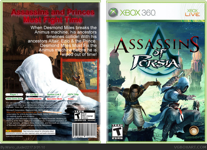
Updated Box!!!
I have Fixed:
Grammer
Floating Assassin
Only Front
Hope you enjoy!!!
[ Reply ]
My eyes! Somebody burn my eyes out!
The front is a million times better, but the back is hideous. Terrible font, bland background, oddly placed render, and bad description spoil the front for me.
[ Reply ]
Okay, I promised you a fav so I gave you one. Oh, how dissappointed I am in myself for that.... You can do better than this!!! Man, whether you've never done a box or have done it a million times you should be able to look around on this site and see what's expected of you. If you can't pull off certain things you should ask for help. I for one gladly help people on a daily basis. I spend more time helping others tweak their work than I do producing my own. If ever you get the urge to post stuff like this, please drop me a private message and we'll at least get you going in the right direction. For god's sake don't make Gameninja burn his freakin' eyes out!!!
Anyway, to be a bit more constructive:
Altair sticks out like an afro at a white supremecy rally. You need to play with the contrast and brightness to set him into the rest of the image better.
The synopsis sucks. I would rather sell a game with no synopsis on the back, because I feel completely confident in the fact that it would sell more than if it had that crap written on it.
One screen shot is hardly enough. Its understandable when you don't have a lot of resources, but if you actually did some research you could have scored some great images of the prince of persia games with a cell-shaded altair in the scene. It would have been perfect for this. Give me a minute and I'll send you a few.
Your font is blah. Fonts should always be very clean, crisp, and clear. People have to read it! We don't want to warp our eyeballs over your drooling fuzzy text! Sometimes compromising legibility for style will get rabbid monkeys sent to you via fedex and they LOVE to go for the nuts!
The background is..... What is it exactly?
Either brighten it up to where we can at least kind of see what it is or how it relates or just destort it to the point of a Jackson Pollock painting. In this case it looks like the rabbid monkeys have already arrived and took a shit all over your boxart.
Ok.... That's all. That's just about the back, now, but don't go thinking the front is all that great either. I really appreciate the effort you've made so far to make it better, but you need to realize you have a long way to go. I urge you to try harder and keep practicing. Its only a mouse and a little copyright infringement. Nothing you can't master. Now, lets do some work, son!!!
Edited at 1 decade ago
[ Reply ]
#15, it's too late. I can never see again. XD
[ Reply ]
#15, thanks loads for the help ill try and improve my work for this box in a bit!!!
#16, im sorry i have realised how much tis box is a discrase to the site me know
[ Reply ]
#16, Well at least now you wont have to see your own crummy work! Lol. I keed! I keed!
#17, I have faith in you, man! If you ever need help with anything just let me know. Oh, and did you get those screenshots I sent? If so I'll be expecting an update soon! I need you to justify that +fav I gave you! You can do it! ;)
[ Reply ]