[ Box updated on May 16th, 2010 ] [ original ]
 The Legend Of Zelda: The Forgotten Empire Box Cover Comments
Comment on Leegion's The Legend Of Zelda: The Forgotten Empire Box Art / Cover.
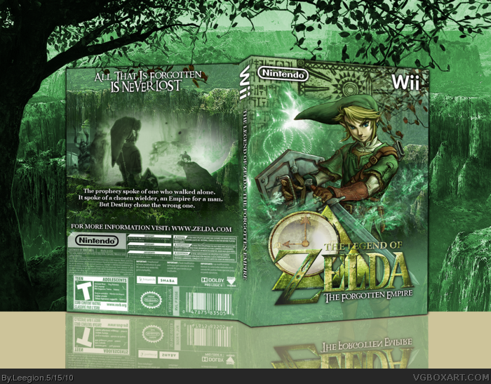
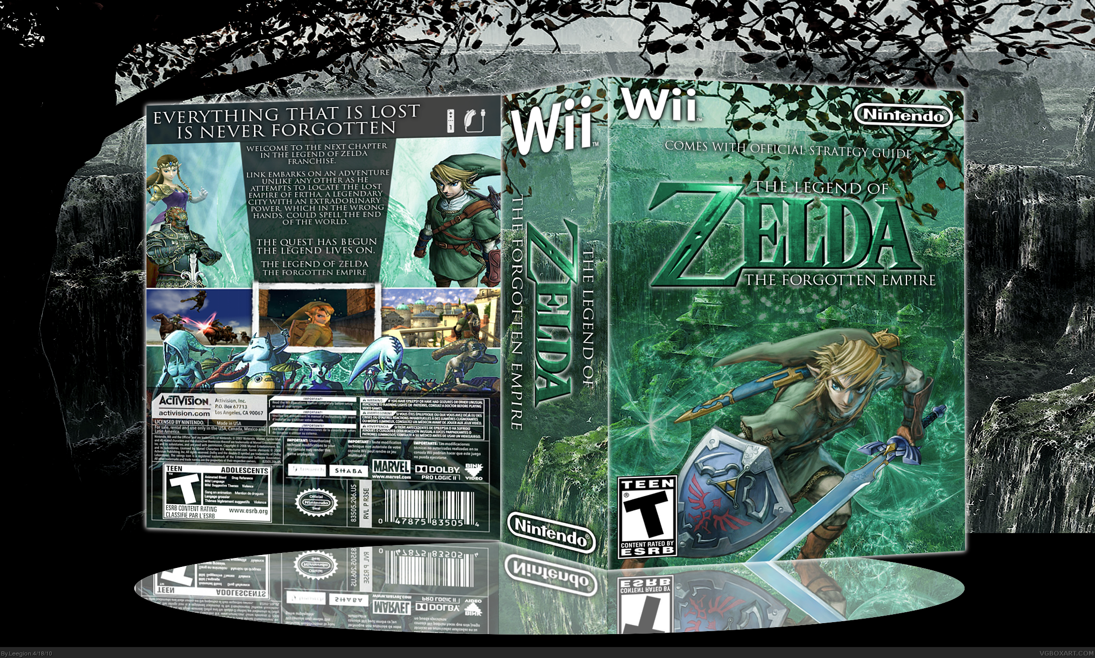
My second Zelda box, this one is more of a custom idea then the last one.
As you can see, the spine is pretty large, but i thought instead of a mess, i may as well include the official strategy guide, which would explain why it was so large.
Credits:
Jevangod - Original wii template, before change
Nimrod - for link, princess, ganon.
google images - Link (Back)
Google images - the 5 others.
[ Reply ]
It just doesn't look good when someone else than jevan is using that template. Use normal templates instead.
[ Reply ]
#2, Well i tried, but it looked squished and horrible, that's why i went with this, makes it stand out a little more.
[ Reply ]
That temp looks like hell anyway. The spine looks to be half the size of the front.
[ Reply ]
#4, Because it includes the strategy guide, that's why i put "Comes with official strategy guide" on the front.
[ Reply ]
Its not bad, but i have 2 complain... the zora band on tha back dont realy fits in the layout, ond also on the back there is the "activision" and marvel logo-
[ Reply ]
#6, He got that Modern Warfare 2 back. LOL.
[ Reply ]
Though I can tell where the presentation ends and where the box begins, it looks like the branches from the presentation are coming on to the box, and that doesn't look good. Plus the normal template would look so much better.
Edited at 1 decade ago
[ Reply ]
I don't like the back nor the template.
There is 3 different art styles on the back (CG, Twilight Princess an Majora) that don't blend together, and overall It's kind of plain... also, the temp style is way overdone now.
Overall It's pretty good though.... I'll fav it because I like the front... Just keep those points in mind.
Edited at 1 decade ago
[ Reply ]
#7, Yes, i think it is.
#8, I have tried the normal template, but it looked terrible.
#9, Thanks, i enjoyed making the front.
Maybe i'll re-do this, with a normal template, depending on if i can get the style right.
[ Reply ]
OKAY, due to popular demand, i have changed the template.
Hopefully i've fixed the errors that there were, even those small ones with activision and marvel dev logos.
Any better ?
[ Reply ]
Looks a lot better.
[ Reply ]
Real nice. the green looks awesome, and very effective for the game.
[ Reply ]
#11, Dude, it looks SOOO much better like this. Good job. +Fav
[ Reply ]
#12,#13,#14 - Thanks guys, i really appreciate it.
[ Reply ]
The only thing I don't like is the border from the middle screen on the back. It looks bad since it's not consistent with the others. Otherwise, so much better than the other temp. This is well put together and I like the unified color scheme a lot as well. Good looks.
[ Reply ]
Love the update.
[ Reply ]
This needed to be updated.
It's more to my current style now.
Credit:
Twilightmystics - logo.
[ Reply ]
The front is beautiful
[ Reply ]