[ Box updated on April 28th, 2010 ] [ original ]
 Tom Clancy's Splinter Cell: Conviction Box Cover Comments
Comment on hesit8's Tom Clancy's Splinter Cell: Conviction Box Art / Cover.
[ Box updated on April 28th, 2010 ] [ original ]
Comment on hesit8's Tom Clancy's Splinter Cell: Conviction Box Art / Cover.
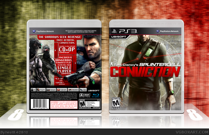
I'm so finished it hurts... here it is at long last. SPLINTA CELL!
Cred. to deiviuxs and Scorpion Soldier for their temps.
Enjoy!
[ Reply ]
Looks awesome! Great job.
[ Reply ]
the box is just great, but the bundle's back have something wrong to me, as layer treatment, to much plain texture and text size (there's also a mistake on reNvenge), so a fav for the box only
[ Reply ]
#4, Thanks for that, I'll fix the mistake when I get back.
[ Reply ]
I don't like the slipcase too much, especially the font and the texture. But the box is amazing!!!
[ Reply ]
#5, yeah, I'm too fond of them either...
I'll probably take em out later today.
[ Reply ]
The box is awesome, and the back is craaazy.
I suggest you to remove the slipcover, and give all the focus to the box.
[ Reply ]
The front reminds me of tomb raider underworld for some reason, maybe it's cause of sam's head being cut off by the template.
But it's still fantastic, as spiner said the back is nuts.
FAV.
Edited at 1 decade ago
[ Reply ]
#6, *I'm not too fond of the slipcover.*
#7, Will do.
[ Reply ]
Dayum.
[ Reply ]
Ah you posted it! Great job with pretty much everything here, I love the back case. Typography/arrangement is just great, and I like you didn't clutter it up by squeezing screenshots in when they weren't needed.
I agree with others the back slip cover could have been better executed, though I like the front pretty good.
[ Reply ]
Box is good and worth a fave. Slipcase is crap--like a strange mixture between Condemned & Arkham Asylum.
[ Reply ]
Hmm.
Your front is groundbreaking, alone, because it's completely different, you have a shot of Sam Fisher with his face cut off, looks good.
The back, works, but I'm not sure if it's really good, or kind of weird, the back arrangement isn't something I'm used to.
For the slip covers, I second Grand, overall, solid work.
[ Reply ]
Update v2:
The slip case is gone. I create slipcases during the creative process to keep the juices flowin', but this time it didn't go so well...
Edited at 1 decade ago
[ Reply ]
This looks great and very different. Good job!
+FAV
[ Reply ]
Looks alot better without the slipcase.
Good work =)
[ Reply ]
Ffs people, this needs alot more attention.
[ Reply ]
awesome!
[ Reply ]