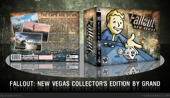
Again I had to resize this to make it less than 7.5MB--the original .png was 40MB. Spent most of my time layering, rendering, doing a bit of drawing, etc. You have to view full to read the text. Template by me--it's meant to be like the Collector's Edition of Fallout 3.
Everything here is official artwork. Did the logo myself, made up the concept art on the back to look like postcards. I had screenshots, but I'm saving them for the next version of this box, which I'll make when there's more renders/images/artwork to use. After all, the game isn't out until September.
So please--PLEASE view full. It really makes a huge difference.
Not bad I like what you did here, but some stuff just doesnt look right. Like the art on the front in the background seems more realistic than the man gambling which seems sort of weird. Plus the font on the back is hard to read and I think thats alot of text.
If you view full, the text is perfectly legible--trust me. And I didn't want to use that magazine render because so many other people have used it before. Keep in mind this is just the outer box and that once more assets are released, I'll make the proper 'case.'
Once again, this is the outer box and when there's more stuff to work with, I'll make a case using a proper PS3 template.
I love the front, but the back looks great until you get to the text, it takes up too much room in my opinion, and though readable, it blends too much with the background.
 Fallout: New Vegas Box Cover Comments
Again I had to resize this to make it less than 7.5MB--the original .png was 40MB. Spent most of my time layering, rendering, doing a bit of drawing, etc. You have to view full to read the text. Template by me--it's meant to be like the Collector's Edition of Fallout 3.
Everything here is official artwork. Did the logo myself, made up the concept art on the back to look like postcards. I had screenshots, but I'm saving them for the next version of this box, which I'll make when there's more renders/images/artwork to use. After all, the game isn't out until September.
So please--PLEASE view full. It really makes a huge difference.
Edited at 1 decade ago
[ Reply ]
Not bad I like what you did here, but some stuff just doesnt look right. Like the art on the front in the background seems more realistic than the man gambling which seems sort of weird. Plus the font on the back is hard to read and I think thats alot of text.
[ Reply ]
The front's pretty sweet, but I think you could have done a bit more with the back. And the text is kind of hard to read too.
Edited at 1 decade ago
[ Reply ]
If you view full, the text is perfectly legible--trust me. And I didn't want to use that magazine render because so many other people have used it before. Keep in mind this is just the outer box and that once more assets are released, I'll make the proper 'case.'
Once again, this is the outer box and when there's more stuff to work with, I'll make a case using a proper PS3 template.
Edited at 1 decade ago
[ Reply ]
I love the front, but the back could have been better.
[ Reply ]
#5, How? It doesn't help much if you just say that--
[ Reply ]
This is really nice, the back could use a little more, but that front is brilliant.
+Fav
+Author Fav
[ Reply ]
It's good, but the text on the back needs to stand out more. It's readable, but it could use maybe a light stroke at a low opacity.
[ Reply ]
I love the front, but the back looks great until you get to the text, it takes up too much room in my opinion, and though readable, it blends too much with the background.
[ Reply ]
OK I'll add a light outer glow or stroke to make the back text pop a bit more.
[ Reply ]
The front is splendid, the back's a bit boring.
[ Reply ]