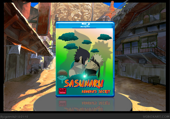
Okay so this is my second box. I know it doesn't look too busy but EVERYTHING you see in it is rendered and edited. This took me a week to figure out what I wanted to do and how to do it. This was a lot of hard work for me so Please comment...
I can assure you that Naruto yaoi won't fly on this site. Aside for the bad concept, the box itself has many flaws such as overuse of the naruto-font, overused cloud render and random leaf symbol thingy. Not to mention the lack of a back. If it took a "week to figure out what you wanted to do" I would love to hear your conclusion cause the result strikes me of nothing than a hastily put together mess.
Ouch. Well, at first I was going to do a humour box. Because I saw some on this site. But they didn't get a good reception so I decided to go serious instead. That's why it took me a week. Also, because I'm completely new at photo-editing, another reason it took me so long. My first box was more wallpapery. I wanted to do more than mostly copy/paste like last time. If you look at my first box, you'll see what I mean.
I thought the image itself was clean enough to post. If it's offensive I'm sorry. I saw some girl-on-girl stuff so I thought it was okay.
I agree with the overuse of the font now that you mention it.
It's nothing of a hastily put together mess I can assure you that much though. If I were an experienced artist though, I can see what you mean by that since there's not a lot happening. The more I looked at it the better the more "simple" look appealed to me.
Yeah, the topic is certainly nothing I'm interested in (both on the yaoi count and the Naruto count), but that's not what this is really about.
I don't feel that there isn't anything terribly wrong with this... but nothing really right either. The composition is kinda bland, and the colors are very dull. With the colors used in the title, it makes the rest of the box look especially desaturated. Could definitely use a back as well.
#3, Man, I've gotta say, your great at handling criticism. *Applauds*
Lol, well though I don't like the concept, aesthetically, it doesn't look all that bad! I think the colors are a bit too dark, though. Brighten the whole thing up and it'll look better.
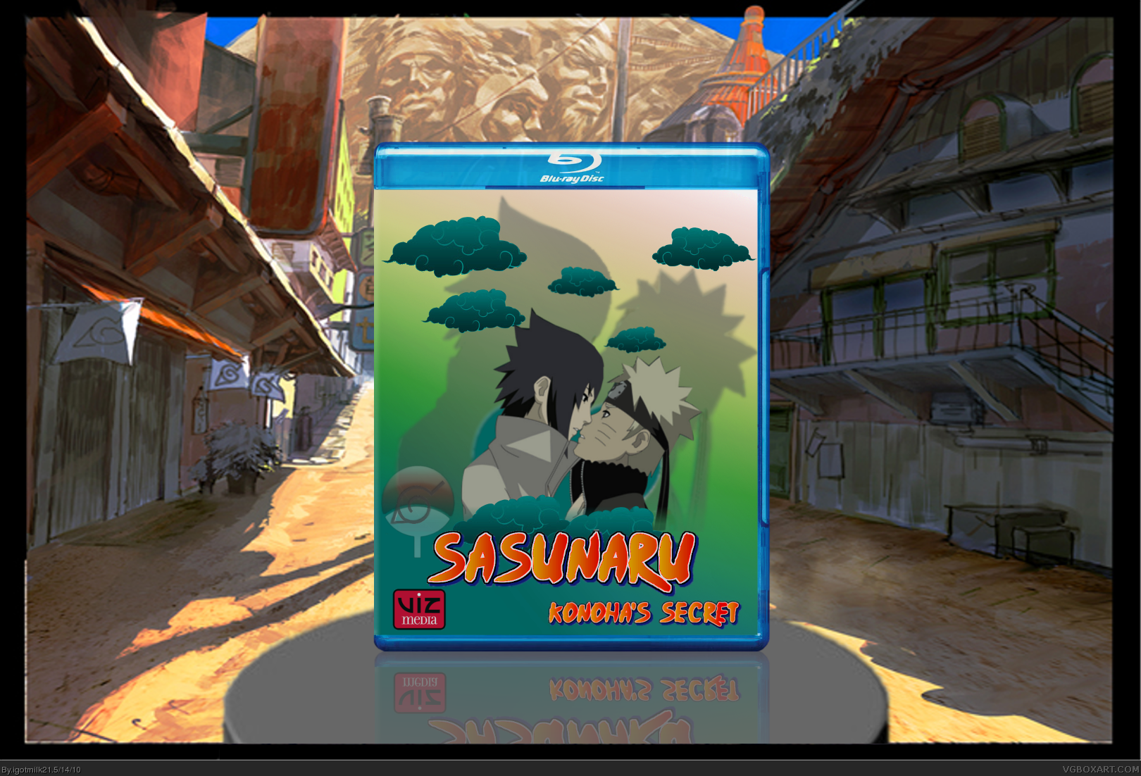
Okay, I brightened up my box in the colors in the background and the characters as per #7 and #8's suggestion. I also added a little gradient glow inside the clouds in the middle to make the background shadows make more sense. Thanks for the comments guys, good and bad.
 SasuNaru: Konoha's Secret Box Cover Comments
Okay so this is my second box. I know it doesn't look too busy but EVERYTHING you see in it is rendered and edited. This took me a week to figure out what I wanted to do and how to do it. This was a lot of hard work for me so Please comment...
Template by Spiner
Edited at 1 decade ago
[ Reply ]
I can assure you that Naruto yaoi won't fly on this site. Aside for the bad concept, the box itself has many flaws such as overuse of the naruto-font, overused cloud render and random leaf symbol thingy. Not to mention the lack of a back. If it took a "week to figure out what you wanted to do" I would love to hear your conclusion cause the result strikes me of nothing than a hastily put together mess.
[ Reply ]
Ouch. Well, at first I was going to do a humour box. Because I saw some on this site. But they didn't get a good reception so I decided to go serious instead. That's why it took me a week. Also, because I'm completely new at photo-editing, another reason it took me so long. My first box was more wallpapery. I wanted to do more than mostly copy/paste like last time. If you look at my first box, you'll see what I mean.
I thought the image itself was clean enough to post. If it's offensive I'm sorry. I saw some girl-on-girl stuff so I thought it was okay.
I agree with the overuse of the font now that you mention it.
It's nothing of a hastily put together mess I can assure you that much though. If I were an experienced artist though, I can see what you mean by that since there's not a lot happening. The more I looked at it the better the more "simple" look appealed to me.
Thanks for the critique. I have a lot to learn...
Edited at 1 decade ago
[ Reply ]
At least you know what your doing graphic wise.
[ Reply ]
Thanks #4, glad to know I'm doing something right.
[ Reply ]
WTF?
[ Reply ]
Man, some real harsh responses.
Yeah, the topic is certainly nothing I'm interested in (both on the yaoi count and the Naruto count), but that's not what this is really about.
I don't feel that there isn't anything terribly wrong with this... but nothing really right either. The composition is kinda bland, and the colors are very dull. With the colors used in the title, it makes the rest of the box look especially desaturated. Could definitely use a back as well.
That's all I really have to say.
[ Reply ]
#3, Man, I've gotta say, your great at handling criticism. *Applauds*
Lol, well though I don't like the concept, aesthetically, it doesn't look all that bad! I think the colors are a bit too dark, though. Brighten the whole thing up and it'll look better.
[ Reply ]
Okay, I brightened up my box in the colors in the background and the characters as per #7 and #8's suggestion. I also added a little gradient glow inside the clouds in the middle to make the background shadows make more sense. Thanks for the comments guys, good and bad.
Edited at 1 decade ago
[ Reply ]
:D id so buy that if it was a movie!!! *drools*
[ Reply ]