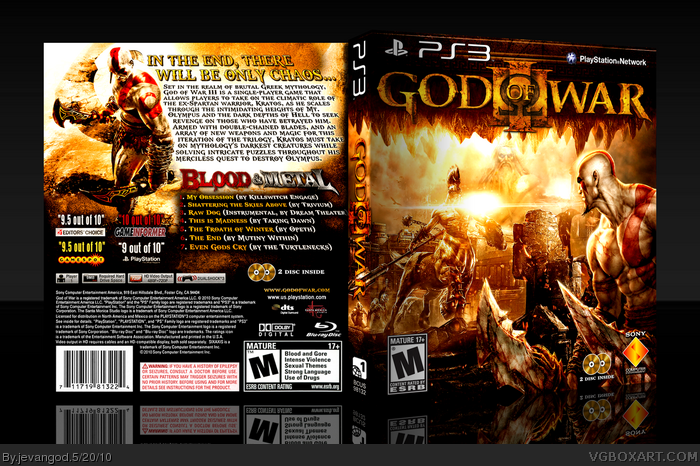
Wow. I cant believe I actually did this. I am so happy to post this. This was a on and off thing. I wanted to make a God of War III box that stood out from the rest. One that didnt have the same artwork like most of the other boxes on the site. So I looked up some GOW artwork that wasnt used on here and I used it on this box. Plus I decided to throw the Soundtrack in with the game as well. Sort of like a bonus thing. Guys im really really excited I completed it, seriously. I actually started working on this like a month ago but didnt know what to do with it.
Edit: I hope you all notice I didnt put that big black monster thing on this box. I mean alot of people have done it already and I dont want people thinking that that monster is like the main thing of the game. I just felt that the monster has been used enough on all the other GOW III boxes.
Probably only of, if not the best you've submitted. Excellent work on the front, and the bright yellow/gold colors definitely makes it stand out from most red-themed GoW3 cases.
I like the editing on the front - I can see at least four or so different source arts = bonus points. Also, I like how the CoO stalactites make it look like Tartarus (where you spend a lot of the game, for people who don't know). The whole theme and scene arrangement looks like you've took consideration. The consistent colour theme looks great, too. Nice work.
#12, Thanks. Everything you said was exactly what I did. The arrangement was a big part of it. I had no idea what I was going to start off with. Than I thought that Kratos would look good here and Zues here and so on. The color theme was something I thought would be real good for the game. Im surprised no one thought of using it earlier on this series. It seems like this would be the perfect game to use this color theme on.
not bad, but the text on the back again... that's sooooo your weak point. this time the copy text is to far on the edge of the back. you should start to work on the tracking of the text to make this stuff better - of course only if you wanna improve. nitpicking? not at all, but that's part of the box, not just the overall impression and photoshop-skills for the title.
#16, Ok. I see what your saying. Thanks for the comment. Plus I sooo hate doing text too. That is most of the time my weak point. I really struggle on that the most.
#15, Lol, I thought someone might point out where they were from but I couldn't find a good, artistic image of spartans. Anyway, this is your thread. Looking at this box again, I still like your design but I think the top of the back is a bit bright. Like #16 said I think text is a weak spot but I'm not that great with typography myself so I know how difficult it is.
You already know the cover is good, I don't need to say that.
One weird thing I noticed is that the ESRB logo on on the front looks odd because of where the shadow is placed, either that or it's levels need to be adjusted.
I seriously wish I knew how to make a decent printout because I'd put this as my cover. I mean really why isn't this in the HOF yet? This is easily as good as the rest of the GOW III boxes in there.
 God of War III Box Cover Comments
Wow. I cant believe I actually did this. I am so happy to post this. This was a on and off thing. I wanted to make a God of War III box that stood out from the rest. One that didnt have the same artwork like most of the other boxes on the site. So I looked up some GOW artwork that wasnt used on here and I used it on this box. Plus I decided to throw the Soundtrack in with the game as well. Sort of like a bonus thing. Guys im really really excited I completed it, seriously. I actually started working on this like a month ago but didnt know what to do with it.
Edit: I hope you all notice I didnt put that big black monster thing on this box. I mean alot of people have done it already and I dont want people thinking that that monster is like the main thing of the game. I just felt that the monster has been used enough on all the other GOW III boxes.
So I hope you all like it!
Edited at 1 decade ago
[ Reply ]
Looks Amazing, I love the color tone and that front is Epic.
[ Reply ]
That's lovely.
[ Reply ]
Looks great, bro.
[ Reply ]
I absolutely love how you can pump out this bad@$$ boxes on such a consistent basis. I love it! This should totally be the official.
You did succeed in making it different from other GoW3 boxes.
[ Reply ]
Probably only of, if not the best you've submitted. Excellent work on the front, and the bright yellow/gold colors definitely makes it stand out from most red-themed GoW3 cases.
[ Reply ]
very very well done.glad you completed it,fav+
[ Reply ]
very very well done.glad you completed it,fav+
[ Reply ]
very very well done.glad you completed it,fav+
[ Reply ]
Thanks everyone.
[ Reply ]
Agreed with sd1833, I think this is your best work by far. The colors and layout are incredible, and it really stands out from the rest.
[ Reply ]
I like the editing on the front - I can see at least four or so different source arts = bonus points. Also, I like how the CoO stalactites make it look like Tartarus (where you spend a lot of the game, for people who don't know). The whole theme and scene arrangement looks like you've took consideration. The consistent colour theme looks great, too. Nice work.
Edited at 1 decade ago
[ Reply ]
#12, Thanks. Everything you said was exactly what I did. The arrangement was a big part of it. I had no idea what I was going to start off with. Than I thought that Kratos would look good here and Zues here and so on. The color theme was something I thought would be real good for the game. Im surprised no one thought of using it earlier on this series. It seems like this would be the perfect game to use this color theme on.
[ Reply ]
Well this beats the holy hell out of mine. Fantastic box for a fantastic game. You always manage to find incredible artwork too.
Edited at 1 decade ago
[ Reply ]
#14, Yours is pretty good. I just wouldnt put the spartan's from the movie 300 on it. Plus having the same red color tone like everyones.
Edited at 1 decade ago
[ Reply ]
not bad, but the text on the back again... that's sooooo your weak point. this time the copy text is to far on the edge of the back. you should start to work on the tracking of the text to make this stuff better - of course only if you wanna improve. nitpicking? not at all, but that's part of the box, not just the overall impression and photoshop-skills for the title.
[ Reply ]
Is it me, or are you starting to post boxes more often?
[ Reply ]
#16, Ok. I see what your saying. Thanks for the comment. Plus I sooo hate doing text too. That is most of the time my weak point. I really struggle on that the most.
#17, Is that a bad thing or good thing?
Edited at 1 decade ago
[ Reply ]
#15, Lol, I thought someone might point out where they were from but I couldn't find a good, artistic image of spartans. Anyway, this is your thread. Looking at this box again, I still like your design but I think the top of the back is a bit bright. Like #16 said I think text is a weak spot but I'm not that great with typography myself so I know how difficult it is.
[ Reply ]
Fooking hell this shit's good.
[ Reply ]
nice job dude it looks awesome
[ Reply ]
Back's a bit text heavy, but HOLY CRAP.
[ Reply ]
Edited at 1 decade ago
[ Reply ]
HoF!!!!!!!!!!!!!!!!!!!!!!!!!!
[ Reply ]
damn bro nice box, the front really grabs my attention, 2 me the back u made it look like a movie
Edited at 1 decade ago
[ Reply ]
#24, yeah is definetely hall of fame. Amazing work
[ Reply ]
man if i knew how 2 vote this as my favorite i would but i just joined vgboxart yesterday so i dont kno much about this site yet
[ Reply ]
You already know the cover is good, I don't need to say that.
One weird thing I noticed is that the ESRB logo on on the front looks odd because of where the shadow is placed, either that or it's levels need to be adjusted.
[ Reply ]
#28, Its just the shadow from 3D thing I do. I do it on all my boxes. ;)
[ Reply ]
Printable added.
[ Reply ]
I seriously wish I knew how to make a decent printout because I'd put this as my cover. I mean really why isn't this in the HOF yet? This is easily as good as the rest of the GOW III boxes in there.
Edited at 1 decade ago
[ Reply ]
THIS SHIT NEEDS HALL OF FAME, NOW!
[ Reply ]
Hall bump :D
[ Reply ]
Awesome job. Thanks for posting printable version too.
[ Reply ]
for some reason i can't see any pictures on this site, can someone help?
[ Reply ]