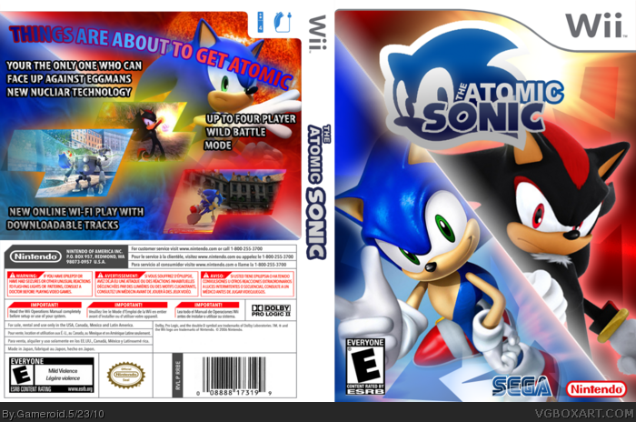
It's clear that you've got a pretty strong foundation for technical skills, it's execution that's somewhat lacking here. It really isn't bad, but the diagonal cut is definitely a negative. I think you could've "disguised" it rather than splitting the cover, you know? Maybe a tear, flames, or lightening bolt. You probably could've even just made a divider decorated to reflect Sonic and Shadow's quills. A simple line is pretty boring, though, and also just disrupts the feel of the cover.
You've got some really good points, i'll try to include some in later covers. As for the name i was just trying to be a bit original... anyway thanks for the advice :)
 The Atomic Sonic Box Cover Comments
My latest box, please be honest on your opinion as i want to improve...
[ Reply ]
It's clear that you've got a pretty strong foundation for technical skills, it's execution that's somewhat lacking here. It really isn't bad, but the diagonal cut is definitely a negative. I think you could've "disguised" it rather than splitting the cover, you know? Maybe a tear, flames, or lightening bolt. You probably could've even just made a divider decorated to reflect Sonic and Shadow's quills. A simple line is pretty boring, though, and also just disrupts the feel of the cover.
The name is also really weird.
[ Reply ]
You've got some really good points, i'll try to include some in later covers. As for the name i was just trying to be a bit original... anyway thanks for the advice :)
[ Reply ]
Lol 'nucliar'
[ Reply ]
You definitely have potential. That logo is pretty nice.
[ Reply ]