[ Box updated on August 23rd, 2006 ] [ original ]
 Tom Clancy's Rainbow Six Vegas Box Cover Comments
Comment on Lodovicok's Tom Clancy's Rainbow Six Vegas Box Art / Cover.
[ Box updated on August 23rd, 2006 ] [ original ]
Comment on Lodovicok's Tom Clancy's Rainbow Six Vegas Box Art / Cover.
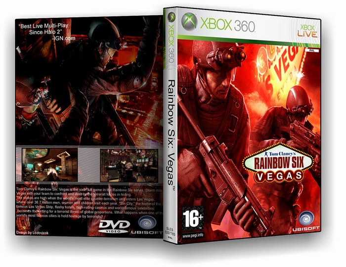
I decided to end on my bigest disapointment in box art, Rainbow Six Vegas. Well here you are, I'll be posting more in a couple of weeks or months...
enjoy and comments would be appreciated
[ Reply ]
decided to keep it 2d :p
[ Reply ]
ThatÂ’s good but you need summary not squashed up in the top left part please. It doesnÂ’t matter if its overlayed on the person but it has more balance, clearer screenshots would be nice too.
If you’re having trouble making a summary look good, use word art or get a white brush under your typing with‘opacity’ of about 40.
[ Reply ]
#3, can't you read the summary in full view...i tried to make it as clear as possible
[ Reply ]
You'r best so far .
4/5
[ Reply ]
3.5, Ok then
[ Reply ]
4.5, Nice Job.
Just Wondering How To You Make Those Lines (Which Are Behind Those Two Screenshots On The Back Cover?)
[ Reply ]
#7, if your using photoshop, it's Halftone Pattern
[ Reply ]
First thing I thought about when I download the art you use in box is that I must create a box right now! But looks like you I am too late (
Anyway, it looks great!
But I still try to made something :D
[ Reply ]
#9, thanks man
[ Reply ]