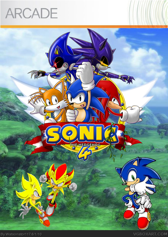
My first Xbox Live Arcade box. I'm excited for Sonic the Hedgehog 4 so I made a box for it :) I must say that I am proud about this box. Please leave comments and feedback about it and please fav if you like it.
#2 Should I get rid of super sonic, super shadow, and sonic and just leave the logo with the background? It is an Arcade game so there's usually not much detail on Xbox Live Arcade boxes.

 sonic the hedgehog 4 Box Cover Comments
My first Xbox Live Arcade box. I'm excited for Sonic the Hedgehog 4 so I made a box for it :) I must say that I am proud about this box. Please leave comments and feedback about it and please fav if you like it.
Edited at 1 decade ago
[ Reply ]
Sonic, Super Sonic and Shadow look WAYY out of place under the logo. For the logo itself I like it
[ Reply ]
#2 Should I get rid of super sonic, super shadow, and sonic and just leave the logo with the background? It is an Arcade game so there's usually not much detail on Xbox Live Arcade boxes.
Edited at 1 decade ago
[ Reply ]
Just take away the extra sonic and supers and just have the logo, but get the real one and dump the fan art and replace it with officials...:E
[ Reply ]
#4 Alright I'll do that now
[ Reply ]
#4 You were right. It looks a lot better now :)
[ Reply ]
It's still a little...empty. May I suggest some well placed renders behind sonic?
[ Reply ]
You forgot the ESRB and Sega logos.
[ Reply ]
#7 I tried that but it ended up being better without them.
#8 Arcade game box arts usually don't have ESRB or any logos but I'll add them anyway :)
[ Reply ]
Its...just a logo
[ Reply ]
#10 It's an Xbox Live Arcade box. It's simplistic on purpose for that reason. And it's not just a logo
Edited at 1 decade ago
[ Reply ]