Not bad, but Halo 3 deserve something more, something rendered :) I think that right now Halo 3 has only few screenshots, no arts at all, so making Halo 3 boxes it's not so good idea, cos your work wouldn't be top... Anyway, this one is good, I just don't like one thing:
Microsoft logo should be black!
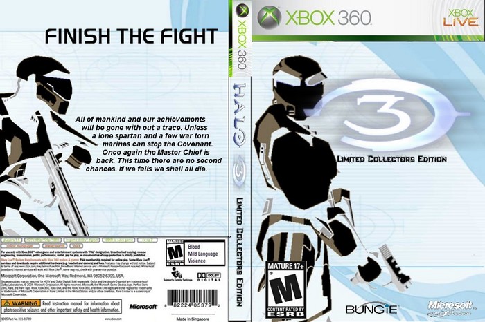
 Halo 3 Limited Collector's Edition Box Cover Comments
yet another halo 3 box by me hope you enjoy
[ Reply ]
nice dude 5/5
[ Reply ]
on the back it says:
"if we fails we shall die" 0_o
otherwise a 4/5
[ Reply ]
I like the art systle of the box . If i saw at EB games i would buy it .
4.5/5
[ Reply ]
#3, my bad gotta fix tht then
[ Reply ]
#4, y thank you
[ Reply ]
woah, useualy I get bored seeing Halo 3 Boxarts, but that one looks awesome.
[ Reply ]
that typo that bob pointed it out is hilarious it made me crack up no oofense to the box we all make mistakes. great box 4.5/5
[ Reply ]
*offense
[ Reply ]
#8, thnx treesquireel. yea it was a typ-o
[ Reply ]
Not bad, but Halo 3 deserve something more, something rendered :) I think that right now Halo 3 has only few screenshots, no arts at all, so making Halo 3 boxes it's not so good idea, cos your work wouldn't be top... Anyway, this one is good, I just don't like one thing:
Microsoft logo should be black!
[ Reply ]
no else going to comment on this or what
[ Reply ]
don't like what u did to mc, but the over all apperence is a nice change from orange clouds or desert sceens
[ Reply ]
#13, thnx
[ Reply ]
#12, Quit with those comments.
[ Reply ]
no more votes come on i worked hard on this
[ Reply ]
#15, sorry reed i wont comment like that anymore
[ Reply ]
#16, And those too. Sheesh.
[ Reply ]
#18, im sorry i apologized please forgive
[ Reply ]
It's a unique art style to say the least. I would've liked it more if you had done the 3 in the same style.
[ Reply ]
#20, yea i tried to but it turned out weird
[ Reply ]