This is probably my favorite box from the session thus far. The blue isn't overdone, and it used in a way that fits the theme of the box. The blue really stands out, and it looks great. Like Reza said, the font choice on the back fits perfectly, and I like the color too because it doesn't distract from the blue, but it still stands out. Great job on this!
I agree with everyone, this flows really well and the subtle blue colors look great.
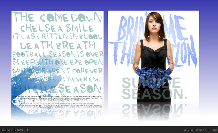
However, I don't really like the "SUICIDE SEASON." on the front. It just doesn't fit--It might look better without it. I love the creative typography on the back though.
This is awesome, man. As said, I love that you didn't make everything blue. My only issues with it are 1) The word "Horizon" is a bit hard to read. If you didn't know that's what the word was, you wouldn't be able to read it. 2) The words Suicide Season are a bit difficult to read as well, mainly where they cross over the blue of her intestines. 3) The parts of the track listings that overlap the blue area on the back are essentially impossible to read. It's a nice design overall, but when you rely so heavily on typography for your design (really nice font choices, btw) then you really need to make SURE that those fonts are readable.
Thank you everyone :D
i wasnt expecting all of this lol
@#11 its the original logo and looked the cleanest and best on the front...yes in some part it dosent fit i must agree
@#12 1. yes i agree with that but i loved how it looked so i kept it
2. also noticed. love how it looks but ill play with it
3. now that you say that i agree. but if i lessen the blueness of the hands you cant tell as much what they are.
 Bring Me The Horizon : Suicide Season Cover Comments
Well for the first session its blue
and i wanted to do a bmth ss cover
so i made it blue
original: link
[ Reply ]
I like it, everything flows well and fits in its place. I love that font on the back too. Nice one dude.
[ Reply ]
This is probably my favorite box from the session thus far. The blue isn't overdone, and it used in a way that fits the theme of the box. The blue really stands out, and it looks great. Like Reza said, the font choice on the back fits perfectly, and I like the color too because it doesn't distract from the blue, but it still stands out. Great job on this!
[ Reply ]
WE WELL NEVER SLEAP CAUZE SLEAP IS FOUR TEH WEEK.
[ Reply ]
Thanks everyone :D
@#4 WE WELL NEVERZ REST CAUZE REST IZ FOUR THEEE DAD
[ Reply ]
#5 Hey man, you leave my DAD out of this.
Exceptional work here. As others have mentioned, you really strengthened the element of blue but not having everything blue.
I love that ball of crazy, or whatever it is the girl is holding in her hands as well.
[ Reply ]
#6, it's her intestines.
Yeah...
[ Reply ]
@#7...yea...lol the idea came from the remix album they did where they mad the guts green. im like this is perfect!
[ Reply ]
She should probably see a doctor about that.
Really liking this one, one of the best session designs yet. Others have already said the subtle use of blue looks great, and I certainly agree.
[ Reply ]
This is lovely.
[ Reply ]
I agree with everyone, this flows really well and the subtle blue colors look great.
However, I don't really like the "SUICIDE SEASON." on the front. It just doesn't fit--It might look better without it. I love the creative typography on the back though.
[ Reply ]
This is awesome, man. As said, I love that you didn't make everything blue. My only issues with it are 1) The word "Horizon" is a bit hard to read. If you didn't know that's what the word was, you wouldn't be able to read it. 2) The words Suicide Season are a bit difficult to read as well, mainly where they cross over the blue of her intestines. 3) The parts of the track listings that overlap the blue area on the back are essentially impossible to read. It's a nice design overall, but when you rely so heavily on typography for your design (really nice font choices, btw) then you really need to make SURE that those fonts are readable.
[ Reply ]
Nicely done, nothing I would change personally.
[ Reply ]
SLEEP IS FOR THE WEAK!!!!!!
Chugchugchugchug
Bad band, great cover
[ Reply ]
Oh yes,awesome!
[ Reply ]
Thank you everyone :D
i wasnt expecting all of this lol
@#11 its the original logo and looked the cleanest and best on the front...yes in some part it dosent fit i must agree
@#12 1. yes i agree with that but i loved how it looked so i kept it
2. also noticed. love how it looks but ill play with it
3. now that you say that i agree. but if i lessen the blueness of the hands you cant tell as much what they are.
[ Reply ]