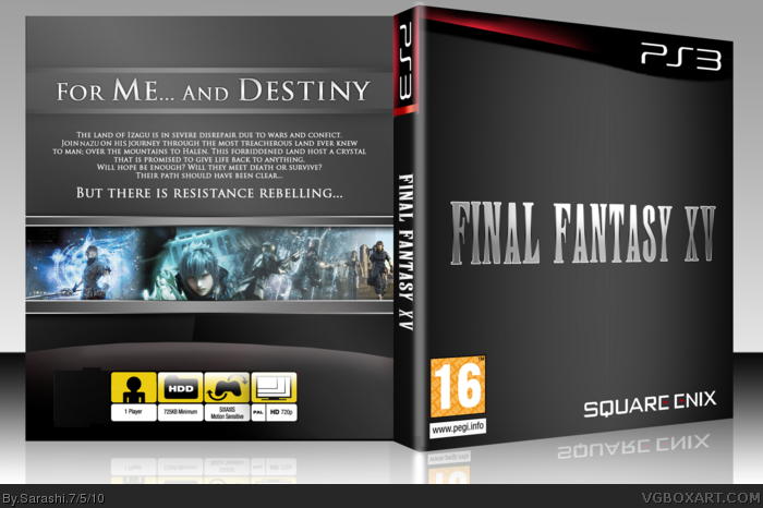
In the tag I used limited. And by limited, I mean nothing to work from apart from a name. On the front, well what can I say. Its simple, but it works. I really focused on the layer effects on the back. I tried to create a more user friendly one than one that is all over the place.
Again, I was urged to make this by a friend, so it's not really official.
I loved this until I viewed in full. Then I realized how choppy everything was. The idea is great, but here are some things that need to be cleaned up
1. Random grey thing to the left of the "1 Player" box.
2. Random red thing at the top-right of the 720p box.
3. There are a few odd squares in the bottom of the glare.
4. Little bit of glare residue under the PS3 logo on the spine.
5. The template is choppy on the front of the box. Really noticeable arond the curve.
#2 Already mentioned the small stuff that needs cleaned up. Other than that, it's a simple yet sleek design, looks pretty stylish to me especially the template. Overall it's nice, I don't see why you couldn't have just made this Versus XIII, seeing that all the screenshots are from it anyway.
One last thing, this always bugs me about Final Fantasy cases. People make the logos with the FF font, but then don't adjust them afterwards so that all the letters are at an equal height. The V needs to be shorter.
 Final Fantasy XV Box Cover Comments
In the tag I used limited. And by limited, I mean nothing to work from apart from a name. On the front, well what can I say. Its simple, but it works. I really focused on the layer effects on the back. I tried to create a more user friendly one than one that is all over the place.
Again, I was urged to make this by a friend, so it's not really official.
BIG NOTE: JUST A SLIPCOVER
Edited at 1 decade ago
[ Reply ]
I loved this until I viewed in full. Then I realized how choppy everything was. The idea is great, but here are some things that need to be cleaned up
1. Random grey thing to the left of the "1 Player" box.
2. Random red thing at the top-right of the 720p box.
3. There are a few odd squares in the bottom of the glare.
4. Little bit of glare residue under the PS3 logo on the spine.
5. The template is choppy on the front of the box. Really noticeable arond the curve.
Clean it up and I'll fav
Edited at 1 decade ago
[ Reply ]
#2 Already mentioned the small stuff that needs cleaned up. Other than that, it's a simple yet sleek design, looks pretty stylish to me especially the template. Overall it's nice, I don't see why you couldn't have just made this Versus XIII, seeing that all the screenshots are from it anyway.
One last thing, this always bugs me about Final Fantasy cases. People make the logos with the FF font, but then don't adjust them afterwards so that all the letters are at an equal height. The V needs to be shorter.
Edited at 1 decade ago
[ Reply ]