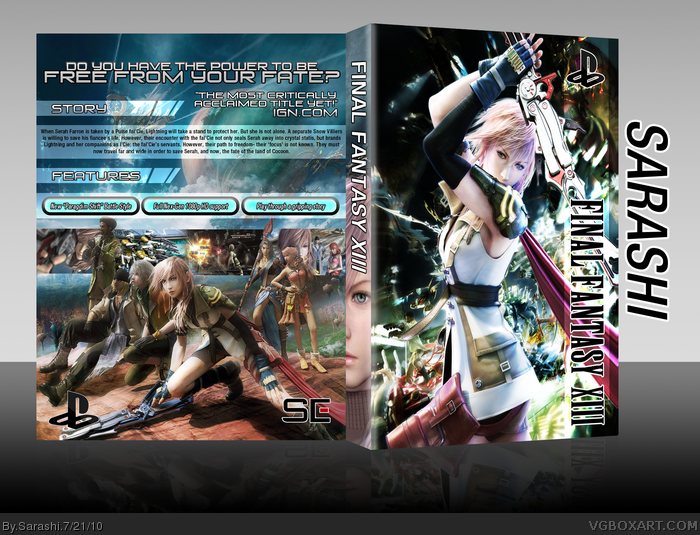
Well I guess first I should credit aelixus for the excellent idea for the template, or in this case (No pun intended), the slip cover.
The front's concept is the Paradgim Shift pose of Lightning. The back's idea is the game's in-battle HUD.
I want to add this to my favorites so bad, but there are things that need fixing up:
The front is near flawless in my eyes, the only real issue I have with it is the PEGI, Square Enix logo and possibly the Playstation logo. If this is to be in the style of a slip cover, I wouldn't say the developer and rating logos are necessarily needed, and overall would make the right side of the design less cluttered.
As for the back, I love the game HUD style you used for the synopsis and tagline. Two thing stand out to me that need addressed: 1) Lightning, Hope, Fang and Vanille need to be rendered out a bit better, their hair (I know it's shitting hard to render) is rather blurred and doesn't look right. And 2) The back as a whole lacks the bright, vibrant colors of the front which I think look excellent.
If you were to take this advice the final result should be fantastic.
Edit: I would also consider reducing/remove the white stroke around the developer logos.
#2, Boy, I was counting the seconds until you posted =D You must have some sensors to tell you when there's a FFXIII box you've not seen.
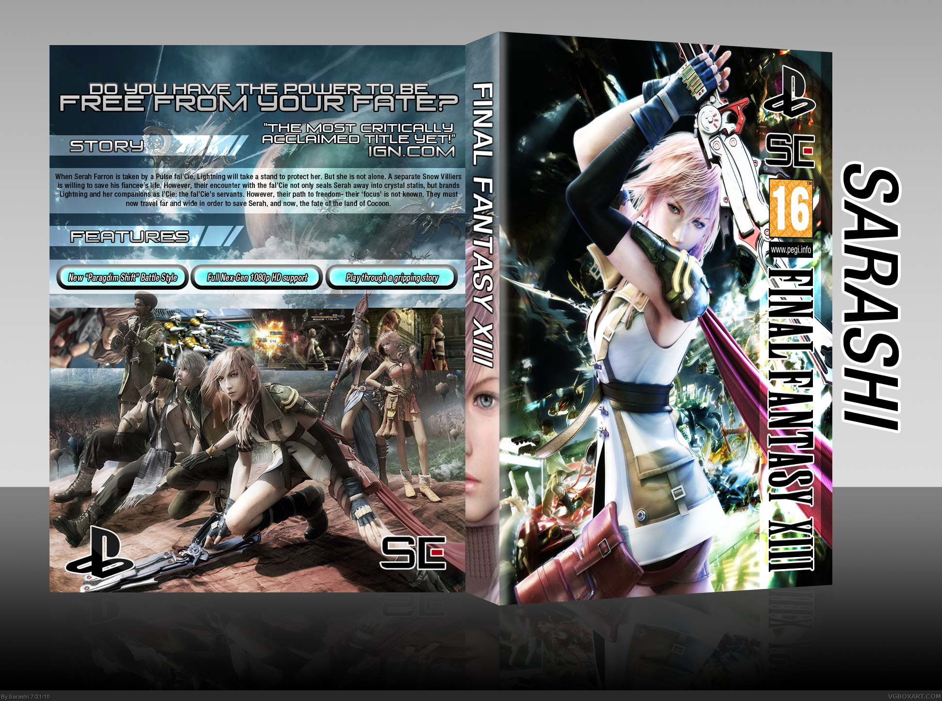
I will be changing right now.
#5, Same. On the day I bought it with the new 360S (Last Saturday) I actually couldn't stop playing it until about 3/4 hours after I started. Updated the box now.
#7, Thank you. I understand that, as I had to use the brush and polygonal lasso, so it'd be a bit blocky
#9, The front's due to the skewing on the front.
I will be removing the Squeenix logo from the back, and to be honest, I really can't do anything about the Blazefire Saber being used twice.
 Final Fantasy XIII Box Cover Comments
Well I guess first I should credit aelixus for the excellent idea for the template, or in this case (No pun intended), the slip cover.
The front's concept is the Paradgim Shift pose of Lightning. The back's idea is the game's in-battle HUD.
[ Reply ]
*obligatory post by me*
I want to add this to my favorites so bad, but there are things that need fixing up:
The front is near flawless in my eyes, the only real issue I have with it is the PEGI, Square Enix logo and possibly the Playstation logo. If this is to be in the style of a slip cover, I wouldn't say the developer and rating logos are necessarily needed, and overall would make the right side of the design less cluttered.
As for the back, I love the game HUD style you used for the synopsis and tagline. Two thing stand out to me that need addressed: 1) Lightning, Hope, Fang and Vanille need to be rendered out a bit better, their hair (I know it's shitting hard to render) is rather blurred and doesn't look right. And 2) The back as a whole lacks the bright, vibrant colors of the front which I think look excellent.
If you were to take this advice the final result should be fantastic.
Edit: I would also consider reducing/remove the white stroke around the developer logos.
Edited at 1 decade ago
[ Reply ]
#2, Boy, I was counting the seconds until you posted =D You must have some sensors to tell you when there's a FFXIII box you've not seen.
I will be changing right now.
[ Reply ]
This is wicked :) what's the cool font called at the top of the back bit?
[ Reply ]
#3, Yeah it's a bit sad when you think about it, I'm that big a fan of the game I guess.
[ Reply ]
#5, Same. On the day I bought it with the new 360S (Last Saturday) I actually couldn't stop playing it until about 3/4 hours after I started. Updated the box now.
[ Reply ]
#6, I know how it is. I shut myself off from the outside world until I completed the game.
Update is better, Lightning and Vanille's hair still looks kind of wonky but I have to add this to my favorites. I just love that front.
[ Reply ]
Damn, the colours are great on the front and i'm with sd1833 regarding th HUD styling on the back, looks great.
If my author favs didn't go to sarahtaylor, i'd give you one in an instant! Great work!!
[ Reply ]
A good cover, besides somethings.
The presentation looks off, the front is a lot smaller than the back.
The back is very good besides that Square-Enix logo that doesn't fit there in my opinion.
The front works well, but it looks like you added a render of Lightning to a FFXIII poster, and I can see Lightning's blade behind the big Lightning.
[ Reply ]
Loving this, especially the front.
[ Reply ]
#7, Thank you. I understand that, as I had to use the brush and polygonal lasso, so it'd be a bit blocky
#9, The front's due to the skewing on the front.
I will be removing the Squeenix logo from the back, and to be honest, I really can't do anything about the Blazefire Saber being used twice.
[ Reply ]
Very,very nice.
[ Reply ]