Mine wasn't the first reply to an Other M box? I must be getting slow. Nice job with this, but a few things:
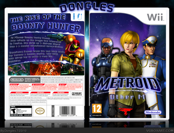
It's a fine design, a bit basic but it works. For the front, I'd consider adding something to the top half, a planet or two maybe (generic, I know). And for the characters themselves, some lighting adjustments, and a subtle blue/purple hue could make them fit in with the background better. And seeing that the background here is an image of space, having shadows behind the character's doesn't make a lot of sense, I'd consider removing them or changing it to more of a glow.
The back, again is a bit basic but nothing especially wrong with it. Like the front a subtle color/light adjustment to Samus would be for the best, as well as blending the screenshots better, similar to what Jevangod did in his design: link
What's this E3 Resource?
Nice work here. The design Is solid, and the artwork is really high res. The only things that bug me are the choppy Team Ninja logo, and the blue Nintendo logo. You also have a PEGI rating on the front, and an ESRB rating on the back. Overall, though, you did I really nice job.
 Metroid: Other M Box Cover Comments
I have very High Hopes for this box.
SO my last box I feel was rather a let down :[
Credit:
Renders: E3 Resource
Template: Jevangod
Logo: Stevencho
Other Logos: ADFD Resources
Got some high hopes ^_^
View in full x
Edited at 1 decade ago
[ Reply ]
Front design seems bit basic but its very good! Typechoice on back may not be the best but overall design layout etc. is great :)
[ Reply ]
#2, Thanks!
[ Reply ]
Mine wasn't the first reply to an Other M box? I must be getting slow. Nice job with this, but a few things:
It's a fine design, a bit basic but it works. For the front, I'd consider adding something to the top half, a planet or two maybe (generic, I know). And for the characters themselves, some lighting adjustments, and a subtle blue/purple hue could make them fit in with the background better. And seeing that the background here is an image of space, having shadows behind the character's doesn't make a lot of sense, I'd consider removing them or changing it to more of a glow.
The back, again is a bit basic but nothing especially wrong with it. Like the front a subtle color/light adjustment to Samus would be for the best, as well as blending the screenshots better, similar to what Jevangod did in his design: link
[ Reply ]
#4, Okay will fix that!
[ Reply ]
What's this E3 Resource?
Nice work here. The design Is solid, and the artwork is really high res. The only things that bug me are the choppy Team Ninja logo, and the blue Nintendo logo. You also have a PEGI rating on the front, and an ESRB rating on the back. Overall, though, you did I really nice job.
[ Reply ]
I agree with #4 pretty much. I think you've laid out a solid design, but it could use some more punch here and there. Keep at it man!
[ Reply ]