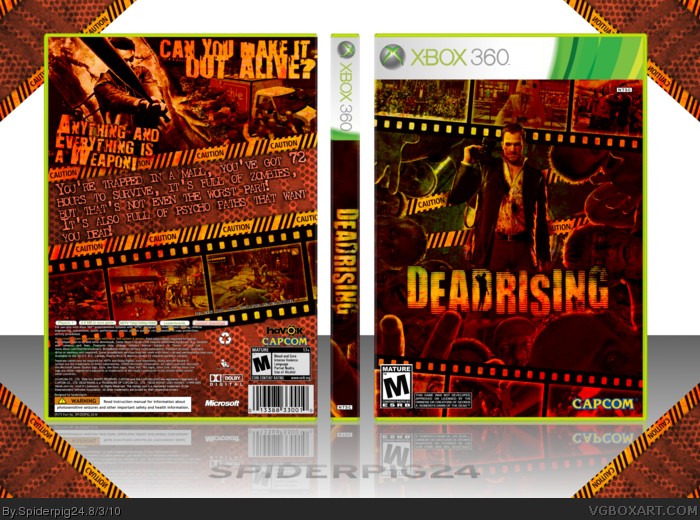
So here is my newest box! Thanks to everyone in the critiques forum for their help on this, Pan, sd1833, beardedwalrus, Roarshark, and Felipe. Please view this in full. I will have a printable version up shortly, even with the correct barcode for the game =P
Credit to AllDreamsFallDown for the plastic part of the template. Comments are appreciated!
Good work on the front, I see no flaws and have to say I really do like the strong red colors.
I like that you continued the film strips onto the back, though I may actually be having second thoughts on that white text. It does make it easier to read, but also stands out a bit too much, seeing that it's the only white on the entire design. And that splattered font still looks so blurry, it's distracting.
So basically: front is great, back could be great but some text issues are holding it back.
#2, Thank you very much for that! I will try to fix the text and update it tomorrow.
#4, The PNG version is 14MB so I didn't really have a choice unless I resize it to 50%. I did lose quite a bit of quality so I will resize it and save as PNG.
I really like the design and layout, great job on that. I do feel that the overlay on the entire box is a little overpowering and I think it would look better if some parts like the screens and the main render wasn't overlayed (at least as much). Still very worth a fav though!
#8, Thanks! It is a little overpowering, it's just kind of a like it or you don't thing. I tried to lower the opacity of it in some places, like on the screenshots and main render on the front, but it didn't look quite right.
 Dead Rising Box Cover Comments
So here is my newest box! Thanks to everyone in the critiques forum for their help on this, Pan, sd1833, beardedwalrus, Roarshark, and Felipe. Please view this in full. I will have a printable version up shortly, even with the correct barcode for the game =P
Credit to AllDreamsFallDown for the plastic part of the template. Comments are appreciated!
[ Reply ]
Good work on the front, I see no flaws and have to say I really do like the strong red colors.
I like that you continued the film strips onto the back, though I may actually be having second thoughts on that white text. It does make it easier to read, but also stands out a bit too much, seeing that it's the only white on the entire design. And that splattered font still looks so blurry, it's distracting.
So basically: front is great, back could be great but some text issues are holding it back.
[ Reply ]
#2, This. Couldn't have said it any better
[ Reply ]
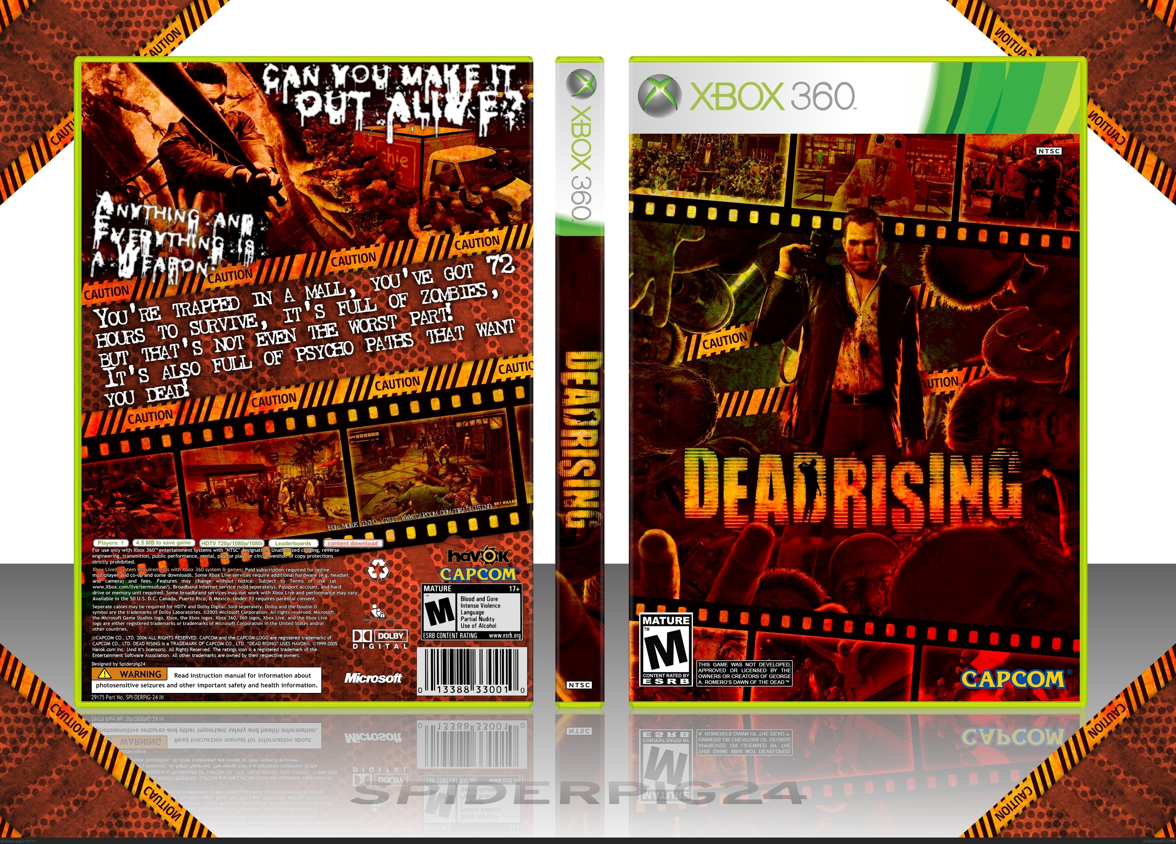
#2, I agree. The overall image looks to be a bit low in quality, what did you save it as?
EDIT: Yupp, it's a JPEG. Can you try saving it as a PNG? It would compliment this great box even more.
Edited at 1 decade ago
[ Reply ]
#4, According to the full view it's jpeg.
[ Reply ]
Thanks for the comments and favorites.
#2, Thank you very much for that! I will try to fix the text and update it tomorrow.
#4, The PNG version is 14MB so I didn't really have a choice unless I resize it to 50%. I did lose quite a bit of quality so I will resize it and save as PNG.
[ Reply ]
Update!
I fixed the font of both the taglines and text on the back, resized and changed to PNG. For the highest resolution, please view the printable version.
Edit: Sorry for double post :/
Edited at 1 decade ago
[ Reply ]
I really like the design and layout, great job on that. I do feel that the overlay on the entire box is a little overpowering and I think it would look better if some parts like the screens and the main render wasn't overlayed (at least as much). Still very worth a fav though!
[ Reply ]
#8, Thanks! It is a little overpowering, it's just kind of a like it or you don't thing. I tried to lower the opacity of it in some places, like on the screenshots and main render on the front, but it didn't look quite right.
[ Reply ]
WOW!
[ Reply ]
Oh My God This is AMAZING , AMAZING
[ Reply ]