#9 It is a damn shame.I can understand when people don't comment on crappy boxes.Cause you're not always in the mood pointing out the problems on a box that could be easier to start from scratch than fixing it.
But this,I can't.It is really frustrating.
#10, Funny thing is that some of the crappy boxes get more attention (comments wise) that good/higher quality boxes.
I really put a lot of effort and time into this, and printable version shows it all. I wish more people view it and realize how much though was put into this.
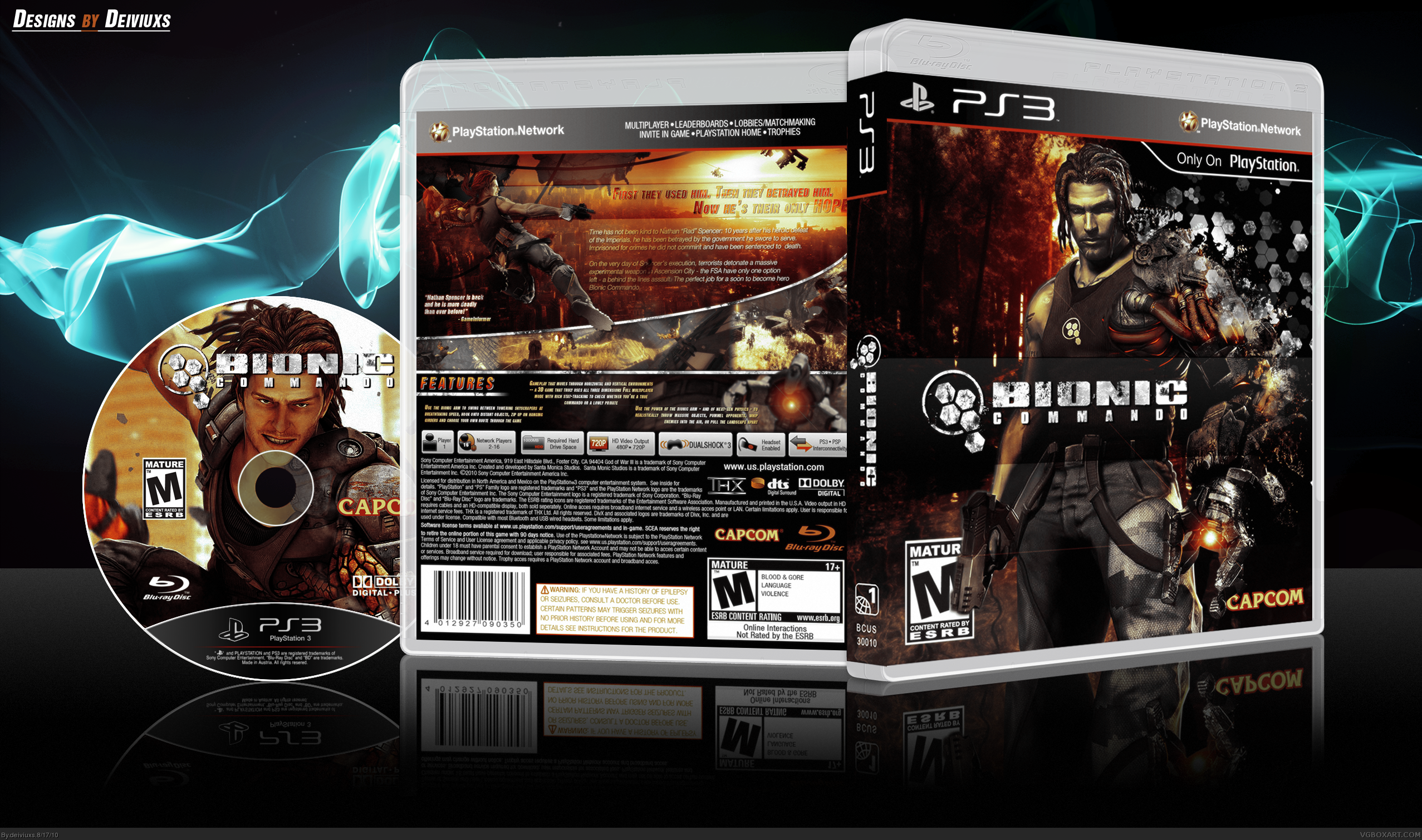
This is mighty impressive. Nice use of splatters and hexagonal patterns on the front, as well as the overall color scheme. The guy's skin is kind of weirding me out, but it's no big deal.
The back looks excellent, professional yet stylish too, which most official cases tend to lack. I only wish the text was easier to read.
Wow, I never noticed this box (maybe because it's almost a year old)
but this is extremely well done! I love everything about it, the front, the back and the disc print.
If there was a bigger heart fave I would definitely use it on this box lol
 Bionic Commando Box Cover Comments
View printable for hi-res.
[ Reply ]
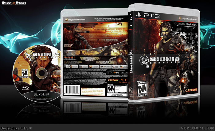
It's perfect, except that it's really bugging me that the guy is over the M rating logo. Fix that.
[ Reply ]
The features text is too small if you ask me.
Other than that it is Great.Front and back.
[ Reply ]
I agree wit 2 but you still get a 5/5
[ Reply ]
Sexy. But the M logo should be over the render. Faved.
[ Reply ]
Updated: placed the "M" logo above the render.
[ Reply ]
LoNg TiMe No SeE
Cool Box though.
[ Reply ]
Wow, I love this box. Deserves much more attention.
[ Reply ]
#8, Thanks, I wish more people would think the same way you do.
[ Reply ]
#9 It is a damn shame.I can understand when people don't comment on crappy boxes.Cause you're not always in the mood pointing out the problems on a box that could be easier to start from scratch than fixing it.
But this,I can't.It is really frustrating.
[ Reply ]
I think I just had an eyegasm
[ Reply ]
#10, Funny thing is that some of the crappy boxes get more attention (comments wise) that good/higher quality boxes.
I really put a lot of effort and time into this, and printable version shows it all. I wish more people view it and realize how much though was put into this.
[ Reply ]
This is mighty impressive. Nice use of splatters and hexagonal patterns on the front, as well as the overall color scheme. The guy's skin is kind of weirding me out, but it's no big deal.
The back looks excellent, professional yet stylish too, which most official cases tend to lack. I only wish the text was easier to read.
[ Reply ]
#13, I can read text perfectly. Did you look at the printable, because the 3D version decreases the quality and thus makes text harder to read.
[ Reply ]
#14, Ah I'm an idiot, I didn't even notice the printable version. The quality is much better there, great job.
[ Reply ]
Wonderful job, faved.
[ Reply ]
Wow, I never noticed this box (maybe because it's almost a year old)
but this is extremely well done! I love everything about it, the front, the back and the disc print.
If there was a bigger heart fave I would definitely use it on this box lol
again very nice job, one of your best imo.
Edited at 1 decade ago
[ Reply ]
#17, Thanks man! It's always better to get a comment/fav later than never.
Oh, and I don't know if anyone notice this, but the city background on the back is actually from the game Prototype. :)
[ Reply ]
Great. Spencer on the front could use some better rendering. The area between his left arm and hip isn't cut out at all.
[ Reply ]
Xbox 360 version? :Q___
[ Reply ]