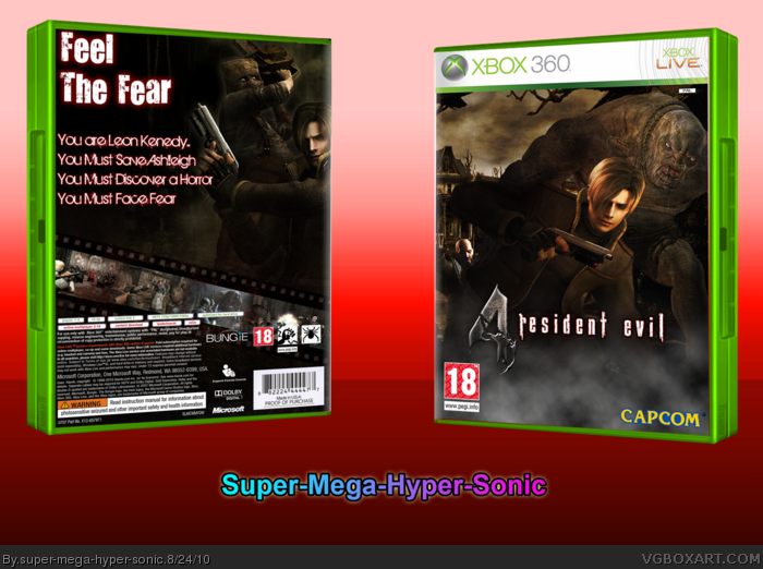
The front isn't bad, it could use some color adjustments. It doesn't make any sense for the fog/smoke towards the bottom to be grey with everything around it having a sepia tone. I'd also try upping the saturation on Leon's surroundings, it all looks a bit dull compared to him.
The back needs work. Having the horizontal text over top the slanted screenshots looks tacky and unprofessional. You need to fill up the synopsis a bit and either straighten out the screenshots or have the text aligned with them.
 Resident Evil 4 Box Cover Comments
Cred to Ninty for the Temp
---------------------------------
First Resi Box in a while. Excuse the 3-D, it's my first time skewing to 3-D, I'll redo if necessary.
[ Reply ]
No offence, but please comment.
[ Reply ]
Not feeling this, sorry.
[ Reply ]
The back looks unfinished.
[ Reply ]
#4, It's Just simple
[ Reply ]
Sepia looks nice, but the back is a bit basic.
[ Reply ]
The front is very good but the thing that needs the most work is the text on the back. I do like the screenshots though.
[ Reply ]
Eh... I'm not liking this one.
[ Reply ]
I like the front more than the back.
[ Reply ]
The front is good, but the back could use some more work.
[ Reply ]
Nowhere near your capabilities.
[ Reply ]
Front is too plain.
[ Reply ]
The front isn't bad, it could use some color adjustments. It doesn't make any sense for the fog/smoke towards the bottom to be grey with everything around it having a sepia tone. I'd also try upping the saturation on Leon's surroundings, it all looks a bit dull compared to him.
The back needs work. Having the horizontal text over top the slanted screenshots looks tacky and unprofessional. You need to fill up the synopsis a bit and either straighten out the screenshots or have the text aligned with them.
[ Reply ]
when can i download your art
[ Reply ]
Do you mean you want a printable?
[ Reply ]