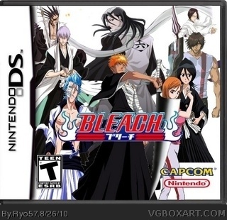
Ok here is my third box I made this one from Scratch I picked the white background because it seems like it belongs to the box I am very sorry if the box is low quality up close (if it is)I will take advice to get better so thank you for viewing my new Box and enjoy.
Watsonator's right. There's a lot of white outlines around your renders. Also, like he mentioned, Rukia is cut off abruptly. Either try and edit it so she isn't like that, move her down, or find a different render. Also, there is a strange brown mark to the right of Zaraki.
Lastly, you don't need the Nintendo logo on the corner, and Sega is the publisher for Bleach games, not Capcom.
The character choice and layout isn't bad, but this could use some nice blending and effects. An idea for the background would be a scene from somewhere in the Seireitei, since this is based in the Save Rukia arc.
Well, I'm a huge bleach fan so prepare yourself for my nerdyness.
Plain white background is lame.
Zangetsu is covering Orihime.
Renders are choppy and all are different colors.
renders are smashed and stretched.
Logo is choppy.
(Prepare for nerdyness)
How come Gin and Grimmjow are on the box and chad has his first arm, in the arrancar part of the story chad learns about his defense arm, why does he only have his first?
 Bleach Box Cover Comments
Ok here is my third box I made this one from Scratch I picked the white background because it seems like it belongs to the box I am very sorry if the box is low quality up close (if it is)I will take advice to get better so thank you for viewing my new Box and enjoy.
[ Reply ]
The renders are badly cut out. Also, the girl on the right is cut off half way. You also need to add a background
[ Reply ]
Really I didn't think the renders were bad
[ Reply ]
You can see the cutout lines around them
[ Reply ]
Watsonator's right. There's a lot of white outlines around your renders. Also, like he mentioned, Rukia is cut off abruptly. Either try and edit it so she isn't like that, move her down, or find a different render. Also, there is a strange brown mark to the right of Zaraki.
Lastly, you don't need the Nintendo logo on the corner, and Sega is the publisher for Bleach games, not Capcom.
The character choice and layout isn't bad, but this could use some nice blending and effects. An idea for the background would be a scene from somewhere in the Seireitei, since this is based in the Save Rukia arc.
I hope these crits are helpful.
[ Reply ]
#5, Yes they helped,thank you.
[ Reply ]
Well, I'm a huge bleach fan so prepare yourself for my nerdyness.
Plain white background is lame.
Zangetsu is covering Orihime.
Renders are choppy and all are different colors.
renders are smashed and stretched.
Logo is choppy.
(Prepare for nerdyness)
How come Gin and Grimmjow are on the box and chad has his first arm, in the arrancar part of the story chad learns about his defense arm, why does he only have his first?
Oh and Rukia is cut at the knees...
[ Reply ]