I like the tone of the box, but the background of the back is not well chosen. You see hair of two guys which seems a little bit odd. The text is very hard to read as mentioned above.
As #8 said the saturated colors work really well. The text/PS3 logo/PSN name would've been better in black so they're easier to see, other than that nice work.
 Mafia II Box Cover Comments
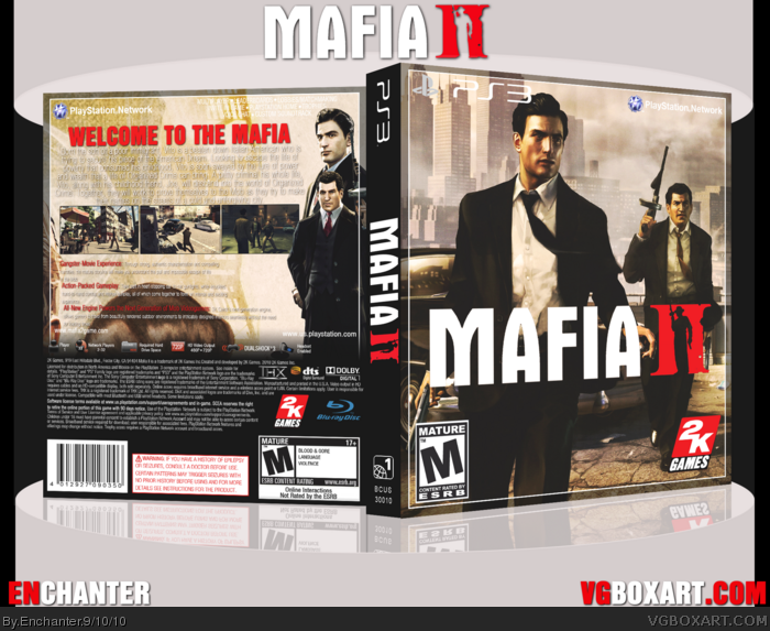
Well, after playing this game, I was inspired to make a cover for it, et voila!
I went with a retro movie look and i think it turned out pretty great. It took some time to finish this one and I'm happy I did.
Credit goes to:
-ScorpionSoldier for the template
-PlanetRenders for resources
And that's it. View in full and comment/critique away!
[ Reply ]
Awesome job dude! The front and the back both look great :) fav+
[ Reply ]
Looks great, you should turn the text to black though. It's pretty unreadable.
[ Reply ]
Try inverting the text colors.It might work out better..
[ Reply ]
This one is pretty cool bro, the front is just a wallpaper, but I like of the back.
[ Reply ]
i really like it. Only thing I would suggest is to turn the text used for the description to black.
[ Reply ]
backs kinda hard to read, but other than that. pretty good.
[ Reply ]
The saturated colors of the boxart does really well to give it a classic movie vibe to it.
[ Reply ]
I like the tone of the box, but the background of the back is not well chosen. You see hair of two guys which seems a little bit odd. The text is very hard to read as mentioned above.
[ Reply ]
As #8 said the saturated colors work really well. The text/PS3 logo/PSN name would've been better in black so they're easier to see, other than that nice work.
[ Reply ]
Make the text on the back a dark grey, and kick the drop shadow.
[ Reply ]