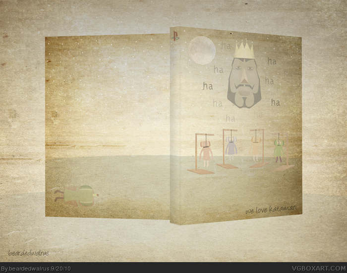
Well this was supposed to be for the Summer Comp, but since Ayron ended it (apparently 7+ entries wasn't enough?) I am posting it now. Theme was opposites so this is a random idea I got for Katamari. Enjoy.
This looks very original and I like how you colored it. Just one thing, it'd have been better if the presentation's BG was a bit darker so the box stand out more.
having played the game, i understand it. It deals with a lightheartedly presented, but underlying theme, almost as if it were an essence cover. Very nice work.
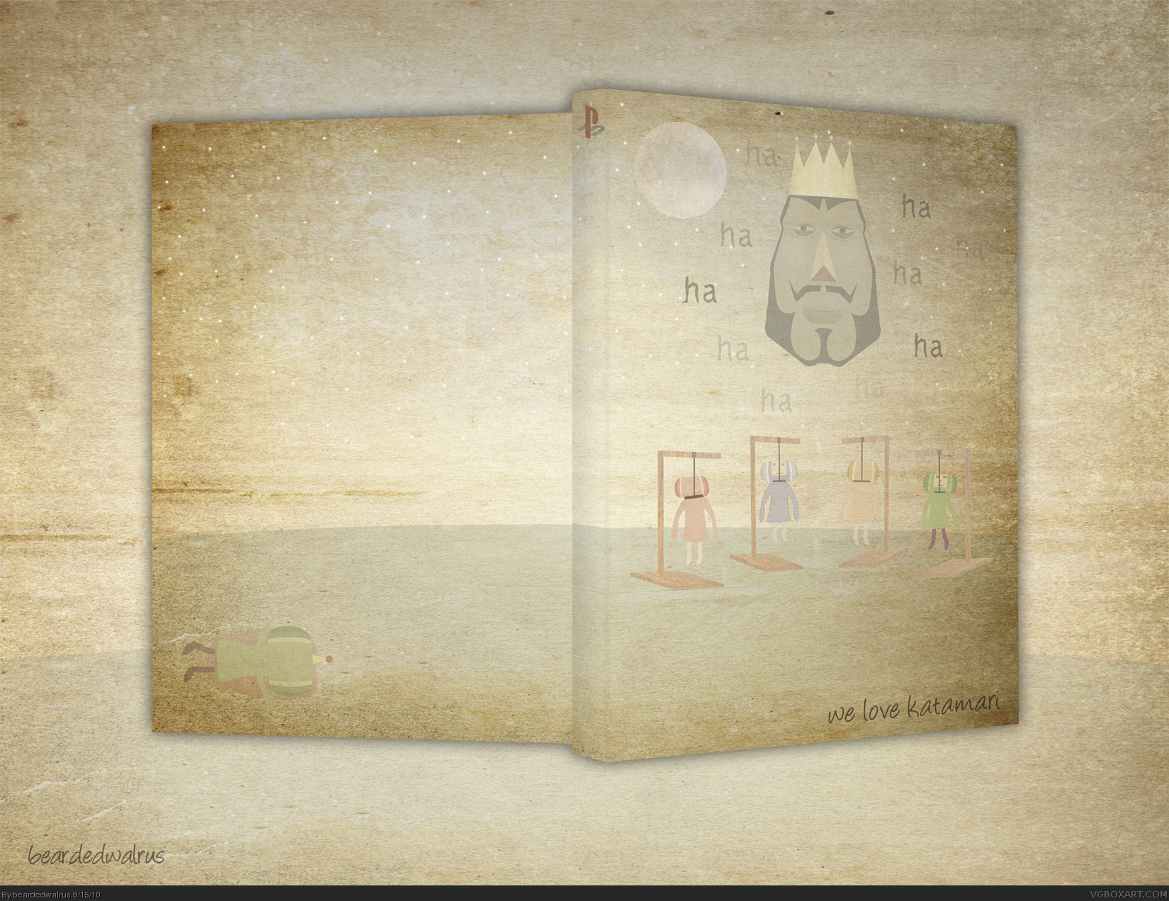
Updated with a new presentation. Darkening the BG actually made it stand out less, but lightening the it and removing the shadow made it look better. Printable added, but I had to compress it to a level 12 jpeg.
#17, I intended to have more going on in the back, but it felt complete with the corpse. With a box like this that is trying to be eerie and disturbing, screenshots and back text would completely kill it.
 We Love Katamari Box Cover Comments
Well this was supposed to be for the Summer Comp, but since Ayron ended it (apparently 7+ entries wasn't enough?) I am posting it now. Theme was opposites so this is a random idea I got for Katamari. Enjoy.
[ Reply ]
Oh yeah and inb4notcolorfulenough
It's supposed to be the opposite of the colorful Katamari boxes.
[ Reply ]
This looks very original and I like how you colored it. Just one thing, it'd have been better if the presentation's BG was a bit darker so the box stand out more.
[ Reply ]
What a strange yet oddly attractive design. I really like the subtle colors in this one man.
[ Reply ]
I like the minimalism in this image, and the colors are subtle, yet attractive. Good job designing this.
[ Reply ]
#3 That
[ Reply ]
Thanks guys! I will work on the presentation when I can find the time.
@sd1833, that's exactly what I was going for.
[ Reply ]
having played the game, i understand it. It deals with a lightheartedly presented, but underlying theme, almost as if it were an essence cover. Very nice work.
[ Reply ]
Updated with a new presentation. Darkening the BG actually made it stand out less, but lightening the it and removing the shadow made it look better. Printable added, but I had to compress it to a level 12 jpeg.
[ Reply ]
I was going to fav , until i was hung....
Still pretty neet
[ Reply ]
Wait, this is grade A creepypasta shiz.*WRITES*
[ Reply ]
#11, Funny you should say that, cause the inspiration for this came from the creepy shit thread.
[ Reply ]
#12, Good to know I am inspiring people. :P
[ Reply ]
This is really unique, and it's really good too.
[ Reply ]
I'm sorry but, what? If i knew people praised minimalism like this, I wouldn't make backs! It's just like what?
[ Reply ]
Me likey.
[ Reply ]
Sorry I acted like a dingus, I just don't like how the back is empty.
[ Reply ]
#17, I intended to have more going on in the back, but it felt complete with the corpse. With a box like this that is trying to be eerie and disturbing, screenshots and back text would completely kill it.
[ Reply ]
#18, Yeah I feel you, but at least some text... but that's what's great about art, it's up to the artist. So please don't heed my words lol
[ Reply ]
Cool.
[ Reply ]