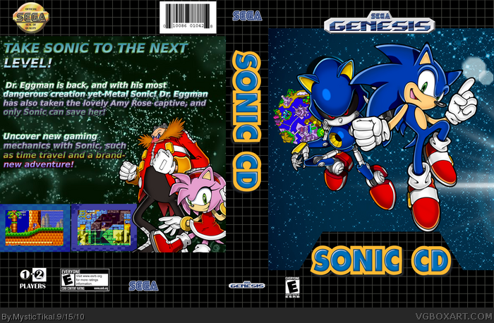
You've done a good job on arranging the images together on this, but the front looks pretty sparse with detail.
The text in the back excluding the tagline should have less gradient so it can be easier to read. In a designer's perspective, the body text should be smaller than the tagline.
It's not bad, but with a little attention to detail, it could definitely be better.
 Sonic CD Box Cover Comments
Credit:
Renders: Sonic Retro
Borders: stevencho
Backgrounds: Sonic Style
Template: Eggboy'13
[ Reply ]
Sorry, not the best box in the world.
The front is just renders slapped on a background and so is the back.
By the way, how did you make that text?
[ Reply ]
GIMP-Glossy
[ Reply ]
It's pretty good, but the Genesis?
[ Reply ]
#4, I don't know, its a good template..:P
[ Reply ]
You've done a good job on arranging the images together on this, but the front looks pretty sparse with detail.
The text in the back excluding the tagline should have less gradient so it can be easier to read. In a designer's perspective, the body text should be smaller than the tagline.
It's not bad, but with a little attention to detail, it could definitely be better.
[ Reply ]
#4, why not? its one of those classic consolesmthat sold big
[ Reply ]