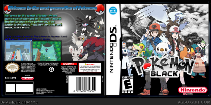
The back kind of feels unfinished - Lots of empty space and the ESRB isn't even filled it.
The front is kind of crowded with a pretty boring background. Maybe add in a better background and take away some characters, then move the starters around?
This fits the game very well, not perfectly, but well. I think it looks better than the real box (I have the game), becuase the real box is too simple. I like how you added you (Trainer, boy/ girl), gym leaders, and starter pokemon.
 Pokemon Black Version Box Cover Comments
A new box thats been in development for a while now.
Credit:
YoshiStar-Logo
Bulbapedia-Renders, Screenshots
deiviuxs-Borders
[ Reply ]
The back kind of feels unfinished - Lots of empty space and the ESRB isn't even filled it.
The front is kind of crowded with a pretty boring background. Maybe add in a better background and take away some characters, then move the starters around?
[ Reply ]
#2, Thanks-maybe some suggestions for the background on the front?
[ Reply ]
it looks really good but ive got to say the background could at least use an extra pokemon or two. but still for me its worth a fav
[ Reply ]
I agree with #4. cool but I would change a few things (E.g starters are sitting on logo)
[ Reply ]
If it's the black version shouldn't the other legendary black pokemon be in the black instead of the white one? Besides that good job on the box!
[ Reply ]
#6, No, Reshiram is the correct mascot.
[ Reply ]
#7, Oh, didn't know that.
[ Reply ]
This fits the game very well, not perfectly, but well. I think it looks better than the real box (I have the game), becuase the real box is too simple. I like how you added you (Trainer, boy/ girl), gym leaders, and starter pokemon.
[ Reply ]
#6, It should be like that, but that's not how Nintendo decides to do it. Also, how do you change your icon?
[ Reply ]