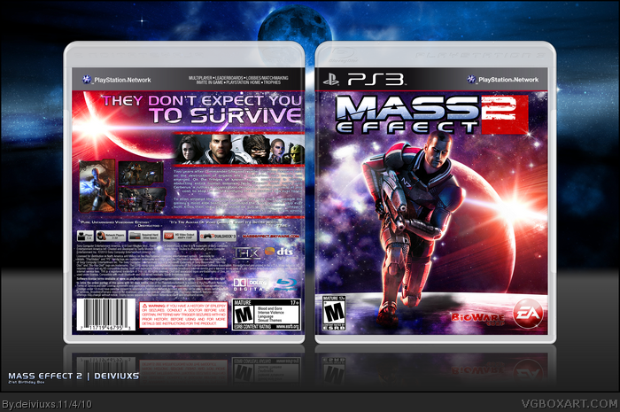
I've been waiting to upload this cover for a very long time and I am finally able to upload it today (since today is my birthday).
I worked hard on this cover. I wanted it to be special, unique and just something I would be proud of. I think I pulled it off well, because every time I look at this cover, I smile. There's been tons of editing, resource gathering and just experimenting to make this cover look the way it looks right now. I wanted this cover to be personal and reflect my design abilities. Dev logos, such as EA logo on the front was custom made by me from scratch (BioWare logo was also edited to fit the design). I am very glad with my final outcome and I think this is one of the best covers I've made so far.
I highly appreciate if you took few seconds to leave a comment below and let me know your thoughts on this cover. If there is anything I should modify, I will definitely take that into consideration.
Nice. The combination of purple/red looks great, although the lighting on Shepard himself seems a bit off, he has a more orange tone. The back seems good, I like the layout (very official) and good job keeping the colors consistent.
Although, most importantly: where is Shepard's... leg?
Overall a nice design despite a few flaws, and happy birthday.
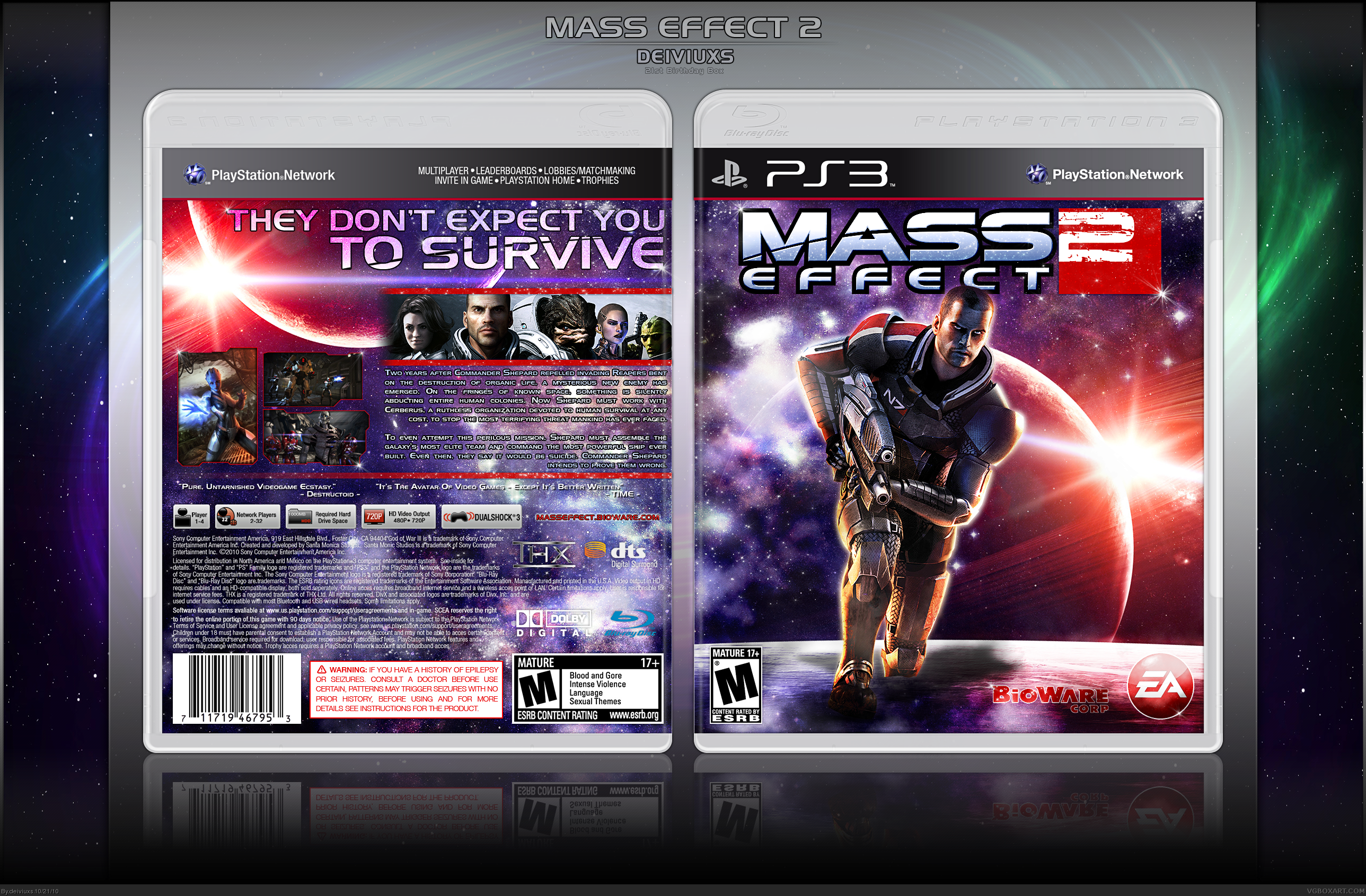
UPDATE #1:
- fixed the lighting on Shepard on the front;
- edited Shepard's left leg a bit so it looks more like he's running and the leg is not just simply cut off.
Well I certainly hope you have a happy birthday. It's actually my brother's birthday too. I won't lie, the box is clean, but it's a bit plain. I would've liked to see more filling up both covers.
Wow, is this really that BAD?? I probably spend most time on this cover than any other cover I made, but it got the least amount of favorites than any other box I created.
Could you at least speak and let me know what's wrong with this box, so I can work on it and improve.
Honestly, if this is all the feedback I'll get on this cover (both comments and favorites wise) then I'll have to call it a day and make this my last cover I upload on this site.
Honestly dude, coming off that last cover you made, this is so plain and boring. The back really doesn't look like anything special and everything is really spaced out so it's looks rather noobish. The front looks like a render of Shepherd on a background. It's really lacking substance.
#11, I highly disagree. This is incredibly well made, and it looks absolutely amazing. The font on the back fits the game, the character layout above the description looks good, the screenshots and borders are very nice, and the front is wonderful as well. You did an excellent job on the editing Deiviuxs, especially with the colors and lighting. The custom EA and Bioware logos are very professional looking and fit the box perfectly. The only thing that you may want to do is tone down the glow on Shepard some, but only slightly.
I didn't say it wasn't well made. It was well put together but it's so empty that it looks kind of noobish. I'm not trying to say he's not able to put a box together by any means. Plus the screenshots on the back look weird being that they're two styles.
#11, I wasn't talking to you man. I was talking in general. Everyone has their own opinion and they respect that and I really respect those who are not afraid to express their opinions (good or bad).
As far as the emptiness goes, I wanted this cover to be "empty" or simple. I was trying to put emphasis on the atmosphere (space) rather than characters.
As far as the editing goes, this box has tons of editing, especially the front cover. If you just take few moments to look at the front cover alone, you might see how much work has been put to it and it definitely is not just a render on a background.
I was directing my comment at SP and I wasn't angry I was just clarifying. I understand that you put a lot of work into this but I'm just not feeling the simplicity.
#15, Everyone to their own opinions. I wasn't angry or anything either, just wanted to give my opinion on the box itself, which I didn't really do in my earlier comment.
What i really like is the custom ea logo. I can see the heavy editing on the front. But the heavy glow on shepard from both sides destroys the whole front. If the light is coming from the sun/star the it would only be on the right side. The shadow on the ground behind shepard seems a bit odd, these two points ruin the whole front for me, so that shepard is not part of the front, but stands out of place before it.
The color tone is well made but it didn't really hit my style.
Awesome box! My only suggestion is the synopsis text should have an opaque or translucent background behind it, get rid of stroke/drop shadow you have going, and don't use all caps and it would be perfect.
#24, Thanks for your feedback, Sessoneon. I really appreciate your input. I will make the changes you suggested and will update the box in near future. I'm also thinking of changing a front a bit, since many people dislike the way Shepard looks on the front.
Alright, since the site is back up and running, I am able to finally update this box. I have read everyones comments several times and decided to make an update to this cover based on the feedback I've receive. Please let me know what you think about the update. Thanks!
UPDATE #3:
- removed Shepard front the front & added Normandy spaceship instead
- changed the color and effects on the description on the back
-
#28 & 29, thanks for your feedback guys. I decided to leave Shepard on the front. That way the front doesn't feel as empty as before. Probably, no more updates for this cover as I like the way the cover looks now.
 Mass Effect 2 Box Cover Comments
I proudly present you my 21st Birthday Box!
I've been waiting to upload this cover for a very long time and I am finally able to upload it today (since today is my birthday).
I worked hard on this cover. I wanted it to be special, unique and just something I would be proud of. I think I pulled it off well, because every time I look at this cover, I smile. There's been tons of editing, resource gathering and just experimenting to make this cover look the way it looks right now. I wanted this cover to be personal and reflect my design abilities. Dev logos, such as EA logo on the front was custom made by me from scratch (BioWare logo was also edited to fit the design). I am very glad with my final outcome and I think this is one of the best covers I've made so far.
I highly appreciate if you took few seconds to leave a comment below and let me know your thoughts on this cover. If there is anything I should modify, I will definitely take that into consideration.
Oh, and one more thing before I go:
VIEW FULL SIZE !!!
[ Reply ]
Beutiful.
[ Reply ]
Nice. The combination of purple/red looks great, although the lighting on Shepard himself seems a bit off, he has a more orange tone. The back seems good, I like the layout (very official) and good job keeping the colors consistent.
Although, most importantly: where is Shepard's... leg?
Overall a nice design despite a few flaws, and happy birthday.
[ Reply ]
O_O I am at a loss for words.....
[ Reply ]
the back is really nice but Shepard seems out of place on the front.
[ Reply ]
#3, Shepard is supposed to be running, that's why you can't see his left leg.
[ Reply ]
UPDATE #1:
- fixed the lighting on Shepard on the front;
- edited Shepard's left leg a bit so it looks more like he's running and the leg is not just simply cut off.
[ Reply ]
Well I certainly hope you have a happy birthday. It's actually my brother's birthday too. I won't lie, the box is clean, but it's a bit plain. I would've liked to see more filling up both covers.
[ Reply ]
The update looks much better, and the editing is fantastic. Really nice job here man, and happy birthday :)
[ Reply ]
Wow, is this really that BAD?? I probably spend most time on this cover than any other cover I made, but it got the least amount of favorites than any other box I created.
Could you at least speak and let me know what's wrong with this box, so I can work on it and improve.
Honestly, if this is all the feedback I'll get on this cover (both comments and favorites wise) then I'll have to call it a day and make this my last cover I upload on this site.
[ Reply ]
Honestly dude, coming off that last cover you made, this is so plain and boring. The back really doesn't look like anything special and everything is really spaced out so it's looks rather noobish. The front looks like a render of Shepherd on a background. It's really lacking substance.
[ Reply ]
#11, I highly disagree. This is incredibly well made, and it looks absolutely amazing. The font on the back fits the game, the character layout above the description looks good, the screenshots and borders are very nice, and the front is wonderful as well. You did an excellent job on the editing Deiviuxs, especially with the colors and lighting. The custom EA and Bioware logos are very professional looking and fit the box perfectly. The only thing that you may want to do is tone down the glow on Shepard some, but only slightly.
[ Reply ]
I didn't say it wasn't well made. It was well put together but it's so empty that it looks kind of noobish. I'm not trying to say he's not able to put a box together by any means. Plus the screenshots on the back look weird being that they're two styles.
[ Reply ]
#11, I wasn't talking to you man. I was talking in general. Everyone has their own opinion and they respect that and I really respect those who are not afraid to express their opinions (good or bad).
As far as the emptiness goes, I wanted this cover to be "empty" or simple. I was trying to put emphasis on the atmosphere (space) rather than characters.
As far as the editing goes, this box has tons of editing, especially the front cover. If you just take few moments to look at the front cover alone, you might see how much work has been put to it and it definitely is not just a render on a background.
[ Reply ]
I was directing my comment at SP and I wasn't angry I was just clarifying. I understand that you put a lot of work into this but I'm just not feeling the simplicity.
[ Reply ]
#15, Everyone to their own opinions. I wasn't angry or anything either, just wanted to give my opinion on the box itself, which I didn't really do in my earlier comment.
[ Reply ]
No I get that, I just didn't want to come off like I was attacking anyone for disagreeing with me.
[ Reply ]
UPDATE #2:
- reduced the glow on Shepard
- changed presentation
Also, added custom EA logo to Resources section.
[ Reply ]
I like it and updated it does look even better.
[ Reply ]
Amazing presentation.
[ Reply ]
What i really like is the custom ea logo. I can see the heavy editing on the front. But the heavy glow on shepard from both sides destroys the whole front. If the light is coming from the sun/star the it would only be on the right side. The shadow on the ground behind shepard seems a bit odd, these two points ruin the whole front for me, so that shepard is not part of the front, but stands out of place before it.
The color tone is well made but it didn't really hit my style.
[ Reply ]
needs HoF
[ Reply ]
Still needs HoF
[ Reply ]
Awesome box! My only suggestion is the synopsis text should have an opaque or translucent background behind it, get rid of stroke/drop shadow you have going, and don't use all caps and it would be perfect.
[ Reply ]
#24, Thanks for your feedback, Sessoneon. I really appreciate your input. I will make the changes you suggested and will update the box in near future. I'm also thinking of changing a front a bit, since many people dislike the way Shepard looks on the front.
[ Reply ]
Looks good! Only think I don't like is the front's render. It looks out of proportion with the size. Rest looks nice.
[ Reply ]
Alright, since the site is back up and running, I am able to finally update this box. I have read everyones comments several times and decided to make an update to this cover based on the feedback I've receive. Please let me know what you think about the update. Thanks!
UPDATE #3:
- removed Shepard front the front & added Normandy spaceship instead
- changed the color and effects on the description on the back
-
[ Reply ]
Needs something else on the front...
[ Reply ]
It really needs to Shepherd render. The front looks bare.
[ Reply ]
#28 & 29, thanks for your feedback guys. I decided to leave Shepard on the front. That way the front doesn't feel as empty as before. Probably, no more updates for this cover as I like the way the cover looks now.
[ Reply ]
It is a really good box and I enjoy looking at it :D
[ Reply ]
It looks cool buddy, I jus think the front should have another image...
[ Reply ]
Well done.
[ Reply ]
#32, Could be more specific? Are you talking about the render of Shepard or the background behind him?
#33, Thank you.
[ Reply ]
So....So.....Pretty.....Love it!
[ Reply ]
OOOOOOHHHH MAH LAWDS.
I love that colour scheme! This was a pretty decent box, I wonder why I never saw it before.
[ Reply ]