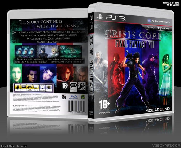
[ Box updated on November 10th, 2010 ] [ original ]
 Final Fantasy VII : Crisis Core Box Cover Comments
Comment on amad2's Final Fantasy VII : Crisis Core Box Art / Cover.
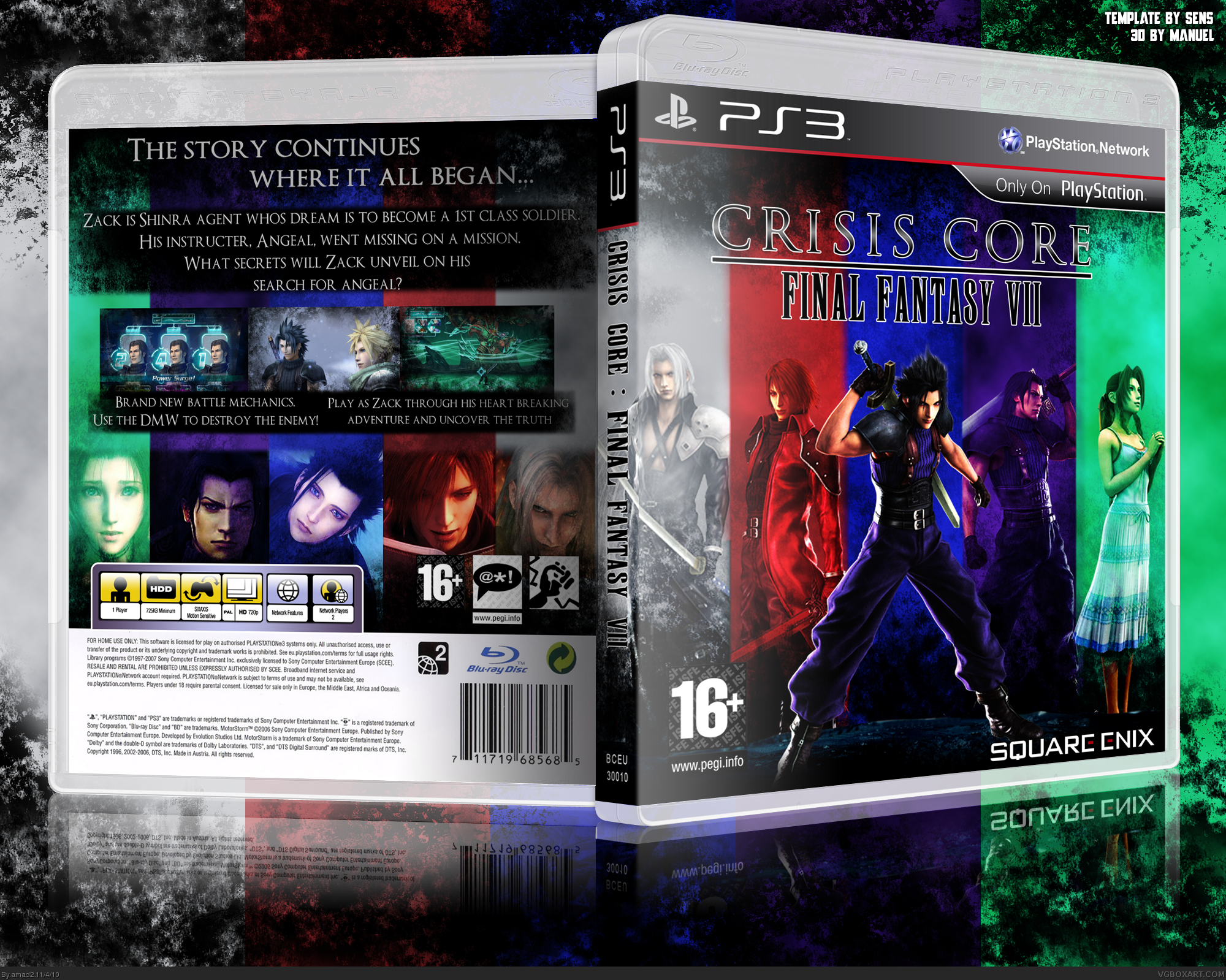
[ Box updated on November 10th, 2010 ] [ original ]
Comment on amad2's Final Fantasy VII : Crisis Core Box Art / Cover.
Well this is my latest, been working on it for a few weeks now.
Cred to sens for temp
Manuel for 3d-ing the box
Sarashi for his awesome logo
[ Reply ]
I like the final outcome, very colorful. My only complaint is how the images on the back fade, it should be smoother. Look at the image of Angeal, and how it goes from almost completely black to suddenly a bright(er) purple.
[ Reply ]
+fav? Lol
It can be fixed easily, ill update later when im on my comp.
[ Reply ]
My biggest complain is the presentation which takes away attention from the box since it has the same colors as the box. Otherwise, it's a pretty decent design.
[ Reply ]
Deserves a lot more attention.
[ Reply ]
#5, You really think so? Thanks.
[ Reply ]
It's a good box, but the colors are throwing me off.
[ Reply ]
Awesome!!
[ Reply ]
The blue colors (purple and blue) are not diffrent enough. If i look at it it seems to be merging in to one big block, which leads to the effect that your concept of five colors/characters is destroyed.
[ Reply ]
Hmmm. I think its your moniter or something, i can see a clear partition between the two colours and they dont look merged at all to me.
[ Reply ]
This needs way more attention. The front colors look amazing. The back is alright, I would change a few things. The presentation should be changed. It takes away the color of the great box. Overall, fantastic job.
[ Reply ]
Ok added new presentation :)
[ Reply ]
The front is fine, but the back needs serious work. The biggest issue is the black behind the description.
[ Reply ]
The front is nice, but i really don't think this theme fits the game. The back is too generic.
[ Reply ]
Wow, I really like the use of colors here, I'm a sucker for the dark grungy feel.
If I had to say somthing negative, it would be text on the back in dumbed down, it's all caps, which can work somtimes, it's got nothing but a black boax solid behind it, and it's very short.
[ Reply ]
That front is kinda dark, but it is amazing. However, I feel you could have done so much on the back
[ Reply ]