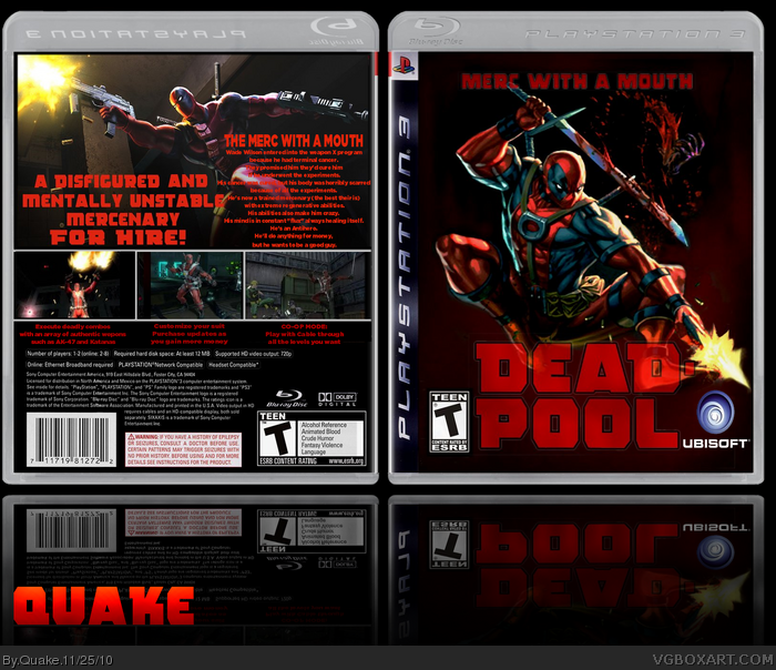
Although, it's a year old, I kinda like this box (yeah, it needs some work, especially on the back) but it does feel quite like a 'deadpool' game to me ;)
I don't know if you're even still a member on here? or even care about the feedback? but I'd suggest to make the synopsis white with a light drop shadow underneath, align the text to the left (so it's less interfering with the tagline) and make some sort of text box, so it's much better readable.
I like the subtitle, you've added to the front of the box :) but I'd would make the sword overlap the 'merc' of the subtitle a bit and make it together with the 'Deadpool' main title (not transparent, but in full opacity)
 Deadpool Box Cover Comments
the back needs some work but overall im very happy with the result
[ Reply ]
I like it but it looks obvious it was made in gimp =/
9/10 :D
[ Reply ]
actually is paint shop pro 6 but is basically the same as gimp
[ Reply ]
Although, it's a year old, I kinda like this box (yeah, it needs some work, especially on the back) but it does feel quite like a 'deadpool' game to me ;)
I don't know if you're even still a member on here? or even care about the feedback? but I'd suggest to make the synopsis white with a light drop shadow underneath, align the text to the left (so it's less interfering with the tagline) and make some sort of text box, so it's much better readable.
I like the subtitle, you've added to the front of the box :) but I'd would make the sword overlap the 'merc' of the subtitle a bit and make it together with the 'Deadpool' main title (not transparent, but in full opacity)
[ Reply ]