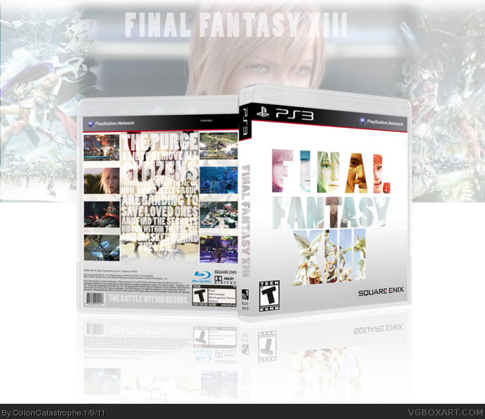
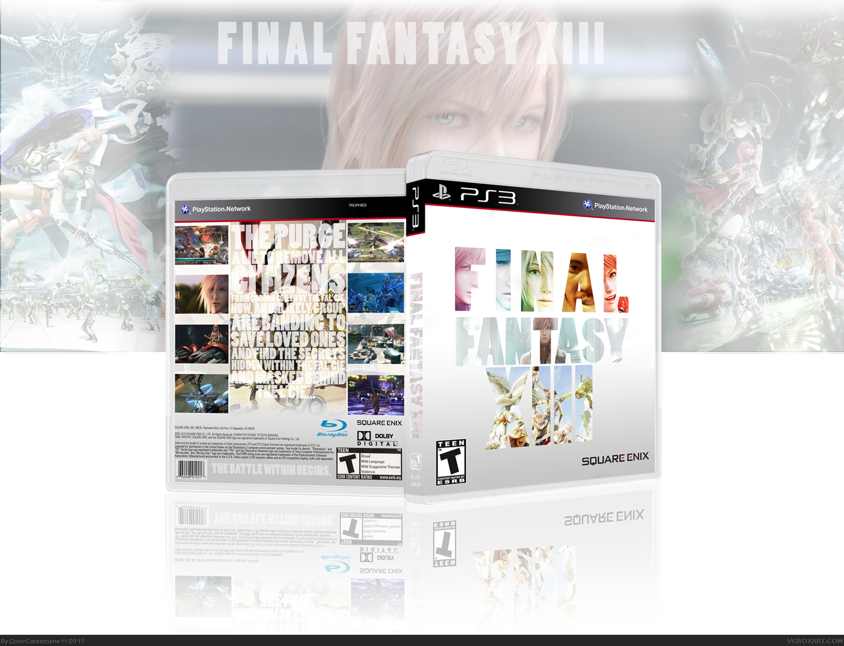
I saw a desktop with Lightning inside of the XIII, and decided to take that and create a nice picture of the game on the cover. It shows the main five characters (Minus Fang) and then two beautiful pieces of art to show the world of the game.
On the back, I wanted to sort of take the idea I used for my Silent Hill 2 back and relate it onto here. Not much to say, hope it looks good!
#3, thank you! It's a little bit clearer in the printable view, but I was trying to balance between legible enough and pretty enough. I think I found a decent medium.
#5, Ohh, well... Oh, well thank you! I'd love for you to elaborate, but I feel the same way. I'm satisfied with it, but then again, I feel like there is so much more that could have been.
I feel that the description text is bundled up, (I know this was purposely done), I understand the effect it's giving off but I don't like it personally. You also managed to actually put up correct legal information, I would check to see if that's the actual authentic barcode there, but I don't feel like it right now.
The legal information is well set up, except that the blu-ray, dolby digital, and square-enix logos appear to be randomly placed over the ESRB logo, you could have shrank them and made them equally sized on top of the ESRB logo, but, this is just my preference since I tend to use grids and measurements on my work in progresses.
The spine is hard to see without being zoomed in because it's a bit too white, you could have made it a bit darker of course, not a big problem. However, the region 1 logo along with the text under it could have easily been made black instead of white, on a light gray background it's almost like it's not there.
I really like the front most of all, everything is well put together and colored, except for the TEEN logo and the square-enix logo, which appear to be too large and placed slightly too high up.
#9, I appreciate you really getting down to the grit on my box!
I'll try and give you my breakdown of everything, and hopefully explain a little bit about it.
The back text was a somewhat easy choice for me. I did something sort of similar on my Bayonetta box, and never doing it before, it turns out I liked it, so I carried it over to this box. The box would have probably benefit more from a different layout, but I wanted to try and separate from the "blurb picture blurb picture" layout. I'm not saying that is bad, but I wanted to make it somewhat easy on the eyes, but have a little depth. Of course, the description on the back is hard to read anyways, so... Screwed that up a little.
I usually end up finding a box (if I have it) or on the internet so I can type up all the legal info to keep it all the same, but unfortunately, I couldn't find any good images with the barcode, so it's for a different game. I tried, but I don't have a scanner, so I was a bit out of luck.
I completely understand your gripes on the three logos, but those were mainly put on to take up some blank space. I feel ashamed, since I just did sort of randomly throw em on there...
The spine is a little harder to make out, like you said, but I think if it were printed out and in the collection, it would be somewhat easy to read from a distance. Plus, once you see Lightning, it clicks. I guess a quick aside, I make boxes more for my personal enjoyment... Something I would love to see on my shelf. I don't typically go for something that would catch the eye in a store or anything.
As for the front, they could be a little smaller. I see what you are saying. I'll get to this within the next day and try to polish up the little things you pointed out. I appreciate your input!
#10, I understand, for instances like that you can go to covergalaxy and find printables as references. As for the barcode I usually copy and paste it, then change the levels of it so appears to be completely black and white.
Alright, I've been in a rut with making boxes lately, but I finally got around to updating a couple boxes, this one in particular. I took most of your improvements into consideration, #9, so hopefully it looks a little more pleasing!
I really like it. but its so hard to read. The best text part is the FINAL on the front. i love that, but its so hard to read on the back. Maybe if u had a darker background.
I think it's a little easier to read when you view the printable, but I can kind of mess with the opacity a little on the typography. I was thinking about changing the synopsis because I wrote it a bit quick and have a small problem with the wording and such. Plus, I want to mess with the screenshots and find some better ones as well.
 Final Fantasy XIII Box Cover Comments
Final Fantasy XIII!
A bit of a letdown, but damn pretty to look at!
I saw a desktop with Lightning inside of the XIII, and decided to take that and create a nice picture of the game on the cover. It shows the main five characters (Minus Fang) and then two beautiful pieces of art to show the world of the game.
On the back, I wanted to sort of take the idea I used for my Silent Hill 2 back and relate it onto here. Not much to say, hope it looks good!
[ Reply ]
Gah! Forgot to add the credit (since editing doesn't work!)
PS3 Template: Scorpion Soldier
Box Template: Sens
[ Reply ]
although it hard to read, I still love the color you use :)
[ Reply ]
#3, thank you! It's a little bit clearer in the printable view, but I was trying to balance between legible enough and pretty enough. I think I found a decent medium.
[ Reply ]
I really don't like this, but I really like this. I would give criticism but I don't feel like typing right now.
[ Reply ]
#5, Ohh, well... Oh, well thank you! I'd love for you to elaborate, but I feel the same way. I'm satisfied with it, but then again, I feel like there is so much more that could have been.
[ Reply ]
attractive in all the right ways, but could use a different font to the one you have currently
[ Reply ]
I absolutely adore the front, its simplicity and colors.
[ Reply ]
I feel that the description text is bundled up, (I know this was purposely done), I understand the effect it's giving off but I don't like it personally. You also managed to actually put up correct legal information, I would check to see if that's the actual authentic barcode there, but I don't feel like it right now.
The legal information is well set up, except that the blu-ray, dolby digital, and square-enix logos appear to be randomly placed over the ESRB logo, you could have shrank them and made them equally sized on top of the ESRB logo, but, this is just my preference since I tend to use grids and measurements on my work in progresses.
The spine is hard to see without being zoomed in because it's a bit too white, you could have made it a bit darker of course, not a big problem. However, the region 1 logo along with the text under it could have easily been made black instead of white, on a light gray background it's almost like it's not there.
I really like the front most of all, everything is well put together and colored, except for the TEEN logo and the square-enix logo, which appear to be too large and placed slightly too high up.
[ Reply ]
#9, I appreciate you really getting down to the grit on my box!
I'll try and give you my breakdown of everything, and hopefully explain a little bit about it.
The back text was a somewhat easy choice for me. I did something sort of similar on my Bayonetta box, and never doing it before, it turns out I liked it, so I carried it over to this box. The box would have probably benefit more from a different layout, but I wanted to try and separate from the "blurb picture blurb picture" layout. I'm not saying that is bad, but I wanted to make it somewhat easy on the eyes, but have a little depth. Of course, the description on the back is hard to read anyways, so... Screwed that up a little.
I usually end up finding a box (if I have it) or on the internet so I can type up all the legal info to keep it all the same, but unfortunately, I couldn't find any good images with the barcode, so it's for a different game. I tried, but I don't have a scanner, so I was a bit out of luck.
I completely understand your gripes on the three logos, but those were mainly put on to take up some blank space. I feel ashamed, since I just did sort of randomly throw em on there...
The spine is a little harder to make out, like you said, but I think if it were printed out and in the collection, it would be somewhat easy to read from a distance. Plus, once you see Lightning, it clicks. I guess a quick aside, I make boxes more for my personal enjoyment... Something I would love to see on my shelf. I don't typically go for something that would catch the eye in a store or anything.
As for the front, they could be a little smaller. I see what you are saying. I'll get to this within the next day and try to polish up the little things you pointed out. I appreciate your input!
[ Reply ]
#10, I understand, for instances like that you can go to covergalaxy and find printables as references. As for the barcode I usually copy and paste it, then change the levels of it so appears to be completely black and white.
link
[ Reply ]
link
[ Reply ]
Alright, I've been in a rut with making boxes lately, but I finally got around to updating a couple boxes, this one in particular. I took most of your improvements into consideration, #9, so hopefully it looks a little more pleasing!
[ Reply ]
I really like it. but its so hard to read. The best text part is the FINAL on the front. i love that, but its so hard to read on the back. Maybe if u had a darker background.
[ Reply ]
I think it's a little easier to read when you view the printable, but I can kind of mess with the opacity a little on the typography. I was thinking about changing the synopsis because I wrote it a bit quick and have a small problem with the wording and such. Plus, I want to mess with the screenshots and find some better ones as well.
[ Reply ]