Im not a fan of the spine, the logo stretched is a bad decision. I do like the design of the front, with the Sword off in the distance behind Link, but the difference in art from Skyward sword gives the box the opposite feeling than what the game is trying to portray.
The back isn't so good. I don't really like THAT scroll you used, the scroll idea however is a good one. The text is too large, it shows you were trying to fill space, which makes the back look amateur. I do like the screenshot line up, but I think you should try and incorporate a tagline, and figure out what symbolically stands behind Ganon, what gives him power, and use that as a background rather than the Master sword for him too.
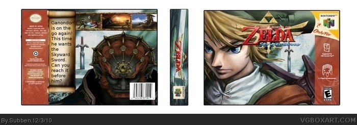
 The Legend of Zelda: Skyward Sword Box Cover Comments
This is my 4th box! I think it's an improvement from the last one! And I know that the back is a bit messy...
[ Reply ]
A SNES background, GC art, A N64 template and a Wii title. What a mixture.
[ Reply ]
#2, yee xD
Did u like it?
[ Reply ]
Im not a fan of the spine, the logo stretched is a bad decision. I do like the design of the front, with the Sword off in the distance behind Link, but the difference in art from Skyward sword gives the box the opposite feeling than what the game is trying to portray.
The back isn't so good. I don't really like THAT scroll you used, the scroll idea however is a good one. The text is too large, it shows you were trying to fill space, which makes the back look amateur. I do like the screenshot line up, but I think you should try and incorporate a tagline, and figure out what symbolically stands behind Ganon, what gives him power, and use that as a background rather than the Master sword for him too.
[ Reply ]
#4, Ok I'll think of that nex time. And I'm not satisfied with the back!
[ Reply ]