Interesting concept. I'd originally though the bits breaking away from Batman were actually bats, until I looked closer. Good work.
#5: I was thinking the same thing.
i agree with #3. the box looks fantastic and very different from others members. i like the way that it look's simple but also very original. i disagree with #4 because if you did have bats then the box will look very boring. the characters are a much better idea's because they make the box interesting. i like the way you think!
keep up the good work. fav from me!
I love the way you went with this, but I think that it should be more about the location of Arkham Asylum--it was a character just as much as any of its inmates.
#4, I was going to put bats into the mix but completely forgot to. Damn.
#5 6 and 14, I've seen the picture in question, did that use the characters in the same way I did? I thought it was just a broken-up Snake. I'll take another look.
#11, I initially planned to put a silhouette of Arkham across it but decided against it, just didn't look good.
awsome box the only problem i hav is that they are all villans flying off him. it would look alot cooler if they were just bats. the villan silluets would look alot cooler if they were lined up on the back boarder of the box
the front of the box is fantastic carrying the same style to the back is a stroke of genius and the writing is simply beyond words.Put simply the very best
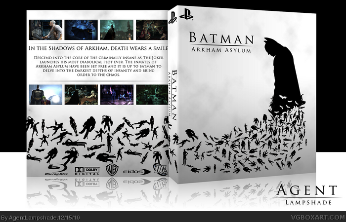
 Batman: Arkham Asylum Box Cover Comments
Wow.
[ Reply ]
I wanted to present a different side of Arkham Asylum, other than the "madhouse" feel, so I went with a black-and-white simplistic style.
Based slightly on Ayron and Death's colab box - link
The villains are meant to look like they are breaking of of Batman, representing their escape from their incarceration.
I thank you for viewing.
[ Reply ]
Very nice. Love the temp as well. Glad your trying to make something different than everyone else. People seem to start using the same temp as me.
[ Reply ]
I think bats replace characters will be better, but this box soooo beautiful. Love it!!! :D
[ Reply ]
Sexy as hell.
MetalGearSolid 4 much?
[ Reply ]
Interesting concept. I'd originally though the bits breaking away from Batman were actually bats, until I looked closer. Good work.
#5: I was thinking the same thing.
[ Reply ]
i agree with #3. the box looks fantastic and very different from others members. i like the way that it look's simple but also very original. i disagree with #4 because if you did have bats then the box will look very boring. the characters are a much better idea's because they make the box interesting. i like the way you think!
keep up the good work. fav from me!
[ Reply ]
Saw something like this when I was looking for bats on google, nice job. :D
[ Reply ]
what an arty box. i love it!
[ Reply ]
Wow, I love the uniqueness of this. Fantastic job!
[ Reply ]
I love the way you went with this, but I think that it should be more about the location of Arkham Asylum--it was a character just as much as any of its inmates.
[ Reply ]
i really like the simplicity of the box but the front doesnt really capture what the game is about 8/10
[ Reply ]
Very nice
[ Reply ]
Nice and classy. Reminds me of the MGS4 artwork of Snake.
[ Reply ]
Thanks everyone for the comments and favs.
#4, I was going to put bats into the mix but completely forgot to. Damn.
#5 6 and 14, I've seen the picture in question, did that use the characters in the same way I did? I thought it was just a broken-up Snake. I'll take another look.
#11, I initially planned to put a silhouette of Arkham across it but decided against it, just didn't look good.
[ Reply ]
#15, I'd say it looks a bit more like this: link*jQ17tOPDdnqtWEqexL9UN6IVZxjNfoIyZZWVr6b5KvzgpsM/The_Bat_Man_by_Arashdeep.jpg
[ Reply ]
#16, Wish I noticed this earlier. That's an awesome image.
[ Reply ]
This is sweet. Hopefully this gets HoF soon.
[ Reply ]
Phenomenal, one of the best and most original concepts for AA I've seen.
+Fav.
+Author Fav.
[ Reply ]
#18, We can only hope.
#19 Very much appreciated. Thank you.
[ Reply ]
Hall of Fame? Please?
[ Reply ]
Congrats on the Hall!
[ Reply ]
Bout time sann.
[ Reply ]
Congrats on Hall!
[ Reply ]
#22 23 and 24, thanks!
My first Hall. Thanks everybody!
[ Reply ]
awsome box the only problem i hav is that they are all villans flying off him. it would look alot cooler if they were just bats. the villan silluets would look alot cooler if they were lined up on the back boarder of the box
[ Reply ]
Nice box the style reminds me of this image.
link
[ Reply ]
You are a genius
[ Reply ]
Awesome work!
[ Reply ]
the front of the box is fantastic carrying the same style to the back is a stroke of genius and the writing is simply beyond words.Put simply the very best
[ Reply ]
This is insanely good
[ Reply ]
simplistic in design but ohh so stunning. amazing
[ Reply ]
Printable Version please? :)
[ Reply ]
Hi. How can i download this awesome cover?
[ Reply ]
Is there anyway to download a printable version of this? It's very good
[ Reply ]
would you kindly share a printable version? Thanks ;)
[ Reply ]