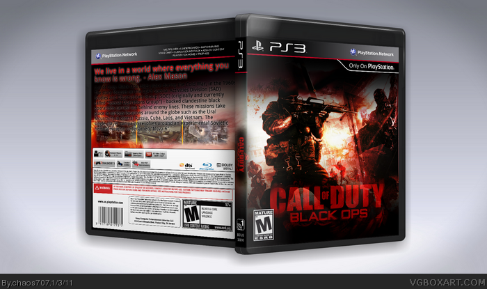
The high contrast and red colors are a refreshing change for Black Ops cases, although that shadow along the top edge is obtrusive, and if not removed entirely should at least be toned down. The Black Ops logo itself could be moved up a few notches, if only so it isn't lying underneath the ESRB. You could add an Activision logo to the right side while you're at it.
The back, unlike the front, is in need of plenty more work. The intense, action-packed, blood red style of the front is lost here, and instead replaced with a foggy, cloudy(?) backdrop. A game like this I'm sure has more art than that, and I'd suggest completely reworking the back with new imagery, stronger colors and brightness (like the front), and a more interesting layout. The fonts could use an upgrade too, something more battle-worn like the chipped logo on the front would work.
The way you've blended the logo into the images ends up making the logo hard to see, something a packaging designer would tend to avoid, because with a brand name like Call of Duty you really want that name to stand out. That's what sells the game. The red contrasted with the black is a nice change, but you seem to have blended a lot of images together on the front, and it ends up making it difficult to tell exactly what is going on. The typography on the back is difficult to read as well, given the way it blends into the background. It seems like you tried to avoid that with a shadow around the text, but there's just so much text there that it overwhelms the back. Simplicity is key. Remember, this is a war game. You want to sell them the action, not the story. That means more images, less text, and more key points. The tagline is good, and appropriate, but you've given the bottom half a different color than the rest, which seems strange. Overall, try to keep the backgrounds behind your text simple. It's a difficult lesson to learn, because you always want to have as many images as possible, but for backs, having one or two key images standing out is fine, as long as you keep the text separate.
 Call of Duty: Black Ops Box Cover Comments
I dont like the description i did for the back but this box took like 5 hours
[ Reply ]
please don't bump your boxes dude
[ Reply ]
neat cover though
[ Reply ]
The front looks great but the back is bad. Try a new font for the tagline and organize your description and also re-organize your screenshots
[ Reply ]
#2, Sorry
#4, Yeah i know can you recommend a Font and ill reorganize the screenshots
[ Reply ]
The high contrast and red colors are a refreshing change for Black Ops cases, although that shadow along the top edge is obtrusive, and if not removed entirely should at least be toned down. The Black Ops logo itself could be moved up a few notches, if only so it isn't lying underneath the ESRB. You could add an Activision logo to the right side while you're at it.
The back, unlike the front, is in need of plenty more work. The intense, action-packed, blood red style of the front is lost here, and instead replaced with a foggy, cloudy(?) backdrop. A game like this I'm sure has more art than that, and I'd suggest completely reworking the back with new imagery, stronger colors and brightness (like the front), and a more interesting layout. The fonts could use an upgrade too, something more battle-worn like the chipped logo on the front would work.
[ Reply ]
The way you've blended the logo into the images ends up making the logo hard to see, something a packaging designer would tend to avoid, because with a brand name like Call of Duty you really want that name to stand out. That's what sells the game. The red contrasted with the black is a nice change, but you seem to have blended a lot of images together on the front, and it ends up making it difficult to tell exactly what is going on. The typography on the back is difficult to read as well, given the way it blends into the background. It seems like you tried to avoid that with a shadow around the text, but there's just so much text there that it overwhelms the back. Simplicity is key. Remember, this is a war game. You want to sell them the action, not the story. That means more images, less text, and more key points. The tagline is good, and appropriate, but you've given the bottom half a different color than the rest, which seems strange. Overall, try to keep the backgrounds behind your text simple. It's a difficult lesson to learn, because you always want to have as many images as possible, but for backs, having one or two key images standing out is fine, as long as you keep the text separate.
[ Reply ]
I like the alienware style :P
[ Reply ]