This is pretty nice. The ONLY thing I see missing, and it's not even "missing", is that it would be nice if you had some sort of "Screen", like a computer window or terminal or something, behind the text. Halo boxes here typically have it. There's a lot of text, but given that it's an RPG that's appropriate. I'd just like to see something behind the text to separate it from the background and help it stand out a bit more. Other than that, the design is great. The presentation is a bit lackluster, but then again so are mine :-p. So... yeah. Nice work.
 Mass Effect 2 Box Cover Comments
This is really awesome, especially for someone new. I mean seriously, how come the new guys now are always better then me <:P
[ Reply ]
Welcome to the site dude, great first box!
[ Reply ]
What... this is your first box? Great work, can't wait to see more boxes from you.
[ Reply ]
Nice. I dont think the sun rays are necessary though.
[ Reply ]
Great first cover (if it is your first?) dude! Welcome to the site & hope to see more from you in the future. =)
[ Reply ]
When I first saw this I thought it was a deiviuxs cover.
[ Reply ]
#4: Those aren't sun rays, it's the Citadel.
Anyways, I really like this, very impressive work. The orange looks awesome.
[ Reply ]
#6, lol, why did you think it was my cover?
[ Reply ]
#8, Your covers are usually very vibrant and filled with colors.
[ Reply ]
#9, haha, thanks for that (if that's a good thing?)..
[ Reply ]
Really nice box.
[ Reply ]
#1, Always better than me, this kills my first.
Incredible work.
+Fav
+Added to list of authors I can't fav 'cause of glitch.
[ Reply ]
#10, Yeah it's a good thing.
[ Reply ]
It's not really anything revolutionary but it's really clean and professional looking. Good job.
[ Reply ]
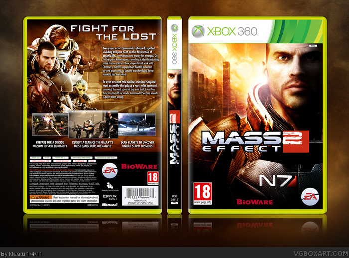
This is pretty nice. The ONLY thing I see missing, and it's not even "missing", is that it would be nice if you had some sort of "Screen", like a computer window or terminal or something, behind the text. Halo boxes here typically have it. There's a lot of text, but given that it's an RPG that's appropriate. I'd just like to see something behind the text to separate it from the background and help it stand out a bit more. Other than that, the design is great. The presentation is a bit lackluster, but then again so are mine :-p. So... yeah. Nice work.
[ Reply ]
Wow, impresive! - You could make a living out of that sort of thing, keep it up!
[ Reply ]