[ Box updated on January 9th, 2011 ] [ original ]
 Prince of Persia: The Forgotten Sands Box Cover Comments
Comment on aelixus's Prince of Persia: The Forgotten Sands Box Art / Cover.
[ Box updated on January 9th, 2011 ] [ original ]
Comment on aelixus's Prince of Persia: The Forgotten Sands Box Art / Cover.
Well done.
[ Reply ]
surprise?? :D I don't think I can keep horizontal style all my life ^_^. Anyway, hope you like it :)
[ Reply ]
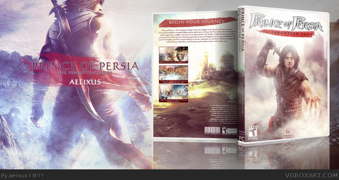
Very sandy, the entire cover itself is drenched in sand and sand dust residue.
[ Reply ]
My lord, I honestly don't think there's a box of yours that I wouldn't print off and use in my collection. Every cover you create really seeps with a different style and it always looks amazing. I know if I saw some of your cases on a shelf, I'd pick up a game based solely off of the art.
[ Reply ]
Lovely editing here.
[ Reply ]
Holy shit man, this is great, although i would have liked it better if you increased the brightness of the screens/make them lighter so they just fit it a bit more.
[ Reply ]
Jesus Christ...
[ Reply ]
What?!?!...this is not horizontal style cover. You lost all my respect..
joking joking.. =)
The cover itself is great, but I am not so much in love with it like others. I think the contrast is too low and the screenshots on the back pop-up too much since they have a much higher contrast than the rest of the box.
[ Reply ]
It's beautiful and of course the fact that it's vertical is a welcome change. Horizontal is cool, but this is a breath of fresh air.
[ Reply ]
Though I do agree with the latter part of deiviuxs's comment.
[ Reply ]
I agree with deiviuxs, the low contrast definitely doesn't fit the game. I could live with that, however. The thing that irks me the most is that giant empty space that's doing nothing but making our view of the box smaller. You're not doing a magazine spread here, shrink your presentation down. To your credit, though, it is beautiful. Just doesn't fit the game.
[ Reply ]
thank you everyone! Love your comments so much!
#4, I really appreciate it, thank you!
#6,8,10, I have increased the contrast of the screenshots, thank you guys!
#11, thank you for the detailed comments, but that is the way I show my work so I don't feel any problem with it, and I think my box fits the game as well. I want to creat a fantasy colors that make you feel like in the world of "1001 Nights"
[ Reply ]
I looooooove this dude its so beautiful, the only thing is that you should change the screenshots, they don't look good to me.
[ Reply ]
#13, thanks, I'll see what I can do :)
[ Reply ]
Omg, a non-horizontal cover from aelixus?That's a fav on its own right there:D.Oh, and the fact that it's great helps too:P
Nice one man
[ Reply ]
#15, thanks ^_^, I think horizontal or vertical box is not important to me now :D
[ Reply ]
You R0CK dude! Practically!
You should also make for prince of persia the forgotten sands(horizontal one) and POP sands of Time!
And make a POP series(horizontal)
[ Reply ]