man you just get better and better!!!
and fuck that 5 star wanker fellow who calls you shit
your a big star
you get more and more popular every week
you clearly deserve all the faves you get
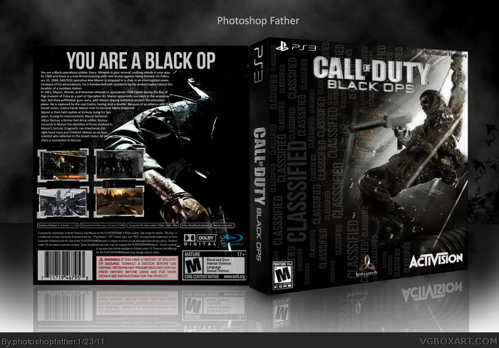
Ok guys I wanted to stay on the war theme for this box and decided to go for the latest Call Of Duty game. This one has sort of been an on and off thing which I started last month. I took on board the critique about improving the back cover as previous were not up to standard. Credits to soundwave for the crosschair screenshots border, it really helped improve the appearance of the back.
I actually disagree with Spiderpig. I like it that way. You should turn down the opacity on the words though so they stand out less. Just an idea though, you should try turning the logo sideways and putting it on the left hand side. That could look cool.
I totally agree with Spiderpig, and the front is just a wallpaper faded with the background and a LOT of classified, which is kinda distracting, you could've made more on the front...as for the back, I think you overdone with description text...
You can do better dude!
#10. I have specifically targeted areas on it to bring out the figure. that includes making the dark parts darker and the light parts lighter. Even the glass debris has been edited. The simplicity of the original is what makes it successful and I intended to do the same on mine. So suggesting that I made wholesale colour adjustments and fades is not fair.
Have you guys ever seen a typography posted. They usually are cluttered with words.
I like the front but the quality is bad and you added the words after you skewed it so the words aren't skewed. Needs work but it's overall a good design.
The back has quite a few grammatical errors, and it's too much of a story. You should change it to something more of a "play as Mason and uncover the secrets of his past" (don't use that, that would be even worse) kind of things.
I forgot to mention that you should change the tagline. You are not a "Black Op", you are a soldier who is assigned to black operations (again don't use that).
I don't want to be picky lad, but you can't help but notice that the Activision logo is way out of proportion. Also there is way too much text on the back most of which is irrelevant to the game. I'm guessing you ran out of ideas for the back so you filled it with text. Am I correct? Other than that it is a mezmerising box. + FAVE
Very nice. One thing I dont like is the guy on the back. You can barely see him, if you look at it. You can basically only see his arm. But everything else is good.
Wow very nice box. Nothing to say for the back.
About the front, I really love the soldier and the text effect even if there is way to much word according to me.
But that's really a good box. +Fave
Not bad, your problem lies with the text on both sides, in that there's simply too much of it. The concept on the front may have worked, but repeating the word "classified" over and over again looks redundant and unappealing.
The back is better, I like the dark/mysterious vibe given off by the half-hidden soldier. It's very text heavy however, and the screenshots are presented in a rather generic fashion.
It's not bad, but there's sure room for improvement.
ahhhh... great stuff! i salute you, great sir!! i would really appreciate if i get a copy of this ultimately awesome art! uhhh... here's my email address if it's okay teo123inamoski@yahoo.com
 Call Of Duty Black Ops Box Cover Comments
man you just get better and better!!!
and fuck that 5 star wanker fellow who calls you shit
your a big star
you get more and more popular every week
you clearly deserve all the faves you get
[ Reply ]
Ok guys I wanted to stay on the war theme for this box and decided to go for the latest Call Of Duty game. This one has sort of been an on and off thing which I started last month. I took on board the critique about improving the back cover as previous were not up to standard. Credits to soundwave for the crosschair screenshots border, it really helped improve the appearance of the back.
[ Reply ]
This is very nice. Very clean.
[ Reply ]
#1,#3. Thanks a lot guys.I really appreciate your support.
[ Reply ]
This isn't bad, but there are WAY too many words on the front. It's really distracting.
[ Reply ]
You might try changing some of the words on the front to numbers seeing as numbers play a large role the games story.
[ Reply ]
I actually disagree with Spiderpig. I like it that way. You should turn down the opacity on the words though so they stand out less. Just an idea though, you should try turning the logo sideways and putting it on the left hand side. That could look cool.
[ Reply ]
I totally agree with Spiderpig, and the front is just a wallpaper faded with the background and a LOT of classified, which is kinda distracting, you could've made more on the front...as for the back, I think you overdone with description text...
You can do better dude!
[ Reply ]
#8 Not really. look at the wallpaper you are talking about then compared it to mine. you'll see how I've worked up the figure.
[ Reply ]
Fading it and making color adjustments? that's easy...
[ Reply ]
Edited at 1 decade ago
[ Reply ]
I quite like this. The wallpaper you used on the front right looks really low res compared to the rest of the box though. That's disappointing.
[ Reply ]
#10. I have specifically targeted areas on it to bring out the figure. that includes making the dark parts darker and the light parts lighter. Even the glass debris has been edited. The simplicity of the original is what makes it successful and I intended to do the same on mine. So suggesting that I made wholesale colour adjustments and fades is not fair.
[ Reply ]
Have you guys ever seen a typography posted. They usually are cluttered with words.
I like the front but the quality is bad and you added the words after you skewed it so the words aren't skewed. Needs work but it's overall a good design.
[ Reply ]
#14 fair point about the unskewed words.
[ Reply ]
Ok then, but at least remove some classified of the front and add other few elements...
[ Reply ]
yeh, this is nice, didn't think that front image coulkd evr get used on a box, but you nailed it :D
[ Reply ]
The tagline looks like "you are a black cop" when glanced at. And as for the box, it looks pretty nice.
[ Reply ]
#16, Now that does make sense.
[ Reply ]
#19, Sometimes is really hard to understand me...
[ Reply ]
I was a little disappointed by the back text. Grammar was a bit froggy, and it seems to be abruptly cut off at the end.
[ Reply ]
The back has quite a few grammatical errors, and it's too much of a story. You should change it to something more of a "play as Mason and uncover the secrets of his past" (don't use that, that would be even worse) kind of things.
[ Reply ]
I forgot to mention that you should change the tagline. You are not a "Black Op", you are a soldier who is assigned to black operations (again don't use that).
[ Reply ]
Thanks guys. I appreciate your Favs and comment. Wow 9 Favs already:)
[ Reply ]
#23 #21 #20 #19 #12.Thanks for the critique guys. I will try to complete the changes you have suggested. Also thanks #18 #17 for your kind comments.
[ Reply ]
I don't want to be picky lad, but you can't help but notice that the Activision logo is way out of proportion. Also there is way too much text on the back most of which is irrelevant to the game. I'm guessing you ran out of ideas for the back so you filled it with text. Am I correct? Other than that it is a mezmerising box. + FAVE
[ Reply ]
#26, Is it. Didn't realise that. Oh and thanks for faving my box I really appreciate it.
[ Reply ]
Very nice. One thing I dont like is the guy on the back. You can barely see him, if you look at it. You can basically only see his arm. But everything else is good.
[ Reply ]
Wow very nice box. Nothing to say for the back.
About the front, I really love the soldier and the text effect even if there is way to much word according to me.
But that's really a good box. +Fave
[ Reply ]
#28, 29.Thank you so much guys.You dont know how much this means to me.I really appreciate it.Thanks again.
[ Reply ]
Not bad, your problem lies with the text on both sides, in that there's simply too much of it. The concept on the front may have worked, but repeating the word "classified" over and over again looks redundant and unappealing.
The back is better, I like the dark/mysterious vibe given off by the half-hidden soldier. It's very text heavy however, and the screenshots are presented in a rather generic fashion.
It's not bad, but there's sure room for improvement.
[ Reply ]
I appreciate you commenting on my work sd1833. Thanks.
[ Reply ]
I kind of like it but the tagline is weak. It's not possible to be "black operation", if you know what I mean.
[ Reply ]
What the heck photoshopfather?
[ Reply ]
#33, think it means operative.
[ Reply ]
#34, It thought it was an unusual and random name. Is that a problem?
[ Reply ]
Guys how do I get the printable version.
[ Reply ]
cool. I don't know how to do all that complicated shit, but damn this is nice
[ Reply ]
ahhhh... great stuff! i salute you, great sir!! i would really appreciate if i get a copy of this ultimately awesome art! uhhh... here's my email address if it's okay teo123inamoski@yahoo.com
Thank you in advance! ---A Filipino Gamer :)
[ Reply ]