Cheers :D :D :D
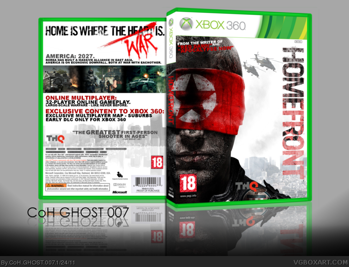
I saw the trailer for this and then instantly started thinking about a box, i seriously can't wait for this game, box took a while, and was enjoyable to make ;)
I like it.
The front with the mostly white background works because.
The back? Well, I think it works less because it's seperated by the screens, therefor making my mind register the top as just a blank spot.
But, I do really like the plain style, and the color here.
There's you're screens aswell, they're kinda boring, next time make a better way to frame, or just space them out (still framed.)
Me likes it, but I think the white space underneath the tagline seems a little sparse. You should try to add some scratches or something to let the design flow a little more.
I'm also not a fan of how you lay out the screenshots.
You're improving though, which is very good. Great job.
My only gripe here is that the space you left empty right below the tagline seems that could've been better used. Plus I'd reccomend to turn the "TH" of the THQ logo white, so It stands out and becomes more visible.
Great job, nevertheless.
Thanks to everyone,
I muight alter it again to the help, but i'm buzy most of the time with school and friends, and i really want to get onto my next box (The Dark Knight - hopefully ;D).... But keep the suggestions coming, cos as i said, i might come back to this ;D Thanks
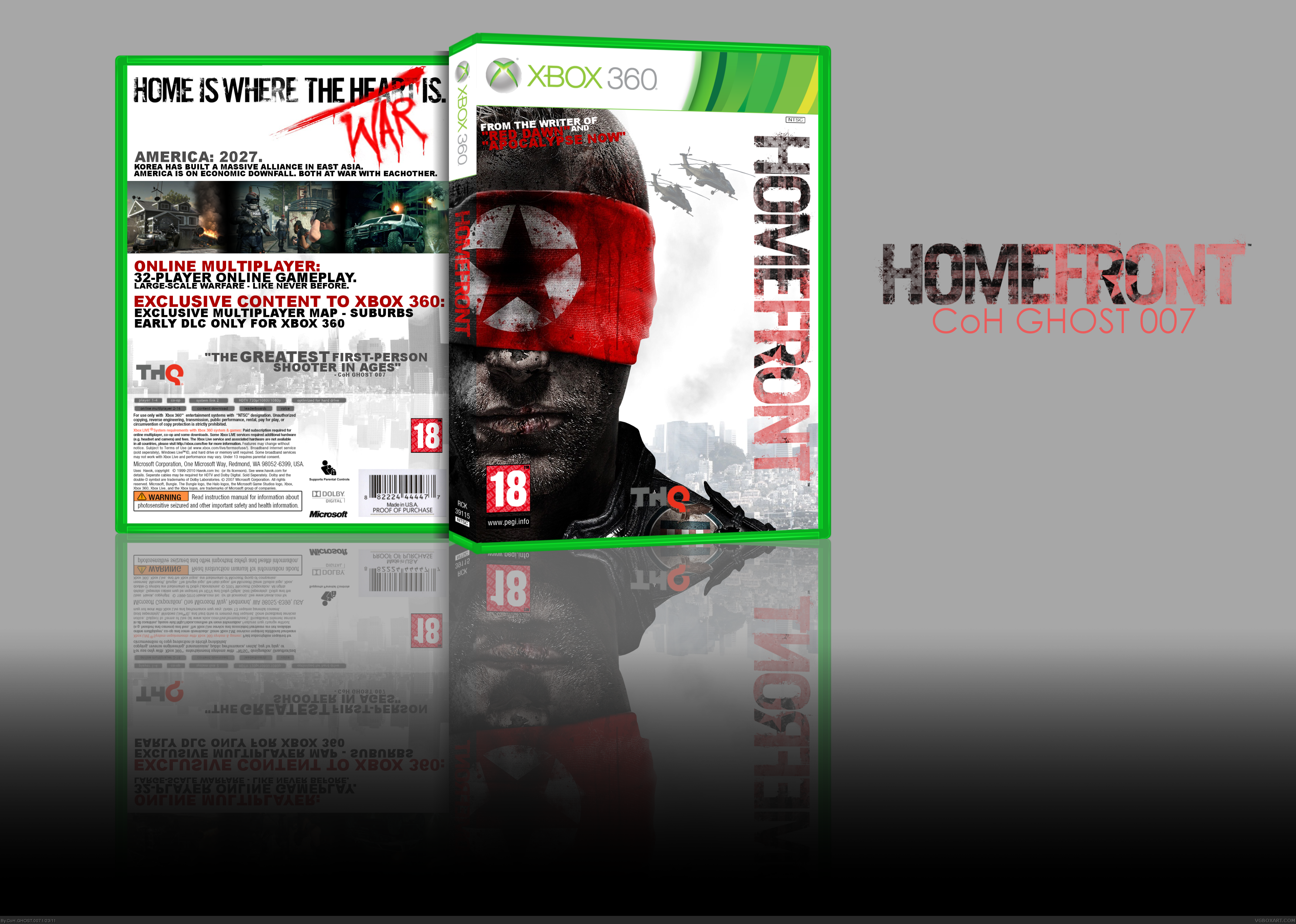
#17 - Thank you so much, i just never have had any 'pegi reasons' saved on my laptop, but i might get some for my next work, thanks again :D
Thank you to everyone who has faved and/or commented, this is my most popular box, never have i had more than 11 fav's, this was a great, and fun box art to work on
 Homefront Box Cover Comments
Nice work dude. Can you please have a look at my one.
[ Reply ]
I love it :)
[ Reply ]
Cheers :D :D :D
I saw the trailer for this and then instantly started thinking about a box, i seriously can't wait for this game, box took a while, and was enjoyable to make ;)
[ Reply ]
Pretty nice. I like it, but there is way too much space at the bottom of the presentation.
[ Reply ]
Awesome work dude!! Fav+
[ Reply ]
#4, there Updated, also altered the reflection ;D
#5 - Thanks, this really means alot to me :)
[ Reply ]
About time you got the presentation right. Lol, nice improvement. +Fav.
[ Reply ]
#7 Ha yeh, lol and thanks ;D
- Believe it or not, this is my most faved box of all time :D :D :D
[ Reply ]
Love it. I also enjoy what you did with the tag on the back.
[ Reply ]
I like it.
The front with the mostly white background works because.
The back? Well, I think it works less because it's seperated by the screens, therefor making my mind register the top as just a blank spot.
But, I do really like the plain style, and the color here.
There's you're screens aswell, they're kinda boring, next time make a better way to frame, or just space them out (still framed.)
fav+
[ Reply ]
Me likes it, but I think the white space underneath the tagline seems a little sparse. You should try to add some scratches or something to let the design flow a little more.
I'm also not a fan of how you lay out the screenshots.
You're improving though, which is very good. Great job.
[ Reply ]
My only gripe here is that the space you left empty right below the tagline seems that could've been better used. Plus I'd reccomend to turn the "TH" of the THQ logo white, so It stands out and becomes more visible.
Great job, nevertheless.
[ Reply ]
Thanks to everyone,
I muight alter it again to the help, but i'm buzy most of the time with school and friends, and i really want to get onto my next box (The Dark Knight - hopefully ;D).... But keep the suggestions coming, cos as i said, i might come back to this ;D Thanks
[ Reply ]
This looks great, I love how the red ands white just flow together. Good work.
[ Reply ]
love it man
[ Reply ]
This is actually very good, good job.
[ Reply ]
Man, your boxes are fantastic! They look very professional!
I faved! But, maybe, you should try to put the reasons of PEGI rating on the back
Edited at 1 decade ago
[ Reply ]
#17 - Thank you so much, i just never have had any 'pegi reasons' saved on my laptop, but i might get some for my next work, thanks again :D
Thank you to everyone who has faved and/or commented, this is my most popular box, never have i had more than 11 fav's, this was a great, and fun box art to work on
Edited at 1 decade ago
[ Reply ]