Glad you gave it a shot, but there are a lot of things wrong with this this. I know this is an old piece, but I had to critique it.
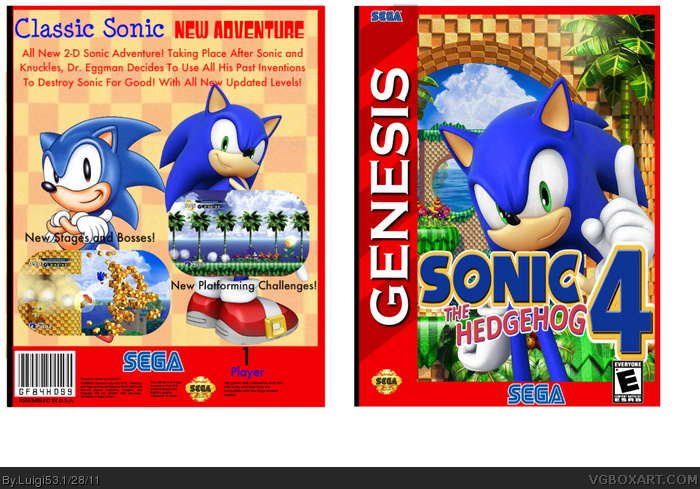
Front: The logo and Sonic are stretched. It isn't the official logo, looks like the fan made one that was floating about before the official logo released. Since you have access to screens and the cover art, you should have had access to the real logo. The logo is poorly placed, covering a majority of Sonic's body, making the pose difficult to make out. The red border on the top and right side is unnecessary and it would look better without it.
Back: The checkerboard pattern is low res and not consistant. The boxes are all over the place in sizes. Too many fonts for the copy, and the copy itself doesn't make sense. "Classic Sonic Gameplay" perhaps? The copy is choppy and very badly written. Reads like bullet points rather than a paragraph. Classic Sonic implies Sonic Generations. Showing two different designs of Sonic in two art styles makes no sense. Lose the classic design and keep the modern one, as that is all Sonic 4 has. The screens corners are too rounded and they're poor choices. Choose more diverse screens showing off more stages. Perhaps stack them to the left of Modern Sonic? The captions next to the screens are very difficult to read. The 1 Player bit looks bad, better to use an official "1 Player" logo from any official Genesis release.
 Sonic the Hedgehog 4 Box Cover Comments
I this this might be my VERY best.
[ Reply ]
I like it but where's the ESRB logo on the right? And I think it's a little...empty, but I really like it.
8.5/10
[ Reply ]
#2, Thanks =D
[ Reply ]
simple box, simple game matches great!
9/20 +fav
[ Reply ]
The Genesis cannot render graphics like that.
[ Reply ]
#5, Why are you being serious? It's a fan-made box, I can put Wii Graphics on a Gameboy Color if I fucking want.
Edited at 1 decade ago
[ Reply ]
Glad you gave it a shot, but there are a lot of things wrong with this this. I know this is an old piece, but I had to critique it.
Front: The logo and Sonic are stretched. It isn't the official logo, looks like the fan made one that was floating about before the official logo released. Since you have access to screens and the cover art, you should have had access to the real logo. The logo is poorly placed, covering a majority of Sonic's body, making the pose difficult to make out. The red border on the top and right side is unnecessary and it would look better without it.
Back: The checkerboard pattern is low res and not consistant. The boxes are all over the place in sizes. Too many fonts for the copy, and the copy itself doesn't make sense. "Classic Sonic Gameplay" perhaps? The copy is choppy and very badly written. Reads like bullet points rather than a paragraph. Classic Sonic implies Sonic Generations. Showing two different designs of Sonic in two art styles makes no sense. Lose the classic design and keep the modern one, as that is all Sonic 4 has. The screens corners are too rounded and they're poor choices. Choose more diverse screens showing off more stages. Perhaps stack them to the left of Modern Sonic? The captions next to the screens are very difficult to read. The 1 Player bit looks bad, better to use an official "1 Player" logo from any official Genesis release.
[ Reply ]
Oh hey Barry, do you know who I am?
[ Reply ]