I heard this game is amazing when you're high... SIKE-NAH!
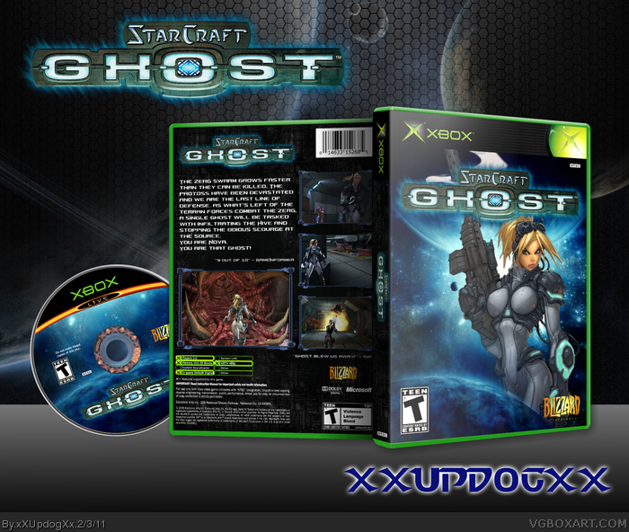
I really like this box, however, I think there are too many logos on it, I don't know why there's one on the back. Good enough for a fave though.
#4, Not all companies put logos on both sides, but it is fairly common. Bungie does it with Halo games, Harmonix does it with Rock Band games and Rockstar does it with GTA games as examples.
There are more games on my shelf with developer logos on the front and back than not.
I think you could do more with the text on the back. It looks kind of uneven and disorganized. I really like the screenshot borders, though, and the placement looks like I'd expect a PS2 game box to look.
The front is kind of "meh". I'm not a fan of the 2D art, but I see what you were going for.
 Starcraft: Ghost Box Cover Comments
My take of a Starcraft: Ghost box. Took a good amount of time and effort to make. Thank you again to those who helped in the WiP thread!
Credit:
Disc Template: Nerdysimmer
Sexy Xbox Template: stevencho
Logo: Ronthis the Werewolf
[ Reply ]
Very sharp, and very authentic to the original Xbox era. It looks great!
[ Reply ]
you are one to watch my friend...
fantastic, but maybe a little too dark on the back perhaps.
[ Reply ]
I heard this game is amazing when you're high... SIKE-NAH!
I really like this box, however, I think there are too many logos on it, I don't know why there's one on the back. Good enough for a fave though.
[ Reply ]
#4, Not all companies put logos on both sides, but it is fairly common. Bungie does it with Halo games, Harmonix does it with Rock Band games and Rockstar does it with GTA games as examples.
There are more games on my shelf with developer logos on the front and back than not.
[ Reply ]
Simply amazing dude, good work!
[ Reply ]
Nice work, and template really fit with this design too. :D
[ Reply ]
Thanks guys! :)
[ Reply ]
Good work.
[ Reply ]
#9 Thank you! That means a lot coming from a blue rank :)
[ Reply ]
This looks clean... +Fav.
[ Reply ]
I think you could do more with the text on the back. It looks kind of uneven and disorganized. I really like the screenshot borders, though, and the placement looks like I'd expect a PS2 game box to look.
The front is kind of "meh". I'm not a fan of the 2D art, but I see what you were going for.
[ Reply ]