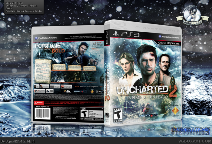
The text in the left description box is a little small, but I love everything else about this. The front looks very professional, and I like that you didn't stick to one color on this. Adding the green works very well. I really like what you have here.
I dont like the thing going through the 2. Plus this doesnt really have an Uncharted feeling going on. Like Uncharted is intense. The front doesnt really give off that vibe. The back is descent, I dont like how you made the screenshots almost blend in with Drake. The screenshots need to stand out more.
#14, lol, I was thought this is Uncharted: X-mas edition ^_^
This is really nice, these effect and color make the box outstanding, I quite like it! but like Jevan said, screenshots should be stand out more.
#14, I understand your opinions though I don't really agree with some of them. As for the screenshots one I do agree and that I could have incorporated them more into the box without a blend look to them by the colors but i feel that this has Uncharted 2 written all over it. Such as the big theme that the game had; snow. Anyways thank you for your comment and personal opinion.
#15 Thanks man =) Uncharted 2 : Among Thieves : Christmas Edition XD
I like this. The colors are great, the snowy effects are a nice touch, and the back layout is excellent. A few issues though: the description text, while stylishly presented, is pretty small and could be difficult to read, printed out. Sullivan's arm cuts off too abruptly. And the scars and bruises on Drake look pretty fake, and out of place considering the other characters are clean and untouched.
#21, Yeah i can see where you can get that, but I kept them all untouched and clean because in the game ONLY Drake is the one that gets hurt in that remark and trust me it's a pain to work with nothing for those scratches XD. Thanks for your comment SD1833, you always have something that helps me out.
#21, Yeah i can see where you can get that, but I kept them all untouched and clean because in the game ONLY Drake is the one that gets hurt in that remark and trust me it's a pain to work with nothing for those scratches XD. Thanks for your comment SD1833, you always have something that helps me out.
#24: Yes. The biggest and most recognizable moment / areas in the game is largely related to snow. So it's not unusual for there to be a few snowy designs for the game.
#24, The biggest and most related moment to the entire game is when the train crashes on the Mountain. Snow was the key point of that scene and is a significant to the game.
#26, Actually I would have to say the biggest during all the trailers and stuff. The game had many big moments. But the biggest would have to be the train tumble. When its about to land on Drake but they go through a tunnel.
#27, I have to agree and disagree. To me the highlight of the game on a personal point is that scene; but in overall it's the crashing of the train over the mountain. The teaser was that scene and also was the first thing that occurred in the game. What I'm trying to say is that Naughty Dog wanted to impress the public with the focus on the presentation of snow; such as the first one was with water and plant life. I also think that their doing the same thing with the new installation with sand or fire.
#28, Yea. But that was naughty dog, not you. I mean a whole bunch of boxes on the site used snow for Uncharted 2 covers, so since your a very creative person, you could mix it up. Make it focus on something else besides snow.
#29, If you noticed I didn't just add snow but also incorporated plant life in the box too; notice the pictures on the back and front. Also that was the impact to me too that the game's focus was snow.
 Uncharted 2: Among Thieves Box Cover Comments
"I have an issue. My work is over 5MB and won't convert to ANY Image Hosts. So can I post it on VGBoxArt or is that out of the question?"
Answer:
"I'll make an exception since I certainly want you to be able to partake. Go ahead and post it."
-LooseJuice
So that's why this is up.
[ Reply ]
Awesome.
[ Reply ]
The text in the left description box is a little small, but I love everything else about this. The front looks very professional, and I like that you didn't stick to one color on this. Adding the green works very well. I really like what you have here.
[ Reply ]
Amazing job dude! (:
[ Reply ]
What is the name of the font that you used for "FAVORS THE"?
[ Reply ]
#5, Albertus Medium
Thanks All =)
[ Reply ]
Aaargh, this is so great.
[ Reply ]
#7, XD Thanks man!
[ Reply ]
Outstanding box!
[ Reply ]
#9, Thanks Felipe! My good friend XD
[ Reply ]
Looks pretty hot.
[ Reply ]
#6, Ok.
[ Reply ]
Purely amazing.
[ Reply ]
I dont like the thing going through the 2. Plus this doesnt really have an Uncharted feeling going on. Like Uncharted is intense. The front doesnt really give off that vibe. The back is descent, I dont like how you made the screenshots almost blend in with Drake. The screenshots need to stand out more.
[ Reply ]
#14, lol, I was thought this is Uncharted: X-mas edition ^_^
This is really nice, these effect and color make the box outstanding, I quite like it! but like Jevan said, screenshots should be stand out more.
[ Reply ]
#14, I understand your opinions though I don't really agree with some of them. As for the screenshots one I do agree and that I could have incorporated them more into the box without a blend look to them by the colors but i feel that this has Uncharted 2 written all over it. Such as the big theme that the game had; snow. Anyways thank you for your comment and personal opinion.
#15 Thanks man =) Uncharted 2 : Among Thieves : Christmas Edition XD
[ Reply ]
#16, I wouldnt say snow was the big theme about this game. To tell you the truth you didnt get to the snow part till the last 25% of the game.
[ Reply ]
#17, You're right, but it works in terms of originality.
[ Reply ]
The one thing that bugs me, is how abruptly Victor's arm ends. Otherwise great work squall!
[ Reply ]
#19, Thanks man =P
[ Reply ]
#17: The official cover had a snow theme as well.
I like this. The colors are great, the snowy effects are a nice touch, and the back layout is excellent. A few issues though: the description text, while stylishly presented, is pretty small and could be difficult to read, printed out. Sullivan's arm cuts off too abruptly. And the scars and bruises on Drake look pretty fake, and out of place considering the other characters are clean and untouched.
[ Reply ]
#21, Yeah i can see where you can get that, but I kept them all untouched and clean because in the game ONLY Drake is the one that gets hurt in that remark and trust me it's a pain to work with nothing for those scratches XD. Thanks for your comment SD1833, you always have something that helps me out.
[ Reply ]
#21, Yea, cause that was one of the biggest moments of the game.
[ Reply ]
#24: Yes. The biggest and most recognizable moment / areas in the game is largely related to snow. So it's not unusual for there to be a few snowy designs for the game.
[ Reply ]
#24, The biggest and most related moment to the entire game is when the train crashes on the Mountain. Snow was the key point of that scene and is a significant to the game.
[ Reply ]
#26, Actually I would have to say the biggest during all the trailers and stuff. The game had many big moments. But the biggest would have to be the train tumble. When its about to land on Drake but they go through a tunnel.
[ Reply ]
#27, I have to agree and disagree. To me the highlight of the game on a personal point is that scene; but in overall it's the crashing of the train over the mountain. The teaser was that scene and also was the first thing that occurred in the game. What I'm trying to say is that Naughty Dog wanted to impress the public with the focus on the presentation of snow; such as the first one was with water and plant life. I also think that their doing the same thing with the new installation with sand or fire.
[ Reply ]
#28, Yea. But that was naughty dog, not you. I mean a whole bunch of boxes on the site used snow for Uncharted 2 covers, so since your a very creative person, you could mix it up. Make it focus on something else besides snow.
[ Reply ]
#29: The color blue =/= snow
[ Reply ]
#30, Not always.
[ Reply ]
#29, If you noticed I didn't just add snow but also incorporated plant life in the box too; notice the pictures on the back and front. Also that was the impact to me too that the game's focus was snow.
[ Reply ]
#32, Yea. I noticed. But I think you could make a better Uncharted box, without the snow. IMO.
[ Reply ]
#33, That I can understand lol Sorry about the battle XD
[ Reply ]
I'm not a fan of the front. The concept art at the bottom is pretty uninteresting and I'm not a fan of the colors.
The back, however, is really cool.
[ Reply ]
#35, Thanks man =)
[ Reply ]
thx for printable, its rare to find good boxes and even much more rare to find printable versions. i successfully replaced my platinum one :)
[ Reply ]
Well done!
[ Reply ]
#37, Thanks!
[ Reply ]