Great box! I see you have the potential to become a high-ranking artist!
But I would change the ESRB to E10!
Other than that, I would have to give this a 5/5! Great work!
so you want some critique and so i'll give you my honest one
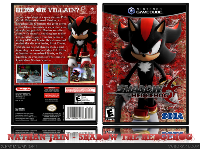
i can see that you have used grunge brushes but you haven't used them well because you just created a background with those brushes and it would look more effective if you used it on shadow himself...and the render of shadow i think looks too plain and simple and you should've instead make him look more shadowy - hence his name and also make the render tone different or reduce his stauration to add more to his skin.
so thats with the front...over to the back
well i can see that you wanted to keep the back simple but i truly think the simplicity made it look too dull and boring...maybe add some more renders and lower it's opacity
and did you check other shadow the hedgehog boxes on this site for inspiration because their were some really good boxes to view
but the font choice was fine and so was the rest of your box however i think your sonic color box was better because you were inspired and thats a good thibg when making a new box
overall i'll give it
3.2/6
#5, I din't want to put the grunge on shadow, only as the background. And as it was the main render, I didn't want to make it any darker.
I thought this would get more attention than my Sonic Colors box, but, comparing them both now, I think my Sonic is better.
 Shadow the Hedgehog Box Cover Comments
4th box. Tried going for a grungy look on front. Tell me how I did. Also, do you think I should make it grungy on the back?
Credits to qwerty334 for template, cerium for sega logo and planet renders for renders and logo.
Comments, faves and criticism appreciated.
PS. I wanted this to turn out better than my Sonic Colors box.
[ Reply ]
I have to say, I'm starting to like you. You keep getting better and this is better than your last box. My favourite of yours is your first.
I like the grunge and think you should add it on the back.
[ Reply ]
Thx Blade, I appreciate it, but...
Is there no one else on this site to comment/critique/fav my box? Honestly, it seems like there isn't.
[ Reply ]
Great box! I see you have the potential to become a high-ranking artist!
But I would change the ESRB to E10!
Other than that, I would have to give this a 5/5! Great work!
[ Reply ]
so you want some critique and so i'll give you my honest one
i can see that you have used grunge brushes but you haven't used them well because you just created a background with those brushes and it would look more effective if you used it on shadow himself...and the render of shadow i think looks too plain and simple and you should've instead make him look more shadowy - hence his name and also make the render tone different or reduce his stauration to add more to his skin.
so thats with the front...over to the back
well i can see that you wanted to keep the back simple but i truly think the simplicity made it look too dull and boring...maybe add some more renders and lower it's opacity
and did you check other shadow the hedgehog boxes on this site for inspiration because their were some really good boxes to view
but the font choice was fine and so was the rest of your box however i think your sonic color box was better because you were inspired and thats a good thibg when making a new box
overall i'll give it
3.2/6
[ Reply ]
#5, I din't want to put the grunge on shadow, only as the background. And as it was the main render, I didn't want to make it any darker.
I thought this would get more attention than my Sonic Colors box, but, comparing them both now, I think my Sonic is better.
Sorry guys if I've let you down.
[ Reply ]
Any game ideas, people? I'm stuck.
[ Reply ]