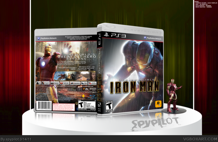
Not bad, the front actually looks pretty cool. The logo is not centered however, and neither is the "The Invincible" text above "Iron Man". The back is simple, but I still like it. Having a drop shadow behind Iron Man would only make sense against the screenshots, unless he's standing in front of a cardboard cutout of a city. The legal text and PSN features on the template are also incorrect, but I notice a lot of people don't change that stuff.
Overall a good case, but it's got flaws. Oh, and you left?
 The Invincible Iron Man Box Cover Comments
Not bad, the front actually looks pretty cool. The logo is not centered however, and neither is the "The Invincible" text above "Iron Man". The back is simple, but I still like it. Having a drop shadow behind Iron Man would only make sense against the screenshots, unless he's standing in front of a cardboard cutout of a city. The legal text and PSN features on the template are also incorrect, but I notice a lot of people don't change that stuff.
Overall a good case, but it's got flaws. Oh, and you left?
[ Reply ]
...You left...?
Pretty cool box, I like it.
[ Reply ]
#3, Banned.
[ Reply ]
#2 & #3, ^ what he said
[ Reply ]
Awesome! Make a 360 cover next time
[ Reply ]
#6, i have a really hard time making that fugly neon green work with my darker designs.
[ Reply ]
Decent work here my good man!
[ Reply ]
This is pretty much what my new box was going to look like...
[ Reply ]
#7, Could be a dark 360 color template
[ Reply ]
Feels great, nice layout, cool colors.
faved.
[ Reply ]
#11, lol, you already had faved it.
[ Reply ]