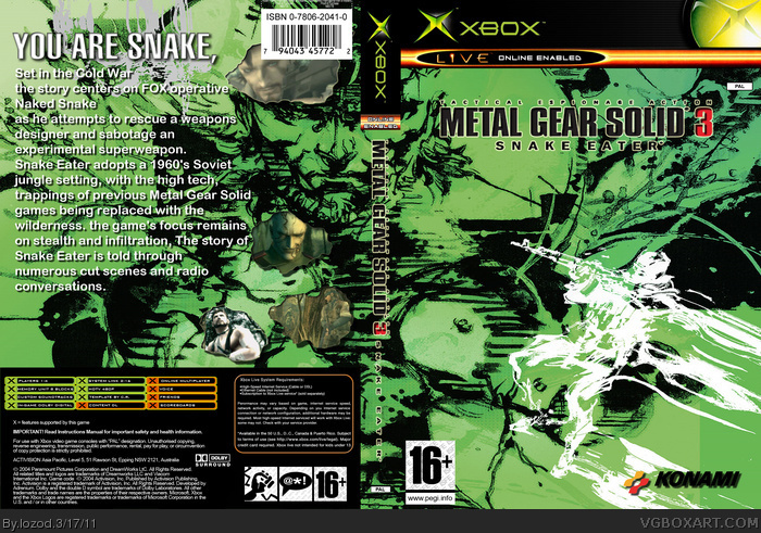
It has potential, but at it's current state is confusing and generally difficult to tell what's actually going on.
Instead of using one image, spanning the entire case, downsizing and limiting it to one side would give the case more focus. Right now, the front doesn't really have anything to catch the viewer's attention, and looks like a random collage of abstract shapes.
The cluttered / random issue extends to the back, especially now that you're dealing with text and screenshots as well. A general rule of most cases, is to have a space on the back set aside for your text synopsis and screenshots, rather than placing them directly over top of the artwork. It not only makes things difficult to see, but takes away from the artwork itself.
On the subject of text, my opinion is that there's too much of it to begin with. Again, this problem could be solved with a reserved bare space used for text. I'd also recommend experimenting with different font choices. While a more basic font like you're using here is fine for the synopsis, as you want it to be legible and easy to see. The tagline could be something more fitting of the game's theme, however, like the game logo for example.
Props for using generally high resolution material. That's a rarity.
 METAL GEAR SOLID 3 - Snake Eater Box Cover Comments
poeple here is my new cover
i didnt make one in a long time but tell me how you like it :)
[ Reply ]
no comments?
i want to improve so please say something :O
[ Reply ]
I like it. The back feels like you put way to much text though.
[ Reply ]
very nice, the green really seeperates it from losts of MGS boxes I have seen over the years. Also, what program do you use to make your boxes?
[ Reply ]
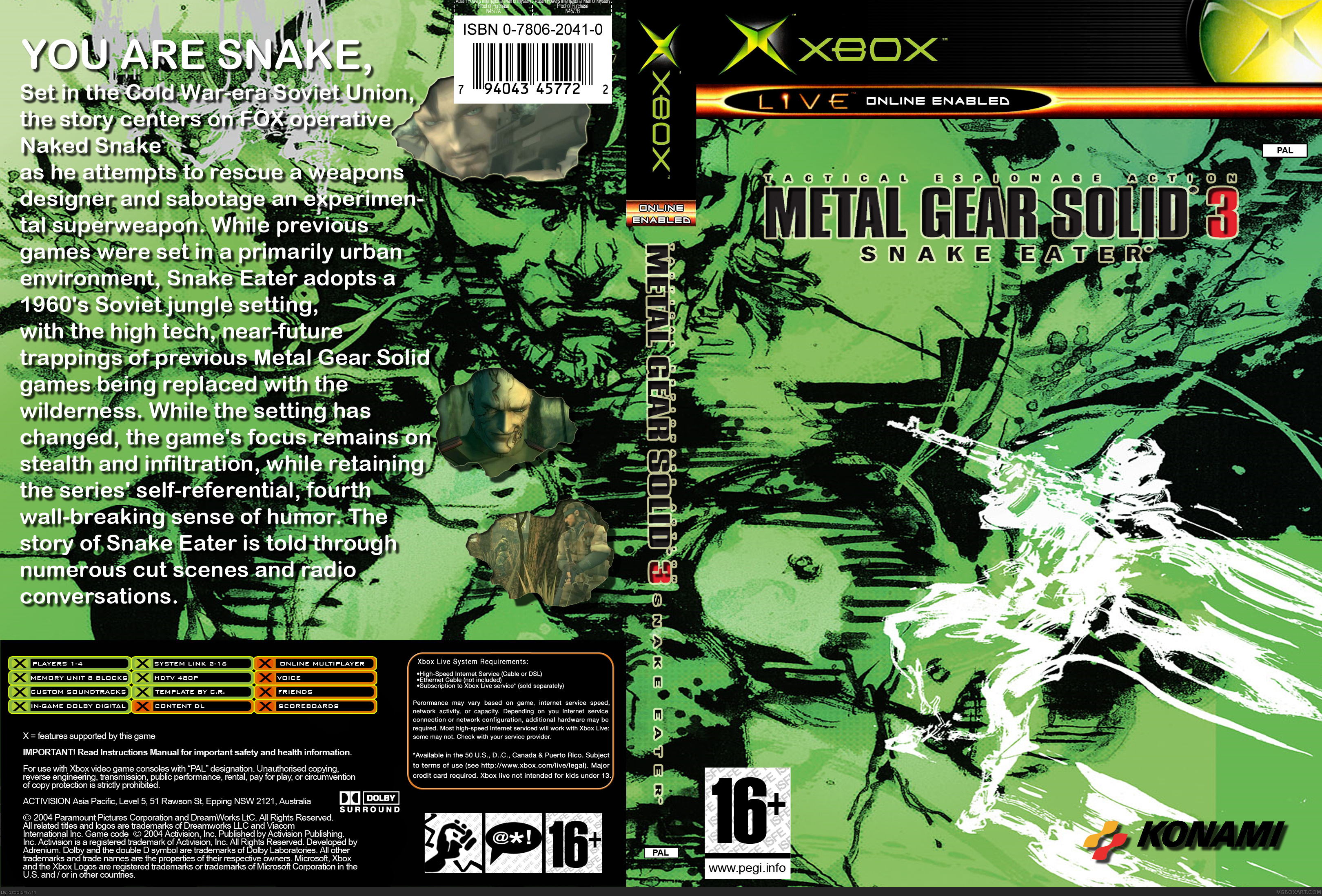
It has potential, but at it's current state is confusing and generally difficult to tell what's actually going on.
Instead of using one image, spanning the entire case, downsizing and limiting it to one side would give the case more focus. Right now, the front doesn't really have anything to catch the viewer's attention, and looks like a random collage of abstract shapes.
The cluttered / random issue extends to the back, especially now that you're dealing with text and screenshots as well. A general rule of most cases, is to have a space on the back set aside for your text synopsis and screenshots, rather than placing them directly over top of the artwork. It not only makes things difficult to see, but takes away from the artwork itself.
On the subject of text, my opinion is that there's too much of it to begin with. Again, this problem could be solved with a reserved bare space used for text. I'd also recommend experimenting with different font choices. While a more basic font like you're using here is fine for the synopsis, as you want it to be legible and easy to see. The tagline could be something more fitting of the game's theme, however, like the game logo for example.
Props for using generally high resolution material. That's a rarity.
[ Reply ]
Edited at 1 decade ago
[ Reply ]
#5, updated
[ Reply ]
is v2 better than v1?
[ Reply ]