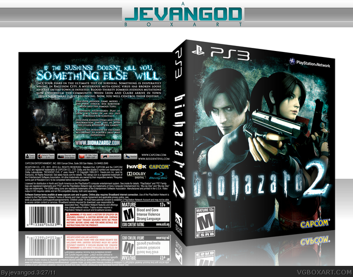
My version of Biohazard 2 for the PS3. I actually had to make the logo from scrap. Plus the characters on the front were scans from the darkside chronicles artbook. I had to render them and make them clearer. So.... hope you guys like it.
I like this but I'm not fond with the back. I find it to be way to cramped and the text is somewhat hard to read. I think you need to make the text more visible and find a different design. However the front is gorgeous.
#10, Really? I think its really easy to read. I can see why you think its cramped. Seems fine to me though, I wanted to go for a different arrangement on the back and I think I accomplished that. Might not be the best, but its something else.
But I do partially agree about the back.
Jevan, I love ya', but you're backs are always lacking in idea and presence, they're good, but they always feel way too uniform. Not creative enough.
But.. to each his own.
Front is solid. Nothing technically wrong with it. Nice colors and the grunge goes hand in hand with Resident Evil. The back looks crammed with text, but I really like that tagline.
#12, That's not what I really meant for the text. I can read it fine, though the background classes with the text itself making it hard to see. Again I can read it though I thought the background under it didn't work and looked way to busy.
plus: the glow on the 2 on the back seems off, because on the front the biohazard is kinda glowing too, but not on the spine. IMO you should remove the glow on the spine.
 Biohazard 2 Box Cover Comments
My version of Biohazard 2 for the PS3. I actually had to make the logo from scrap. Plus the characters on the front were scans from the darkside chronicles artbook. I had to render them and make them clearer. So.... hope you guys like it.
[ Reply ]
Looks hot, Nice job
[ Reply ]
Sick.
[ Reply ]
Good, to me the back looks crammed.
[ Reply ]
It looks good, but why the Biohazard title with an NTSC/U template?
[ Reply ]
#5, I always liked the name Biohazard more than Resident Evil. Plus Biohazard is the original name. US had to change it to Resident Evil.
[ Reply ]
wow, I love the tagline so much.
[ Reply ]
surely love it ^^
fav +author fav
[ Reply ]
its bootiful!
#6 yeah, wasnt it becauses 'Biohazard' was already under patent pending at th etime?
[ Reply ]
I like this but I'm not fond with the back. I find it to be way to cramped and the text is somewhat hard to read. I think you need to make the text more visible and find a different design. However the front is gorgeous.
[ Reply ]
#10, Really? I think its really easy to read. I can see why you think its cramped. Seems fine to me though, I wanted to go for a different arrangement on the back and I think I accomplished that. Might not be the best, but its something else.
[ Reply ]
#10, You need glasses or something man..
But I do partially agree about the back.
Jevan, I love ya', but you're backs are always lacking in idea and presence, they're good, but they always feel way too uniform. Not creative enough.
But.. to each his own.
[ Reply ]
*hands down*
[ Reply ]
Nice. I love the tagline.
[ Reply ]
Author FAV and FAV. Fricking amazing!!
[ Reply ]
Front is solid. Nothing technically wrong with it. Nice colors and the grunge goes hand in hand with Resident Evil. The back looks crammed with text, but I really like that tagline.
[ Reply ]
PRINTABLE ADDED!!!!!!
[ Reply ]
#12, That's not what I really meant for the text. I can read it fine, though the background classes with the text itself making it hard to see. Again I can read it though I thought the background under it didn't work and looked way to busy.
[ Reply ]
you should add shwadows to the whole text on the back or not. using one with and the other without looks weird.
agreed at "biohazard" and the us-package "issue"
the rest is the typical stuff. nothing new here. looking good, that's it.
[ Reply ]
plus: the glow on the 2 on the back seems off, because on the front the biohazard is kinda glowing too, but not on the spine. IMO you should remove the glow on the spine.
[ Reply ]
clean and simple, great job, love it
[ Reply ]
#20, Yea. I was gonna remove the glow on the spine but I was like, its not that big of a deal.
[ Reply ]
Printable please.
[ Reply ]