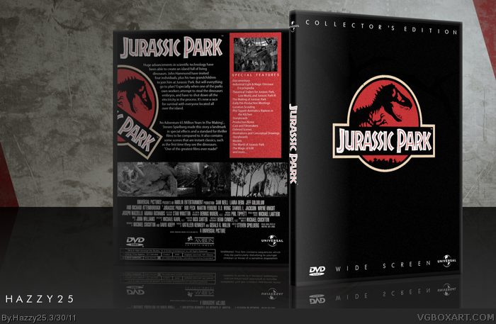
Looks very well done. But I do have some issues: The front is too plain, I know you were going for a simple approach but I think every Jurassic Park box has been going with the simple approach and a new concept is in need. Jurassic Park is very repetitive, like the front, then side of the back, spine and then even the tag line says the same thing, could have at least gone with a different tag line. Also not really a fan of the Grayscale screenshots on the back, they dont really go well with the box in my opinion. The spine is really crammed as well. So overall it does look good just a little too generic for my taste, but good job :)
#3, I have to say that I disagree. I like the simplicity of the whole box. The front looks absolutely perfect and so does the back in my opinion. The greyscale screenshots would have worked better becuase the coloured ones would have stood out way too much and not gone with the colour scheme. Just personally, the only flaw I see is that the spine is too narrow (causing the spine text to leak over into the front)
I like the cleanly organized back, and black/red have a history of working really well together. The greyscale images are a nice touch, and definitely add a lot towards continuing the color scheme.
I do feel like I've seen that front design countless times now. There's nothing technically wrong with it, just that it's become such a standard choice for Jurassic Park that it's no longer interesting to me.
I like the design but then I checked out the printable version, that's when I saw the major issues.
First may I say like the simplicity of the front if it wasn't done over million times. Ever box with that title has the simplistic front you made and to me it's getting old. However I like the touches you did to add some silhouettes and extra's, but I can still see you can improve this. The logo is choppy (I'll throw that out) and the dissolve effect looks nice in presentation mode but looks in my opinion horrible in printable. The back is also nice with a clean, slick design but just like the front it can be improved. Again I dislike the dissolve, the tag line seems lazy, and lastly the low quality of images such as the choppy logo and the boarder are bothering me. It's all good ideas but not executed properly. The greyscale is a first and looks slick but these major issues is what gets to me.
Overall I like the design and the style you tried to pro trade but the major issues in my opinion stick out like a sore thumb. Hope this helps and good luck to your next piece of art!
Thanks for comments. I'm thinking of doing another box of Jurassic Park with a different kind of theme. There are shadows of dinos on the cover just the presentation hides it
 Jurassic Park Box Cover Comments
This is my Jurassic Park Collector's Edition box. Not much to say about it, took me awhile.... Comments and fav appreciated, Thanks
[ Reply ]
Boy, am I enjoying these Jurassic Park boxes, amazing, simply out-standing, if this was the real case, I'd buy about 20 of them XD
[ Reply ]
Looks very well done. But I do have some issues: The front is too plain, I know you were going for a simple approach but I think every Jurassic Park box has been going with the simple approach and a new concept is in need. Jurassic Park is very repetitive, like the front, then side of the back, spine and then even the tag line says the same thing, could have at least gone with a different tag line. Also not really a fan of the Grayscale screenshots on the back, they dont really go well with the box in my opinion. The spine is really crammed as well. So overall it does look good just a little too generic for my taste, but good job :)
[ Reply ]
#3, I have to say that I disagree. I like the simplicity of the whole box. The front looks absolutely perfect and so does the back in my opinion. The greyscale screenshots would have worked better becuase the coloured ones would have stood out way too much and not gone with the colour scheme. Just personally, the only flaw I see is that the spine is too narrow (causing the spine text to leak over into the front)
[ Reply ]
I like the cleanly organized back, and black/red have a history of working really well together. The greyscale images are a nice touch, and definitely add a lot towards continuing the color scheme.
I do feel like I've seen that front design countless times now. There's nothing technically wrong with it, just that it's become such a standard choice for Jurassic Park that it's no longer interesting to me.
[ Reply ]
I like the design but then I checked out the printable version, that's when I saw the major issues.
First may I say like the simplicity of the front if it wasn't done over million times. Ever box with that title has the simplistic front you made and to me it's getting old. However I like the touches you did to add some silhouettes and extra's, but I can still see you can improve this. The logo is choppy (I'll throw that out) and the dissolve effect looks nice in presentation mode but looks in my opinion horrible in printable. The back is also nice with a clean, slick design but just like the front it can be improved. Again I dislike the dissolve, the tag line seems lazy, and lastly the low quality of images such as the choppy logo and the boarder are bothering me. It's all good ideas but not executed properly. The greyscale is a first and looks slick but these major issues is what gets to me.
Overall I like the design and the style you tried to pro trade but the major issues in my opinion stick out like a sore thumb. Hope this helps and good luck to your next piece of art!
[ Reply ]
Thanks for comments. I'm thinking of doing another box of Jurassic Park with a different kind of theme. There are shadows of dinos on the cover just the presentation hides it
[ Reply ]